HOME | DD
 grebnedlog — Blooms of Spring
by
grebnedlog — Blooms of Spring
by
Published: 2013-02-11 14:51:31 +0000 UTC; Views: 167; Favourites: 0; Downloads: 3
Redirect to original
Description
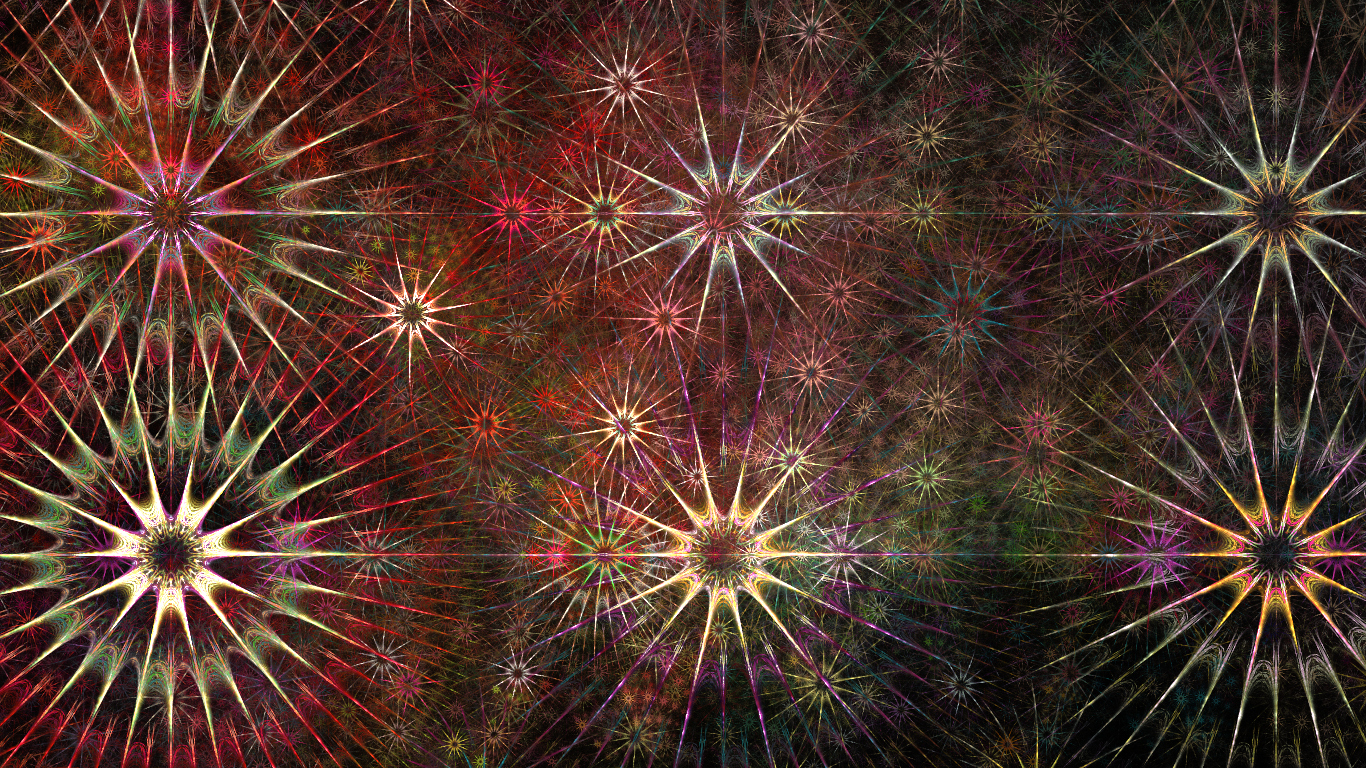
Less symmetric than most of mine, but it's good to be different.--
Made with Apophysis 2.09.
Related content


Comments: 7

I'm liking the chaos of it, then again, I'm not the most organized person. It appeals to certain people I guess. I like the differentiation of the colors and your eyes move from one side of the screen to the other... very nice!
👍: 0 ⏩: 1

Yes, this one is almost identical in structure to the "Digital Forest" one. It has the same golden-rectangle layout, and gives it just enough symmetry to look good, and just enough asymmetry to look interesting.
👍: 0 ⏩: 0

Asymmetry is beauty. Like a pretty flower that is also beautiful.
👍: 0 ⏩: 1
Not to mention, one that's pretty.
👍: 0 ⏩: 1

It looks like... fireworks? Flowers? Stars?
I'm gonna settle with anemones.

")
👍: 0 ⏩: 1
Answer: E: All of the above.
👍: 0 ⏩: 0