HOME | DD
 greenhybrid — terrabite: a picogen frontend
Published: 2009-04-14 06:46:13 +0000 UTC; Views: 950; Favourites: 0; Downloads: 29
Redirect to original
Description
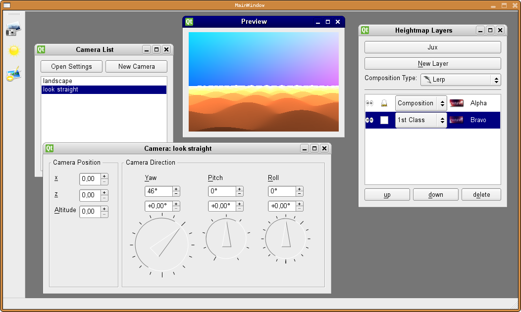
This is a soon preview of the new frontend to picogen, called terrabite. Clearly, this is inspired by the commercial terragen 0.x, in an effort to make it easier to use for those who are used to terragen 0.x.You can have multiple camera definitions in your scene file, and later on when several types of cameras are included (e.g. cubemap camera, hemisphere camera, and more maybe) this will make it very very convenient. Basically, you can take snapshots and plan your next render, without loosing the settings from a previous, cool rendition.
For the same reason, scenes can have multiple atmosphere or weather settings later. And if there are too many settings to remember which one contributed to your last awesome render, I even plan on coding together a "List of Settings-Combination", so that once you have 7 billion potential combinations, you won't forget which one of those combos you have used recently.
But back to the screenshot. You can see the camera-orientation window, which is imho self-explaining.
Further, there's the render preview window, which can be resized arbitrary (currently, preview updates happen in background (i.e. in another thread) upon window resize).
Lastly, the window on the right is what took me most of the work until now. It is the heightmap layers editor, clearly inspired by Gimp's Layer editor. You can have multiple layers of heightmaps, then combine them using operations like "add", "multiplay" or "lerp" (lerp is special in that it will allow to use yet another heightmap as the lerping operand; but more and clearer detail later).
You can lock each heightmap (to prevent accidental changes), make them visible/invisible, give them names, and finally, you can set a type for each heightmap.
I plan to implement 4 types:
* "1st class" (== a template or preset, with some tweakable parameters; very user friendly)
* "Composition", which would open up another heightmap-layers-window (so you can build an actual hierarchy)
* Bitmap, for when you have some cool heightmap laying around on your harddisk
* Code, which would open up a programmer editor and let's you type in program-code (which was the only option in the previous frontend, "picogen-wx"; for experienced users; gives you the maximum possible freedom)
All in all, another target audience of terrabite is game programmers, you will be able to get together cubemaps or skymaps in a glimpse; but it will also have advanced options to satisfy the "pure" user.
Finally, let me say you that "Picogen: Terrabite" is based on Trolltechs (@Nokia) "QT" widget toolkit, which makes it very portable (potentially to the cell phone).
Release plan: When it's usable and at least as mighty as previous picogen (essentially, the next picogen is a complete rewrite in terms of program code and frontend development).
Related content


Comments: 16

will the preview later become "higher quality"? - or will there be a detail-setting or something?
👍: 0 ⏩: 1

yep, detail setting, awesome quality
👍: 0 ⏩: 1
")
thank you, though I have begun to work out yet another frontend, a graph based one. funnily, while it looks more complicated to code, it is actually easier, because the graphs/nodes reflect the underlying architecture less abstract then the photoshop/gimp-like layer based editor. for screenshots: [link]
👍: 0 ⏩: 1
ah very nicely node-based
You know, the node-section of Blender for Image-editing is so powerful that I'd often like to have that as-is in Gimp/Photoshop.
You partially can get that with grouped images but not as nicely as in such a node-view.
Just selecting some parts to split them out is a bit hard... Blender for that offers an ID-number aswell as a layer-system to split up the scene in different layers which autocuts things out but that wouldn't work for photoshop or gimp, if you start from a single-layered image where you want to cut out certain parts to get new layers.
It would be very nice to have a "standard" mode for select and make layers and a "node"-mode for fine-tuning and very advanced effects inside those two
But why do I tell you that? xD You're doing Picogen, not GIMP xD
Oh well...
The Icons are huge, btw. I wouldn't mind to have them smaller. They could take away useful space for complicated node systems...
btw, I'd suggest you an "Iterate" node which basically has a loop of nodes as input
A bit hard to explain....
 (Wink)")
👍: 0 ⏩: 1
it's a pity for the code that has already been written for the gimp like thing. but =lyc once said that someone once said (")
as said, while it looks more complicated to code, it really is far less complicated because it now directly reflects the underlying code-generation.
icons: picogen must look fancy to fascinate those who are less geeky then us, but it's anyways not the final design. there are so many instructions (in the sense of "addition", "sine", "square root", etc.) that I need to somehow group all those, and now I have two modi in mind:
-> hierarchical drop down box. example:
aggregate functions:
* addition
* subtraction
* multiplication
* division
trigonometric functions:
* sine
* cosine
etc. etc. I like that approach, but haven't checked yet if Qt's dropdown box supports such.
Alternatively, familiar instructions could get familiar icons, so you have some optical grouping.
well I'll see
👍: 0 ⏩: 1
yes you know, I'm FOR icons. Just not such huge ones. They distract the viewer.
Icons are made to recognize things and get their meaning quickly in an intuitive way. However, besides looking fancy, they should also look somewhat neutral. Balancing all that is an art on its own. You certainly overdid the fancyness here, on cost of attention
👍: 0 ⏩: 1
hehe, full agree
They should be far, far simpler. I am thinking of just some geometric shapes, in different colors. For example, addition/subtraction/multiplication/division are a green circle; sine/cosine/arcsine are some yellow 5-star; atom-nodes (i.e. without child-nodes) like user-constant, predefined-const are red square, etc.
This would also be some kind of syntax-highlighting then.
Unfortunately I am not an icon artist. If you find such collection (basic, yet fancy shapes), let me know
👍: 0 ⏩: 1
 (Smile)")
but I know someone who truly is an icon artist
At least for his own works (not the ones on dA), he frequently also does icons. And they look simple, yet stylish
You know, with the approach you had there now, the size will be reduced a lot... but... then, the part about intuitivity is gone
For example, as they are either the trigonometric or the circle functions, you should give sin/cos/etc a circle or a triangle... or a triangle in a circle.
predefined constants are quoted, so to say... so, they could simply be quotationmarks
either "" or '' or just " or just '
the other variant could be true for User-defined stuff...
layermixing options as presented also in photoshop, like add sub mul div overlay brightest darkes difference exclusion, soft mix, hard mix, simply "mix", etc....
they could be grouped under an icon, looking like a tiny glass with two different liquids in it.
Advanced operations like powers, exponents, roots and logs could be grouped under a simple root sine or.... e√
vector operations like dotproduct or crossproduct could be simply under an arrow
→, but rotated to point up too
and so on. those are simple ideas and probably not the best ones... but they are starting points.
I'll ask my icon-specialist-friend, if he'd like/be willing to design icons for you
👍: 0 ⏩: 1
those are already very nice ideas
let me bookmark this post.
About your icon making friend: that would indeed be very nice, though I am yet unsure about how many actual icons or icon groups I need. Plus I would need them under GPL or compatible, say so that I can redistribute them (copyright wouldn't be affected by this, it's still his). Aber Fragen kostet ja nichts
I think it would be cool to have icon groups with distinct shape. E.g., let's take your glass idea: So all layermixers have that glass, but on the addition icon, there is a "+" sign, on the multiplication icon, there's a "-", etc. Otoh, that wouldn't be to important, as the seperation is already there in form of they labels.
👍: 0 ⏩: 1
yeah thought about a simple + - (I hope - is for substraction and not for multiplication
👍: 0 ⏩: 1
late reply: Yeah, I've finally made some icons, only a handfull for the basemath:
[link]
[link]
[link]
[link]
You must copy+paste to address "?root")
👍: 0 ⏩: 1
Very nice
I hope, you plan to use them as vector-graphics or something. They'd be ideal for that and probably even smaller than as png, as they're now... Also, it would make the size adaptable.
Well designed. You could keep that style and add a colour-coded function set. Like now, maths are darkyellow/orange. You'll probably add xy and y√x and similar to them.
A different set of instructions would have a different colour - for instance, predefined variables would be... say... slightly bluish grey, like a graphics-effect for silver
👍: 0 ⏩: 0

That looks really smooth. Nice work!! How do you like QT?
👍: 0 ⏩: 1
Thanks, though it is unfunctional yet. All the forms don't save anything to a scene file, or so. And that after nearly 10 kloc of fresh code. To be honest, I don't know where all those loc are ... (if interested, I am mirroring the savannah repository over to googlecode: [link] )
About QT: It took me a while to get the point about signals and slots, and it's own preprocessor (which adds some keywords to c++), and then there was a pitfall about how to display widgets properly in a MDI area (hint: ensure that windows have a top level layout), but then it'
s quite nice to use. E.g. you insert a new button in qt4-designer, name it "pushButton" or something, and then you go to your class that you derived from the form designed in qt-designer, then add "on_pushButton_clicked()" into your private declarations, et voila, you have a clicked() method for that event.
Also, amongst the coolest things are the QT-Stylesheets, which lets you (qt-)natively skin your application. E.g., see here: [link] , [link] , or in the posted image, I use stylesheets to set an image for checked and unchecked checkboxes.
👍: 0 ⏩: 0