HOME | DD
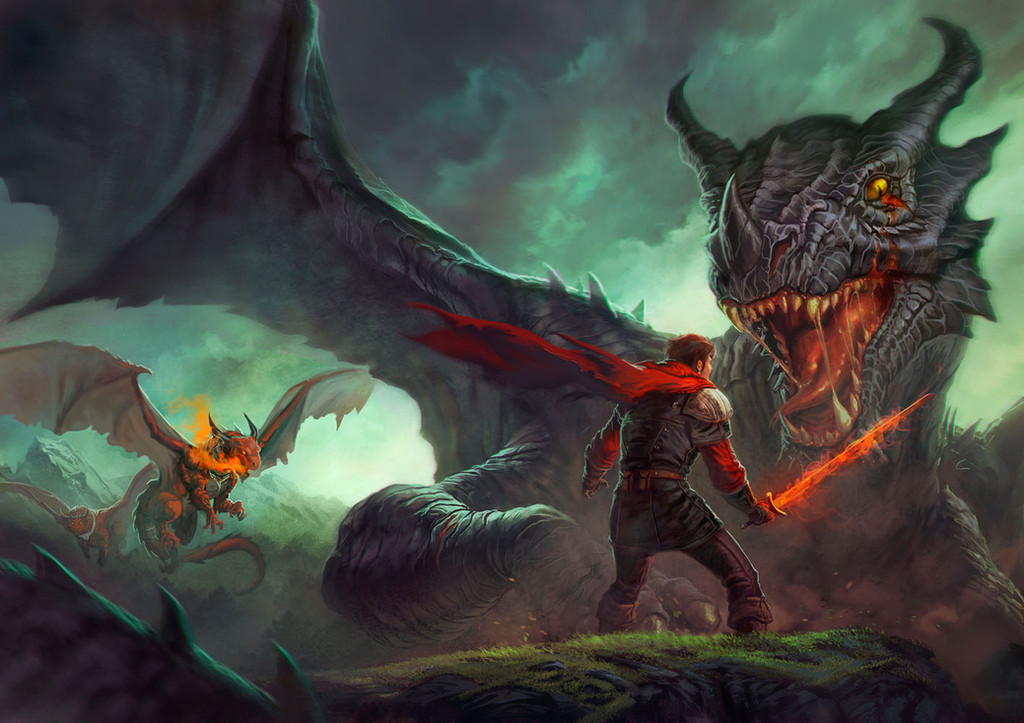
 Greg-Opalinski — Dragon Hunt - Revised
Published: 2015-01-31 07:54:21 +0000 UTC; Views: 4477; Favourites: 264; Downloads: 126
Redirect to original
Description
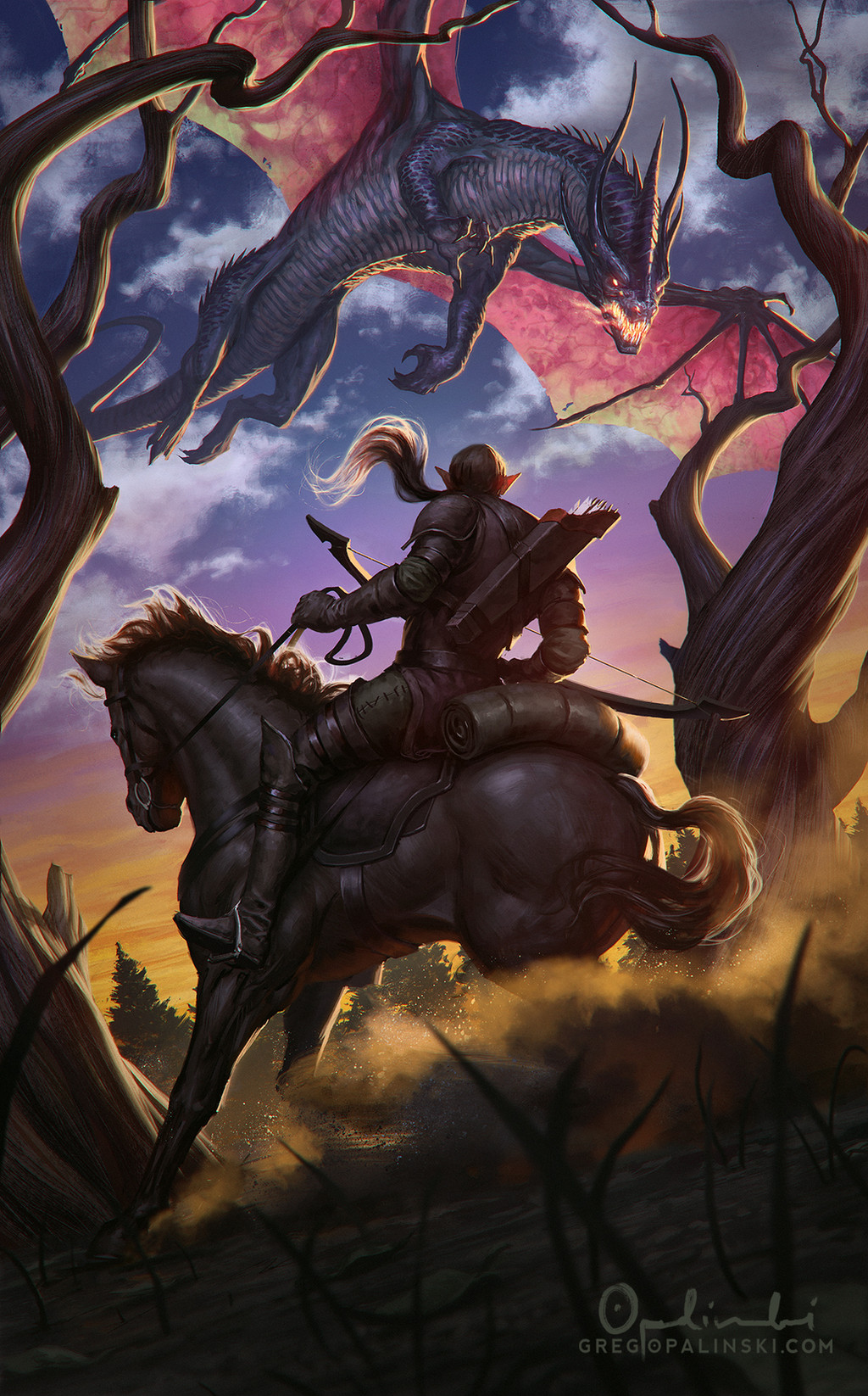
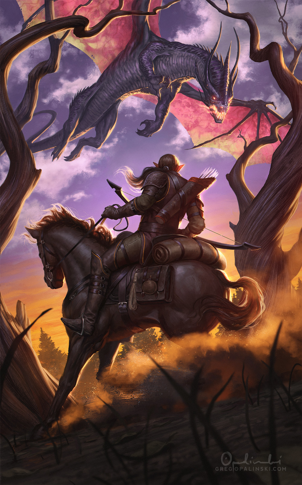
I decided to fix up this painting from a few months ago. Mainly the dragon and the sky bothered me. Oh, and the trees. And the crappy contrast, hehe. I like it a lot better now, and hope you guys do too! (Smile)")
Related content


Comments: 27


The lighting, the angle, the composition...I love everything in this! Your work is inspirational.
👍: 0 ⏩: 0

Really fantastic!! You did the sky very well, its realistic. He colors are nice; but the wings of the dragon are bizarre, according to me.
Nice work.
👍: 0 ⏩: 1

Thanks for the feedback! Is there something particular about the wings that looks off? I've been staring at this for so long it's hard to see it with a fresh eye X_X
👍: 0 ⏩: 0


Thanks! I hope to paint more of them
👍: 0 ⏩: 0

Thank you, that was my main focus while working on this one
👍: 0 ⏩: 0

oh this is way better! the trees make the top half flow much better
👍: 0 ⏩: 1
Thanks! I'm glad it works better now
👍: 0 ⏩: 0

Well the trees are obviously better but not sure 'bout dragon
👍: 0 ⏩: 1
Haha thanks for the feedback! I thought the dragon was lacking some color and I thought the wings would be more interesting this way.
👍: 0 ⏩: 1
You're welcome. I think that wings could possibly be less bright and saturated, to get their silhouette more distinctive.
Anyway you did great work on this scene!
👍: 0 ⏩: 0


Lovely lighting!! I love the way it highlights the sillhouette!
👍: 0 ⏩: 1


Damn, now I wish I could see the two versions together, to compare!
👍: 0 ⏩: 1
I took a few months but here you go
gifmaker.cc/PlayFrameAnimation…
👍: 0 ⏩: 1
Oh my - this is every bit as interesting as I hoped it would!
Good call on the leaves - only now, I see they didn't make sense coming from bare trees like that. That said, I think I'm rather fond of the clearer shapes in the old version - in the new one, the wings and the clouds are mingling a bit. On the flip side, the sky is more natural-looking now, as well.
Thanks for sharing, I really appreciate you doing this!
👍: 0 ⏩: 0

Awesome <3 I'm envy of your skill in drawing horse riders ")
👍: 0 ⏩: 1
Thanks man! I did a rough 3d model of the horse and rider and then looked up a lot of reference on horse anatomy, so it's totally doable
")
👍: 0 ⏩: 0