HOME | DD
 Griatch-art — Reading of Trolls

Published: 2012-06-23 21:48:48 +0000 UTC; Views: 2348; Favourites: 51; Downloads: 0
Redirect to original
Description
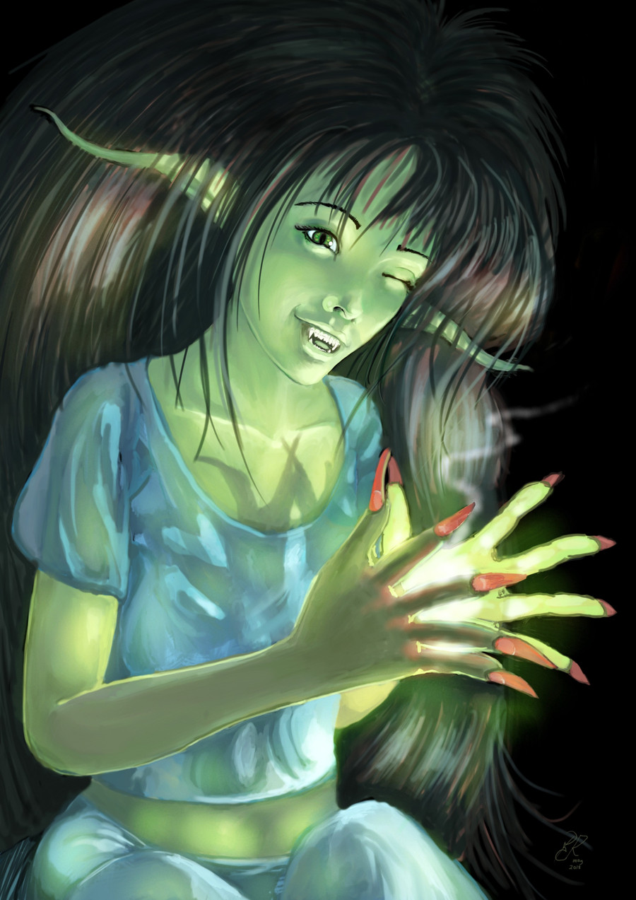
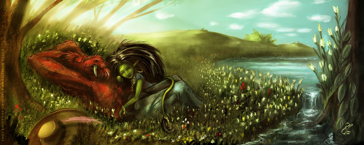
Reading of TrollsThis is an image in my ... of Trolls series, with the same recurring character. You can find the others in my gallery. The books are not unusually small, rather one might infer that she is pretty large ...
Experimented with brighter colours and highlights for this one.
GIMP + MyPaint, a bunch of hours.
This will be a gift, so feedback and critique before it goes to print are highly appreciated!
Update: Changed her legs and arms as well as refined many small details after feedback and critique. Thanks everyone so far!
.
Griatch
Related content


Comments: 39

Overall
Vision
Originality
Technique
Impact
Hi griatch i agree the most with deevad. and these are my two cents.
-remove the hair and redraw the silouette of the character, you will notice automatically the mistakes about anatomy.(see deevad's critique)
- Hair is too dark with no middle values and even dark hair has middle values. The bright on top is excellent. but is not clear where the hair beggins
Background: i see a brave solution here painting the BG in orangeish tones, not usual on forests. I like it. nothing wrong here
Composition. Moving the character a bit to the right you get a bit of more space for the tail and the focus goes to the character following the inverted L composition.
Atrezo. Books seem to be a bit traslucent and i see them more opaque elements. and Rings are usually Circular but yours are undefined, maybe "troll rings" e.deviantart.net/emoticons/b/b… " width="15" height="15" alt="
")
👍: 0 ⏩: 1

Hi TheShock and thanks for a good critique!
After deevad's feedback I already did go back to fix some of the points he remarked on; I think removing the hair at this point is however a bit too much work to get into.  (Smile)")
Hair midtones is a good point; although intentional in this particular image - the image is overall pretty saturated, I first did more midtones only to later darken them to build up a mass; I felt it fit better with the bright background, but I agree it's pretty damn dark.
Moving the character to the right is an interesting proposition; I originally cropped the image further to the right, but then I felt the tree just became a solid wall on that side - I wanted the width of the tree to be visible so as to show its size. I didn't consider moving the character itself to the right though (overlapping the tree). I'll play with that!
"Atrezo" (which I Googled to be Spanish for "props" - something new learned every day!) : Agreed, the rings are not perfectly circular; I kind of liked the effect but I should probably have been more careful in making them. Leaves are indeed very opaque although I like the somewhat stylized impression given by the lack of green. With "transluscent" books, I guess you mean they should be darker? I'll re-look at this to see.
Thanks again for the feedback! Great way to improve!
.
Griatch
👍: 0 ⏩: 0

Overall
Vision
Originality
Technique
Impact
Hey Griatch, I always liked your artwork, theme, your technic, and general ambiant in your illustration.
* What I prefer : Background stylisation, and hair reflect treatment very effective.
* What I dislike : The volumes and proportions of global anatomy part of body are off. Nose and mouth placement a bit off too, arms flat and misproportioned, size of leg really big compare to the top part, head too little. A strong drawing underneath with solid volume and proportion would solve it.
* What I think would solve : skech more before painting, studying anatomy ( like exellent Bridgmans one ), take more skill in drawing ( your painting and color skill is way too good compare to your underneath drawing ).
I hope this critique will help you to do progress, and point you where you should look to gain skill faster. I would be really happy to see your creatures taking good shapes and be more believable. Of course, most of this critique apply to my own artwork too e.deviantart.net/emoticons/b/b… " width="15" height="15" alt="
👍: 0 ⏩: 3
Your welcome,
Yes crouched pose are hell ; with body part who target/shortcut to camera it's really hard. For elaborating, I would be happy to make a paint-over if you permit ; picture can speak faster imo.
I also like the feature of 'critique' ( I test it for the first time here ). Hope you will also do a critique of one of my future illustration if I send a request.
👍: 0 ⏩: 1
I just read through some old comments and came across this. I can't believe I didn't reply to your post last year! Very sorry about that, not sure what happened.
This image is old by now so won't go back and tweak it further at this point. So I'll just reply now (better later than never) to say that I agree with you that the critique feature being a useful one.
.
Griatch
👍: 0 ⏩: 1
no problem for the late answer ; you probably imagine I forget about it
👍: 0 ⏩: 0
Update:
I changed the size of the arm as well as shrunk the legs a bit (the wonders of GIMP!). Hopefully better?
.
Griatch
👍: 0 ⏩: 0
Thanks Deevad, always good to get feedback on these things!
I intentionally try to do (for me) "hard" poses and anatomies in order to practice, and I had plenty of trouble with the crouched pose! Having no formal art education, I do try to read up on the subject, since I know this is a weak point (I was never a fan of Bridgeman though although I know he's often referenced). You have a definite point that I should sketch more, it's a time-issue for me though; I have only a limited amount of time to do art in the week.
Interestingly, I did do a considerable amount of sketching before starting this one though; the proportion of the legs to the body is based on reference. So it's possible I botched something in the shading down the line. I know for sure that the fact that her hair covers most of her lures the eye into thinking she is thinner than she is (at least to my eye).
When judging the length of legs I try to imagine the leg folding upwards. At least on me, the knee then reaches roughly to the shoulder. As far as I can tell this is the case for her as well (admittedly it depends a bit on the angle if her hips and foreshortening). Maybe I'm using a wrong measure here, care to elaborate?
I went back and tweaked the arm a bit; but looking at it now I believe I see what you mean about mis-proportioned - her left arm is a bit too long, isn't it? I will go back and see if I can fix this.
I hadn't considered her head to be too small; it seems to me the distance to her chest is comparable to the size of the head which seems right. I will need to look at that some more.
Excellent feedback Deevad, the best way to improve! Thanks!
.
Griatch
👍: 0 ⏩: 0


It has been fun watching this character develop over time. I must say this is one of my favorite paintings of her.
I love the light play you've done - the spots of light and the shadows cast by the tree - they really enhance tranquility of the atmosphere. The contrast in lighting of the background and troll works quite well, too. I would certainly say your experiment with bright colors and highlights turned out successful. In terms of atmosphere, I'd say this is one of your stronger works.
But what really completes this piece for me is the attention to detail. The books and her jewelry catch my eye the most. Her hair also stands out to me, and I like all the colors you've incorporated into it.
As for critique, a couple of things catch my eye. Both are perspective issues, and I must start out by saying my own sense of perspective (as you may know) isn't the best - so certainly don't take just my word on this.
Her arm (the one holding the glasses) looks a little flat to me. I can't put my finger on the exact reason - but her other arm looks much more round and it has more shadows incorporated as well. Second, some of the fingers she is using to hold her book seem spread out quite a bit. The space between her middle finger and ring finger stands out the most here, but the gap between her ring and pinky finger seems a bit large as well.
On a related note, I like the way you've drawn her toes spread out. I get the sense she has little twitches (such as how some people tap their fingers when they're concentrating) - and I think that enhances the realism of the piece quite a bit.
Great work!
👍: 0 ⏩: 1
The funny thing is that this character was originally intended as one-shot, but it was so appreciated by some people that I ended up making more images of her as gifts. She's fun to do and it's an interesting challenge to make green skin look reasonably realistic.
I was pretty unsure about the use of comparably brighter colours and contrasts here - I usually work with darker shades; especially the bright background took some time to come to terms with in my mind. Hence I'm happy to hear there is a noticeable "atmosphere" in it still.
Good points about the arm. It was a tad too straight (as in the silhouette) compared to the other arm. I have made it a bit rounded now as well as added stronger contrasts to enhance its volume.
I also agree with the fingers; looking at them fresh I also found them to be too spindly. So I went back and reworked the entire book-holding hand, also adding better ambient lighting to the back of it. Should hopefully be better now, take a look.
The toes are indeed meant to be mid-action and you interpret them just as I inteded them - I'm thinking they are tense due to her being so into the book. The separation of toes are also a way to show off her more natural (feral?) side - people used to wearing shoes usually don't separate their toes this much - it's something mostly seen in bare-foot walkers. Not that she could ever wear shoes with those claws ...  (Wink)")
Thanks for the thoughtful critique!
.
Griatch
👍: 0 ⏩: 1
The hand looks much better to me now - more natural. I think having her fingers turn inward has helped - as well as the lighting.
I must wonder what she is reading that she finds so gripping. She probably could wear Crocs... they have holes in them
I really like the way you draw grass and leaves. I've been getting more into MyPaint recently; it's a great program. Would you mind sharing what brushes you used for the grass and leaves? I assume you did that in MyPaint.
")
👍: 0 ⏩: 1
You can actually see what she is reading, although the title is subtle. The book says "Faery Tales". Maybe she's reading about trolls?
The grass is done using a Kabura brush from the "Classic" set. But also GIMP's ink tool could do the same thing.
.
Griatch
👍: 0 ⏩: 1
I did catch the title - I was just curious about which tale she was reading
Thanks for the tip!
👍: 0 ⏩: 0

Glad you think so! Thanks a lot for the comment (and fave)!
.
Griatch
👍: 0 ⏩: 0

I really like the character design, she looks 'girly' despite being green, with fangs and huge hair and tail
👍: 0 ⏩: 1
Thanks! She is quite a peculiar character design; some don't like the teeth, but I think it's an important part of her.
.
Griatch
👍: 0 ⏩: 1

Wow ! Love the hair, it's awesome ! The colouring is also very nice and I'm quite fond of the background
👍: 0 ⏩: 1
It's interesting how differently people respond to her hair! Glad you like it!
.
Griatch
👍: 0 ⏩: 0

This is a pretty interesting topic. Your coloring is also pretty impressive.
The hair looks a bit odd though. I know that it's supposed to puff out but it looks quite unnatural.
👍: 0 ⏩: 1
Always good with feedback! The hair is pretty extreme for this character, this is true.
.
Griatch
👍: 0 ⏩: 0

Thanks! And thanks for the fave too!
.
Griatch
👍: 0 ⏩: 0

Thanks, glad you like them!
.
Griatch
👍: 0 ⏩: 0

Like some people mentioned the anatomy is a bit off in some places, but I still think it works.
It's a nice piece with nice colors and a nice character
👍: 0 ⏩: 1
Yes, there are some anatomical issue; I have hopefully fixed most of the main ones commented on.
Thanks for the feedback!
.
Griatch
👍: 0 ⏩: 0

Thanks! She'd be glad to hear it.
.
Griatch
👍: 0 ⏩: 0

Thanks, I like them too!
.
Griatch
👍: 0 ⏩: 0

That's good to hear! Thanks for the feedback!
.
Griatch
👍: 0 ⏩: 0

Hehe, this is fun!
I love the hair, it's a complete mess, but still has this fabulous quality about it along with her outfit. I also like how this looks a bit like watercolor and ink, and how the light shining through the tree is playing with the colors of her hair and skin. The one thing that doesn't seem to "fit" for lack of a better word is the mouth. I'm not sure what it is about it that seems inconsistent with the rest of her face (which is oh so cute and attractive). Perhaps I don't expect her to have sharp teeth. 

👍: 0 ⏩: 1
Thanks for the comment!
The teeth are indeed a bit special and you are not the first one to react to those. This character is really all about mixed messages - she is a troll with claws, fangs, hair and all - and yet she has painted toenails, fashion sense and a sweet smile.
.
Griatch
👍: 0 ⏩: 0

This is beautiful and amazing. I love the way you made the light shine just right on her hair and body, it's wonderful
👍: 0 ⏩: 1