HOME | DD
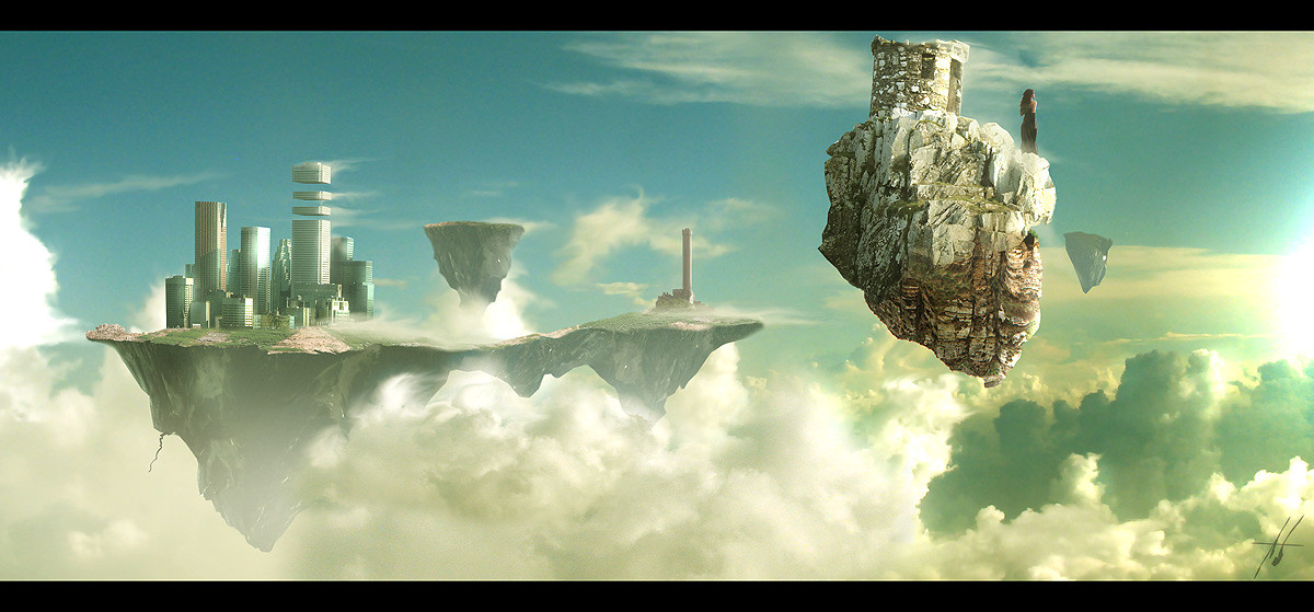
 Grimdar — Cloud Civilization
Published: 2006-10-25 21:55:32 +0000 UTC; Views: 22497; Favourites: 301; Downloads: 219
Redirect to original
Description
This is what happens when bored at work for 2 days.Thanks to:
wishing-star-stock: [link]
oibyrd-stock: [link]
causticstock: [link]
trinket: [link]
Related content


Comments: 46


May I use this as a reference for a setting in my book? You'll get FULL credit, of course!~ I just love your picture and it'd be perfect for my book.
👍: 0 ⏩: 0


man, i'm bored at work a lot of times but this is amazing. Bet that girl's thinkin the same
👍: 0 ⏩: 0

I'd like to live there, breathe the wonderful air, look down onto the human being. *__*
👍: 0 ⏩: 0


Arthur C Clark Describes this in the unused portion of 2001: A Space Odessy  (Smile)")
")
👍: 0 ⏩: 0

It kind of makes me wonder just how the woman got on that rock, or how she's going to get off...
Beautiful work! It's definitely SF/fantasy-ish and yet, at the same time, parts of it look comfortably 'familiar'.
👍: 0 ⏩: 0

holy shiiit,
and to quote the youth of the 90's this is the bomb
👍: 0 ⏩: 0

I really like this, nice conceptual landscape/ city.
👍: 0 ⏩: 0

Man, I think you should have more free time!
Then you can do more nice art!!!
👍: 0 ⏩: 0

Wow this is super cool .. really liking this a lot very matte painting like ... Its just a pity that I had to find this by accident .. please next time can you inform me that you have used my stock so I can come and see stuff like this ?
👍: 0 ⏩: 0

the split up skyscraper somehow reminds me of the A.I. movie
👍: 0 ⏩: 0


awesome! love everything about it! the sliced buildings, the floating islands, the clouds. it all really fits neatly together! great composition.

👍: 0 ⏩: 1

Thanks a bunch for checking it out and the fav!
👍: 0 ⏩: 0


i just love that blue is the dominant colour in this, i dont know the right term to describe it but there is something about blue with black/grey/white that i just really like. this is so much like a dream, like a friendlier dali work, because it doesnt make me want to cry hahaha
👍: 0 ⏩: 0

Amazing. You blend and combine things so well, it looks so surreal. Wow, simply put, wow...
👍: 0 ⏩: 1


omigod that is incredible 
Best use I've seen of my stock - and it's a cityscape one 
I shall have to feature you in my ^oibyrd journal. this dev deserves some attention 
I am currenly revamping my stock gallery and reposting higher res pics - so stay tuned - I'll be grabbing more city/street stock in the next week or two 


👍: 0 ⏩: 1
Thanks I'm glad you like it! Your stock was just perfect
👍: 0 ⏩: 0

If I could hone skills such as those, I'd be a worthy sacrifice.
👍: 0 ⏩: 0

Thanks for checking it out!
👍: 0 ⏩: 0

A very dreamy view, filled with surreal colors. Me likes lots. However, as always, I have something to add to that, things I think could improve this work a lot.
The main that keeps this piece from being perfect, in my idea, is the big, soft wbright spots scattered around it. Mostly the one to the left, the one to the right and the ones scattered along the left rock. They seem to somehow distract the eye when you look over it, leading it away from the main subject. If you could remove those, it'd be a lot better.
The other issue I have, is the girl. I only noticed her when I went to look at the piece closely, and I started wondering about it. I didn't notice her at first, while she seems inproportionately big ( and doesn't cast a shadow), and I figured she'd be there for a reason. I mean, the society is on the other rock, and she's there, pretty mcuha lone. Why? What's she doing there? Was it a choice? Was she banished? I'd love to have seen some more clues regarding why the girl is there.
I think that's about it. Please note I'm not trying to take a jab at your work: I love it, and simply want to see it become even better than it already is.
👍: 0 ⏩: 1
Very nice.. and you're right too. The reasoning for the girl is pretty simple. Ever look at Dali's work and wonder what the heck is going on, nothing makes sense. I wanted to add a surreal feel to this, just like a dream where some things just dont make sense. This girl is alone on her rock in the sky and I think it makes the viewers think about it.
About the technical mistakes, believe me there are plenty more
👍: 0 ⏩: 2
that guy wants too much, he wants to change your work to make it something else, hes polite enough but unappreciative i think. the piece is what it is; amazing!!
👍: 0 ⏩: 0
Ah, yes, I can see what you mean with the surreal influence. Upon browsing through your gallery, it struck me that it's not the first of images with such a thing to it - Death's Door being a great example. Don't get me wrong, though, I didn't think it detrected from the piece, but I'd love to have seen there either being some more explanation, or having the girl to be more obviously seen in terms of composition.
Concerning the technical mistakes, yeah, I noticed a few more, but most of them seemed to fit the surreal mood of the piece (rock shapes and perspective issues mostly). Still, I think that all in all, you've made a great piece. I hope to see one of a similar style, maybe even an update, in the future.
👍: 0 ⏩: 0


Thats right, they just needed some air.. thats all
👍: 0 ⏩: 0

Thanks, it's not my usual type of work. I'd call this fast food style
👍: 0 ⏩: 0