HOME | DD
 Grishend — Electromaster
by-nc-nd
Grishend — Electromaster
by-nc-nd

Published: 2010-01-29 05:15:39 +0000 UTC; Views: 1754; Favourites: 67; Downloads: 46
Redirect to original
Description
Program(s) Used:Adobe Photoshop CS2
PaintTool SAI
Time taken: around 30-40 hours.
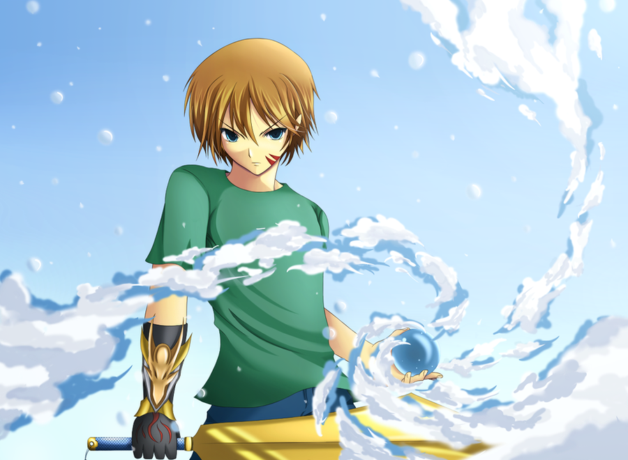
Gary Lecavalier - NEW ZEALAND
Affiliation: Imperial Army
Origin: Auckland, New Zealand
Occupation: Vice-Marshal of the Air Force
Weapon(s) used: Swallow (double-headed spear)
Gary is a bright and cheerful guy. He takes things easily and believes that the solution will come in the end. He has a tendency to be playful almost anytime, even in the battlefield, usually resulting in his average results. However, he can achieve almost anything if he put a lot of effort in it.
Thanks,
=Grishend
Related content


Comments: 14


His face indicates he is a nice person, calm and kind, but everything else makes me think he is a lethal warrior XD
Awesome work!
👍: 0 ⏩: 0

Awesome drawing mate
You did a really good work on the colouring
and I like the character design.
👍: 0 ⏩: 0

I'm still alive!!!! Anyways I love how the lightening came out =3
👍: 0 ⏩: 0

damn ur hair detail keeps getting better, background effects good as usuals, alaways now how to pin point the good lighting effects and where to put what
👍: 0 ⏩: 0


is it just my feeling or he actually looks cuter than the previous one?  - :D")
waaaah imut, tapi keren jg ^^ weaponnya bikin keren <3 BGnya jg cocok.
👍: 0 ⏩: 0


It's very good. Much better than the old one, in fact. The pose looks more natural.
👍: 0 ⏩: 0


nice work
your style hasn't changed at all..heheh.
perhaps u should make the background a little bit darker to add more contrast to the image..
 (Smile) - :)")
👍: 0 ⏩: 0

Oh yeah!
Good thing to color the lineart, I like the final result :3 Only thing to point out, it would look better if there was more blending between character and background

 - :P")
👍: 0 ⏩: 0

Just out of curiosity, what's the stamp on the bottom right supposed to be? I can't see all the characters, but I can see enough to know it's not your name, haha.
I like the lightning effects
👍: 0 ⏩: 0

I love ur artwork!!! ^-^
Keep up the great work...
👍: 0 ⏩: 0