HOME | DD
 GrumpyCrisp — Annie!
by-nc-nd
GrumpyCrisp — Annie!
by-nc-nd

#anime #artist #contest #discord #event #manga #oc #painting #digitalart #fanart
Published: 2019-02-07 18:56:29 +0000 UTC; Views: 387; Favourites: 44; Downloads: 1
Redirect to original
Description
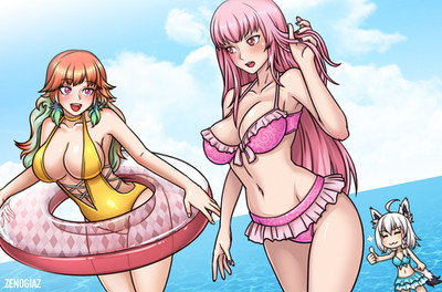
This is my submission for an event on discrod, Annie is the mascot on the serverthe character belong to www.deviantart.com/hatchithene…
the design is based on this
www.deviantart.com/hatchithene…
Related content


Comments: 14


Hey I'm from Project Comment!
I looked at the concept that you based the character on, and you captured the idea! I like the pose, it's dynamic and conveys a sassy/mischievous nature. This is conveyed in t he eyes and smirk, plus the position of the hands and arms, plus the squeezing of the breasts. The coloring, and shading of this drawing is good, I particularly like the shadow of the left hand and how you can see it on the sketchbook, it gives your drawing depth. The shadow under the sketchbook is great too, and communicates part of the roundness of the chest and that the book is actually lying on something. The shine of the hair is good, but it could be pushed more, to really push the highlights/shine of the hair.
The pen in her right hand just blends into the glove and should be more defined to give it life. Speaking of the gloves, the hands are too small, and should be a little bigger. This also goes for the fingers, they're too spindly and the fingers aren't right. In fact the position of the fingers don't look right, use reference it's a great help. The colors feel too muted, don't be afraid to push the colors, the shadows, and highlights. As for the shadows on the body; there should be more than shadows under the breasts. This is good since you've given them some curve, but there should be some shadows on the left hip. I would also like to add that the breasts are too large, and the shoulders too narrow.
Overall I like this piece, the concept, and the paint texture that you put over the character.
👍: 0 ⏩: 1

Thanks for the comment.
👍: 0 ⏩: 0

heya~ this is LuminousLollipops from ProjectComment here to give you a critique on your piece as requested!
the highlights of this piece / the things i personally love about it~
:. i'm a huge fan of the colors that you selected for the character design!
:. the paint splatters in the background is also a creative touch that really compliments with the character~
> since they give a lovely feel to the piece~
:. i really adore how the character is posed!
some parts that need improvement / things you could improve on
:. the lines for the character seem really sketchy.
> it could be improved with some basic clean up or just tracing over with a higher level stabilizer.
:. the highlights could be added to the piece, i wouldn't have actually commented on this part but seeing as there are highlights on the paint coating the end of this character's braid, i'm pretty sure you could have easily done the same with the other elements in this piece.
:. there are also white spaces where there should have been colors.
> this is simply a minor issue, just go over it again in the same color.
:. there are some anatomical issues in this piece, such as how the chin and hands look a bit peculiar. (it's that or how the piece is lined)
> with anatomical errors, i would simply say, regard references! they are a huge help >w<
this piece was overall, really pretty to look at! keep up the magnificent work~ i'm looking forward to more of it <3
👍: 0 ⏩: 1
Hello, thank you for the constructive critique! Glad you like it despite my sketchy lines.
👍: 0 ⏩: 0

 (Smile)")

That's a pretty neat character design. I love how the top splits into two.
👍: 0 ⏩: 1
the character desing belongs to hapiikat (I left the link in the description), I used that and added my personal style tho.
👍: 0 ⏩: 0
thanks! I made it messy as it should be but in my own way
👍: 0 ⏩: 1
Don't forget the colors.
👍: 0 ⏩: 0