HOME | DD
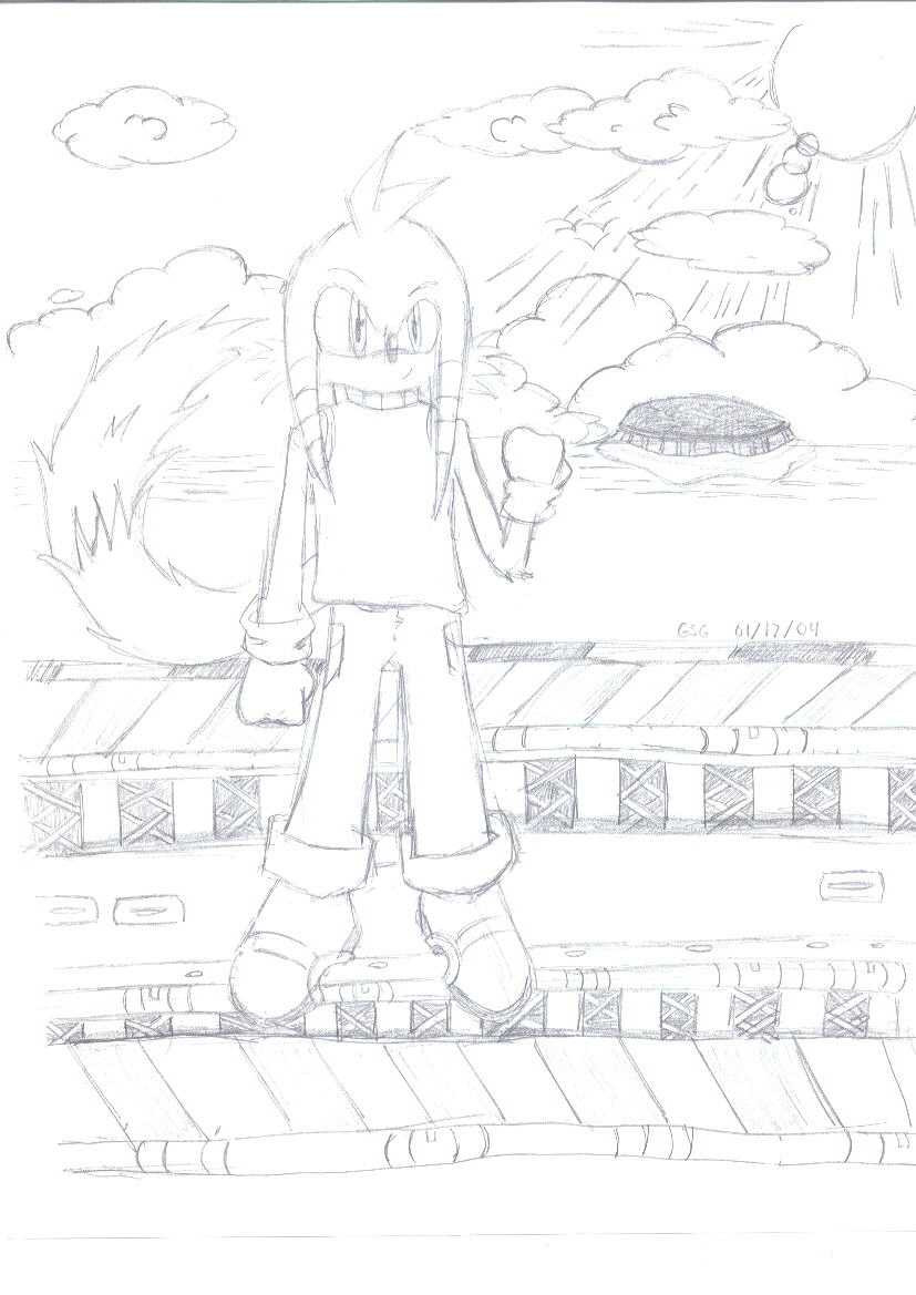
 gsg — GSG in Metal Harbor
Published: 2004-01-18 04:11:37 +0000 UTC; Views: 81; Favourites: 0; Downloads: 85
Redirect to original
Description
I did more detail than I usually do in pictures in this...I like: THE CLOUDS! W00T! The clouds rock, and I've never been able to draw clouds
I don't like: THe way I did perspective on the floor of the thing. It's supposed to reveal more of the supports toward the front, not the back. ><
Materials: PAPER MATE Sharpwriter #2, A4 Paper, and a screenshot of Metal Harbor (which wasn't in this view)
Related content


Comments: 4

Very kew. I like everything; the detailing, the background, everything. I don't know why you say what you do. As said before, ink and color it sometime.
Oh yeah, your sun SCARES me.
👍: 0 ⏩: 0

I have to say it looks nice; and you're right, nicely detailed - but how would I know, my memory of Metal Harbour is a little shot seeing I haven't played SA 2 in like months ")
I agree with Aero though, in saying that it's screaming out for a little bit of colour. That'd make it a lot better than it is even now. Apart from that, some nice work there.
 (Smile)")
👍: 0 ⏩: 0

