HOME | DD

GuidoGuidi โ€” AHM 80 style

Published: 2011-06-14 04:45:01 +0000 UTC; Views: 8340; Favourites: 272; Downloads: 255
Redirect to original
Description 
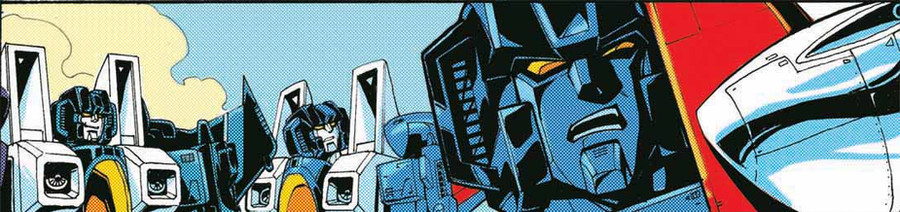
another '80 style coloring test on a AHM panel
Related content
Comments: 60

Daniel-Eggman [2013-04-26 02:04:08 +0000 UTC]

cool

๐Ÿ‘: 0 โฉ: 0

Phenometron [2012-12-03 12:09:12 +0000 UTC]

Purely vintage. :3

๐Ÿ‘: 0 โฉ: 0

D-A-E [2012-10-05 04:20:38 +0000 UTC]

I think I still prefer this style over the glossy crap comics look like now. Love the coloring, love the lines- but I hate that overly glossy printed paper.

๐Ÿ‘: 0 โฉ: 0

Head-Jam [2012-02-02 15:31:41 +0000 UTC]

cool...How do you do the page "80's feeling"?

๐Ÿ‘: 0 โฉ: 1

GuidoGuidi In reply to Head-Jam [2012-02-02 19:12:26 +0000 UTC]

it's a mix of filters on photoshop

๐Ÿ‘: 0 โฉ: 1

Head-Jam In reply to GuidoGuidi [2012-02-02 19:27:21 +0000 UTC]

oh, kay..I've tried to use the color halftone, but it didn't came out as I thought.

..thanks anyway

๐Ÿ‘: 0 โฉ: 0

AndyTurnbull [2011-08-20 16:00:45 +0000 UTC]

Looks awesome.

๐Ÿ‘: 0 โฉ: 0

flynn1978 [2011-08-11 10:03:58 +0000 UTC]

Whadcha use to do the 80's coloring???

๐Ÿ‘: 0 โฉ: 1

GuidoGuidi In reply to flynn1978 [2011-08-11 15:39:12 +0000 UTC]

Photoshop , CYMK mode and halfone filter.

๐Ÿ‘: 0 โฉ: 0

corvus1970 [2011-07-03 18:14:53 +0000 UTC]

Nice!

๐Ÿ‘: 0 โฉ: 0

Grifdaddy [2011-06-17 23:46:58 +0000 UTC]

Gotta love the trips.
Skywarp was always my fave.

๐Ÿ‘: 0 โฉ: 0

Ccamang [2011-06-16 15:52:56 +0000 UTC]

Even in classic style, your art looks so awesome!

๐Ÿ‘: 0 โฉ: 0

abarai-san [2011-06-16 15:41:45 +0000 UTC]

Cool!!!

๐Ÿ‘: 0 โฉ: 0

DamonHellstorm [2011-06-16 10:40:44 +0000 UTC]

And the fanbase starts hoping

๐Ÿ‘: 0 โฉ: 0

TFfan1 [2011-06-16 06:31:49 +0000 UTC]

Love that coloring styl. How is it done

๐Ÿ‘: 0 โฉ: 0

ladyofwreck [2011-06-16 06:14:00 +0000 UTC]

Awesome!


And I already tweeted about this. But still must be talked about some more.

๐Ÿ‘: 0 โฉ: 0

cybertronianlove [2011-06-16 05:55:40 +0000 UTC]

"I am the Master of these things, not--"
"Megatron!"

๐Ÿ‘: 0 โฉ: 0

Variable-Edge [2011-06-15 22:00:51 +0000 UTC]

Really nice, though if it were REALLY something in the 80's, Skywarp and Thundercracker each would have been blocked out in a single color...

๐Ÿ‘: 0 โฉ: 1

cyxodus In reply to Variable-Edge [2011-06-28 22:50:12 +0000 UTC]

I agree. The result would focus the reader's eye on Starscream.

๐Ÿ‘: 0 โฉ: 0

sinead [2011-06-15 21:52:16 +0000 UTC]

Ya gotta love Screamer's disgusted "WTF is WRONG with you?!" look. Priceless!

๐Ÿ‘: 0 โฉ: 0

TFfan1 [2011-06-15 19:47:24 +0000 UTC]

how do you coor pages like this.

๐Ÿ‘: 0 โฉ: 0

T16skyhopp [2011-06-15 16:06:43 +0000 UTC]

how are you emulating the halftone color?

๐Ÿ‘: 0 โฉ: 1

cyxodus In reply to T16skyhopp [2011-06-28 22:52:10 +0000 UTC]

Please tell us how you did this process. Was it a simple half-tone pattern or something else?

๐Ÿ‘: 0 โฉ: 0

Slugbox [2011-06-15 14:26:57 +0000 UTC]

This needs to happen for real...

๐Ÿ‘: 0 โฉ: 0

EvilGrinn73 [2011-06-15 13:29:41 +0000 UTC]

SPOT ON!

๐Ÿ‘: 0 โฉ: 0

TF81fromIDW [2011-06-15 01:23:11 +0000 UTC]

love it Guido!!!

๐Ÿ‘: 0 โฉ: 0

BonnieBlueFlag [2011-06-14 18:48:44 +0000 UTC]

Maor!!!

๐Ÿ‘: 0 โฉ: 0

dyemooch [2011-06-14 17:37:38 +0000 UTC]

Fantastic! Now I need to gather a great printed-comic palette to play with in Photoshop like this XD

๐Ÿ‘: 0 โฉ: 0

metalformer [2011-06-14 16:45:24 +0000 UTC]

I can see a blending of styles here (correct me if I'm wrong). That makes it more interesting.

๐Ÿ‘: 0 โฉ: 0

hellbat [2011-06-14 15:35:36 +0000 UTC]

Classic.

๐Ÿ‘: 0 โฉ: 0

steve2275 [2011-06-14 14:58:40 +0000 UTC]

nuthin wrong with the classics

๐Ÿ‘: 0 โฉ: 0

fedupN [2011-06-14 14:38:38 +0000 UTC]

Well that's kinda nifty!

๐Ÿ‘: 0 โฉ: 0

QueerArtPagan [2011-06-14 14:32:08 +0000 UTC]

Hm...has a very Roy Lichtenstein feel. I actually don't mind this - the coloring looks good when it's done on good lines.

๐Ÿ‘: 0 โฉ: 0

rachaelm5 [2011-06-14 13:26:18 +0000 UTC]

GAH! Litho dithering!

I am sooo happy we have higher resolution printing processes now.

๐Ÿ‘: 0 โฉ: 0

ActorzInc [2011-06-14 13:18:26 +0000 UTC]

Nice! What's the effect with the grid called, it's neat!

๐Ÿ‘: 0 โฉ: 0

heliocentra [2011-06-14 13:11:01 +0000 UTC]

Damn I like this. I actually prefer it to the digital stuff. No offense to anyone intended but this looks great!

๐Ÿ‘: 0 โฉ: 0

DrachePumpkin [2011-06-14 12:52:25 +0000 UTC]

It makes me feel like a kid again...

๐Ÿ‘: 0 โฉ: 0

thecrookedman [2011-06-14 12:11:27 +0000 UTC]

Is it crazy that I think this looks better?

๐Ÿ‘: 0 โฉ: 0

Drawgasm-Designs [2011-06-14 11:35:22 +0000 UTC]

That's pretty cool haha

๐Ÿ‘: 0 โฉ: 0

Moondancer0X [2011-06-14 11:12:35 +0000 UTC]

Man, this is a strange experience. xD Great job with the colors, but considering the style, it's just weird. Still very fun looking, though

๐Ÿ‘: 0 โฉ: 0

Dolomineater [2011-06-14 10:55:15 +0000 UTC]

รจ cosรฌ..... puntinoso O_O

๐Ÿ‘: 0 โฉ: 0

Blackvegetable [2011-06-14 10:51:16 +0000 UTC]

Fantastic!

๐Ÿ‘: 0 โฉ: 0

ValinMonkeyking [2011-06-14 10:44:07 +0000 UTC]

looks like star scream just smelled something nasty

๐Ÿ‘: 0 โฉ: 0

yfm [2011-06-14 08:16:07 +0000 UTC]

That modern & old fusing awesome!

๐Ÿ‘: 0 โฉ: 0

Mournsong [2011-06-14 08:03:43 +0000 UTC]

That'd make an awesome banner!

๐Ÿ‘: 0 โฉ: 0

jpbbantigue [2011-06-14 07:32:35 +0000 UTC]

Classic effect! Cool!

๐Ÿ‘: 0 โฉ: 0

Transypoo [2011-06-14 07:30:36 +0000 UTC]

Awesome! If they decide to continue the original Marvel series you should totally do the colors!

๐Ÿ‘: 0 โฉ: 0

SeekerNami [2011-06-14 07:26:29 +0000 UTC]

lol, nice effect man

We need some retro-syled comics, huh? I'm missing these kind of colors.

๐Ÿ‘: 0 โฉ: 0

MCMXC2 [2011-06-14 06:43:41 +0000 UTC]

Cool!

๐Ÿ‘: 0 โฉ: 0

Lin-JeeYoun [2011-06-14 06:39:45 +0000 UTC]

Classic never get old!

๐Ÿ‘: 0 โฉ: 0


| Next =>