HOME | DD
 GyngerWombat — We... Are not going... Anywhere!

#voltron #voltronangst #voltronkeith #voltronfanart #voltronlegendarydefender #voltronnetflix #voltrondreamworks #voltronlance #voltronshiro #voltronpaladin #voltron_legendary_defender #voltronau #voltron_au #voltronseason6
Published: 2018-06-16 04:43:06 +0000 UTC; Views: 1210; Favourites: 49; Downloads: 0
Redirect to original
Description
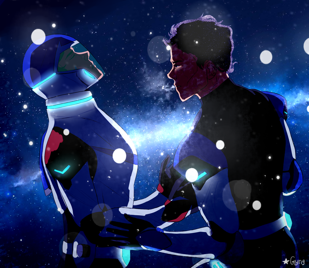
oh s6 was a wild ride... oh boyWELL HERE'S AN AU WHERE LANCE GOT KIDNAPPED AND CLONED INSTEAD OF SHIRO (though shiro is still keith's brother and black paladin)
It's more of a sketchy style I hope you all like :>
Related content


Comments: 4

Overall

Vision
Originality
Technique

I'll split this critique up into 2 sections. I'll start with what you could improve on and then what I think works. Keep in mind with the stars that I consider 2.5 to be neither outstanding nor poor! Overall I think this painting is well done. However, there's always room for improvement.
The cons:
There are some areas of the painting that feel a little flat, such as around the start of the robotic arm. I understand where you were going with having it glow, but the transition from shading and lighting to flat is a little awkward. The stright line of shading doesn't help add form much either. Additionally, the pink glow is jarring because it is so saturated and appears nowhere else in the drawing. I feel like the main focus you were going for was his eyes and expression, which takes me to another point.
It seems like Lance's face and arm do not stand out as well as they should. The problem seems to be that there are too many areas that are extremely bright. For instance, I know the arm is supposed to be a focal point, but right next to it is a giant white patch! I also think the placement of one of the particles on his chin is a bit odd. I guess because the eyes have the same effect. Here's how I recommend you prevent this (I know I'm guilty of it too). 1. Rely less on luminescence layers (I'm not exactly sure what its called in photoshop, maybe dodge?) and 2. plan your values before you begin painting. One good way to do this is set ranges of values you want to stay within for portions of the drawing. Before adding color, you can do a quick black and white thumbnail to see where the darkest areas will be and where the lightest will be.
It does seem like you might have been in a rush to get this done. There are areas on the shading that look a little sloppy (like the left arm) And could have been fixed pretty quickly by using an eraser tool. You probably could've spent a lot more time building up form, but I understand that you wanted to maintain the cartoony style so it's not a big deal.
Lastly, a quick word about originality. I gave you three stars on this, because I'm a bit conflicted. On one hand, this is a really interesting AU! I'd love to see a fancomic or fiction about this. One the other hand I don't know if it really can be considered original because its the same pose and composition from a screencap? Also as painful as backgrounds are to do, they are a chance to add more of your own style into the fanart. (Which if im wrong and you did the background yourself then holy crap dude it looks perfect and im sorry for saying that) I guess all this is necessary for people to recognize the scene so ehhhhhh I dunno originality is hard to judge on fanart
The pros:
Really good job drawing Lance. Like jeezus your lineart is really well done. I'm impressed with how you captured the pose. Having just the slightest bit of asymmetry really conveys his body language and makes him look imposing.
The colors also all flow very naturally, aside from what I mentioned earlier. I can tell that you toned down the colors of his suit in order to make them fit the scene better.
Lastly despite what I said above about values, this drawing does benefit from having such a wide range of values. In most cases its better to have to much contrast rather than too little. This drawing is eye catching, and very readable. Right from the thumbnail you can tell whats going on.
sdafdhjgk that went on longer than I thought it would but I hope it helps you improve. I also really hope you don't get discouraged by this because like I said, it is a good drawing!! Keep it up!
👍: 0 ⏩: 1

Oh my god thank you soooo much! I've been waiting for a critique so well done and detailed as yours for so long! It's hard to judge my own pieces because of just that, it's my own piece. I will definitely follow your advice and work on my shading, I've always had trouble with it. But thank you again so much! Your critique was very much needed.  (Smile)")
👍: 0 ⏩: 1
")

damn, that sort of AUs always makes me yearn for more but it also hurts a LOT
👍: 0 ⏩: 0