HOME | DD
 H3LLB0uND — Aftermath.com.au

Published: 2008-12-11 05:41:23 +0000 UTC; Views: 1929; Favourites: 2; Downloads: 0
Redirect to original
Description
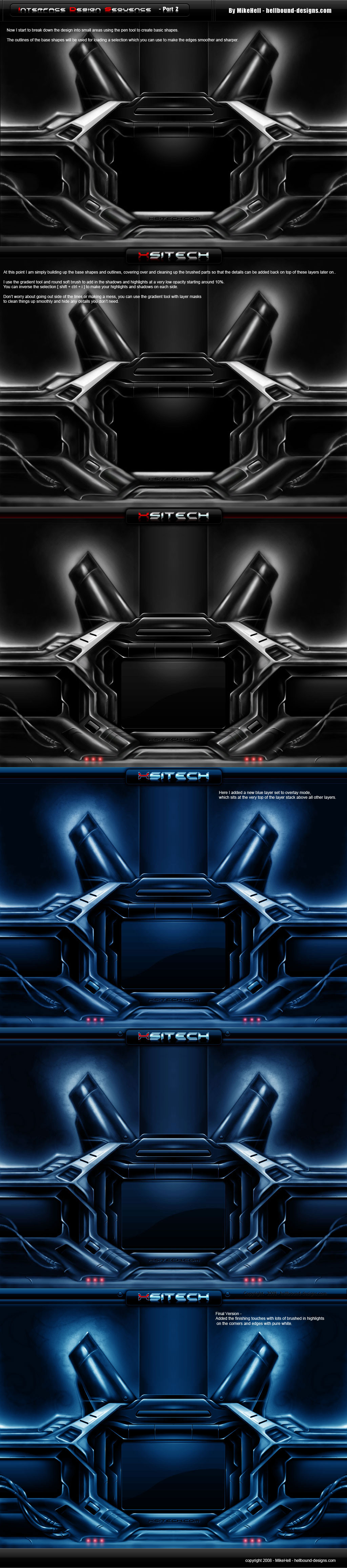
A quick little ecommerce site I built for my friend Mal at Aftermath Clothing Company.Visit the live site if the blurry text bothers you too in this screenshot lol. - [link]
The site was built from my Darkshadow Joomla template -> [link] , which you can get for free from my site at xsitech.com
[ Big thanks to Axertion for the better screenshot
 (Smile)") ]
]
Related content


Comments: 16

hey h3ll... nicedesign, but I dont know if its me and my comp but the roll overs on the site seem backwards ")
on the screenshot... thats what the one of the buttons look like when its hoverd lol not normall ..
and now the idle mode is with a little yellow swaure in the top corner of each image.
👍: 0 ⏩: 1
I TAKE IT BACK... it was my computer rofl.. just reloaded the page and its all normal lol..
sorry .. nice design :~)
👍: 0 ⏩: 1
")

why don't you take a screenshot of your site and post it... then it won't be so blurry
")
👍: 0 ⏩: 1
wtf did you save it in? Paint lol.
Here is a high quality screenshot you should upload. This one looks pretty bad when its all blurry
Screenshot: [link]
👍: 0 ⏩: 1

Awesome man thanks a lot. That looks much better. What did you use to get this ?
I usually use capturewiz pro. Maybe I should have used paint lol.
👍: 0 ⏩: 0

Hai mate, I like this alot good job. Im not sure on the red font though :S
👍: 0 ⏩: 1
Late reply, but yeah I agree the red text is not really working too well.. Thanks for the comment
👍: 0 ⏩: 0

this is cool, i like it! i know who to come to if i want a website made
 (Wink)")
👍: 0 ⏩: 0

I like all except for the logo, I know you could have done this far better, BUT that said it is very easy to read in this style
👍: 0 ⏩: 1
Thanks mate. Yeah a lot of things could still be better. I'll probably update it again later.. Was on a tight deadline to get the shop and catalog up and running.
👍: 0 ⏩: 0

Yeah .. I didn't have a .psd so blurry screenshot and link to the live site will have to do.
👍: 0 ⏩: 1