HOME | DD
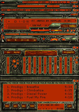
 H3LLB0uND — Overload

Published: 2006-11-02 00:44:31 +0000 UTC; Views: 3558; Favourites: 19; Downloads: 58
Redirect to original
Description
Concept site design - This was my first "attempt" at a minimalistic | tech style .. I'm not a minimal kind of artist though. (Wink)")
Initial inspiration was from a design by MrsX
Related content


Comments: 23

Dude! ")
👍: 0 ⏩: 1

lol.. its still sweet though
👍: 0 ⏩: 0


ummm i wouldn't say its minimalistic lol it's actually really busy. Not my style but i guess its alright
👍: 0 ⏩: 1
Thanks .. "I guess it's alright" is better than this farking sux, throw your computer into the river right now beyotch ! , anyday..
yeah I don't think anyone will ever accuse me of being a minimalist lol , I guess I'd really suck at that sort of designing.
👍: 0 ⏩: 0

Ah that's no good , 60 million fonts out there and I used the wrong one ? lol
👍: 0 ⏩: 2

hehe, you used my default font..Xirod...nice choice
 (Smile)")
👍: 0 ⏩: 1
Actually it's battlefield font -> [link] , but they are pretty much identical.. looks like someone ripped one off from the other one and altered it slightly.. Which was made first ? don't know , don't care.. but thanks for the tip off about xirod , I didn't have that one yet..
👍: 0 ⏩: 1
hmm..weird. Maybe Xirod was the originallthe Battlefield series decided to use it and people just call it the Battlefield font
👍: 0 ⏩: 0
nice...if you simplified the sidebars this could be coded for a CMS such as Zentri or Nuke
-Oh and the grey wires in the top right hand corner a too blurred for me
👍: 0 ⏩: 1
Thanks. I was thinking of making another less crazy version of this and coding it for invision.
Sorry bout the wires, how about the ones on the left ?
👍: 0 ⏩: 1
oh, the ones on the left are just the same thing..just transformed horizontally
👍: 0 ⏩: 1
yeah
👍: 0 ⏩: 1
nope..tried it on 3 different computers at three different locations
👍: 0 ⏩: 1
I cannot reveal my secrets sorry
👍: 0 ⏩: 1
heh, I could guess though, not hard
👍: 0 ⏩: 1
lol, don't even try to guess , it's a top secret , registered & copyrighted highly technical procedure !..
👍: 0 ⏩: 0
