HOME | DD
 HackingDutchman — Almost

#akelei #almost #aquilegia #bud #columbine #dark #day #emotion #flowers #green #leaves #neat #nice #purple #red #scene #scenic #shadows #spring #summer #sunny #weather #wide #atmosphere #cinematic #highlights
Published: 2017-05-05 21:02:38 +0000 UTC; Views: 590; Favourites: 58; Downloads: 0
Redirect to original
Description
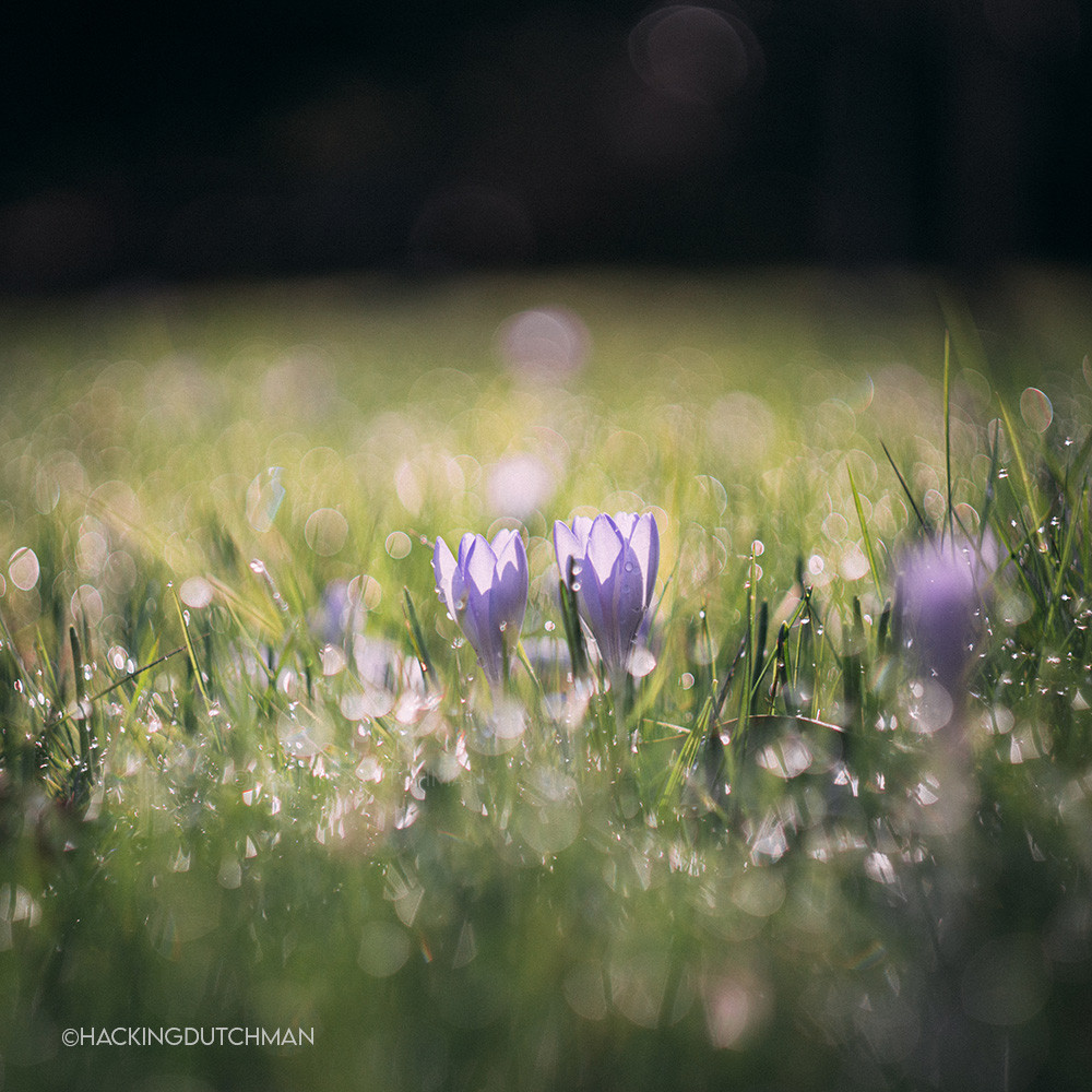
The columbines always officially start the warm weather season, for me. Because I always remember them blosseming on warm sunny days with lots of bees flying around the garden.However, tommorow (what the forecast tells), it will finally get warmer. At the moment only one in the whole garden is blosseming. The rest all neatly waits until the weather gets better.
©HackingDutchman 2017
Related content


Comments: 10

H . E . L . L . O 👍: 0 ⏩: 1
You've been featured here:
Best of June 2017
:iconBeautyClub:
"Keep your face always toward the sunshine - and shadows will fall behind you.. {W.W.}"
Here are some photos i chose as the BEST OF JUNE 2017.
All photos are from Photos of 2015, 2016 and 2017.
Spread the word by giving this article a 
GIVE SOME to the Artists


Just lovely. I love the feeling of peace I pick up from it.
👍: 0 ⏩: 1

I would like to know, how you edit your photos. Colors are greate!
👍: 0 ⏩: 1

Thank you
I edit in Lightroom.
(almost)Never add contrast.
I up or down the highlights, and up or down the shadows, I not always use these.
Most of the time I add a little bit of whites and decrease blacks, so make the already lit parts become lighter and the dark parts darker.
Sometimes I add some clarity.
If I adjust the colours, I down the vibrance and up the saturation a little less than I upped the vibrance and sometimes also play a little with the hue/split toning.
I always try to edit as little if possible. So if I change things most of the time with very little values. I dont edit the colours really much. I have my camera set to neutral colour profile and decreased the contrast and saturation with -3 and -5(out of 10 I believe).
Of course I edit them on a ''calibrated'' monitor. I have one with a PLS screen type and one with a AHVA screen type. I always find that of one of the greatest importance if I edit the pictures because otherwise the colours will come out very differently in for example a print. They say a good photographer can shoot good images with ''crap'' gear. However, if the photographer edits them on a crap screen, the contrast, highlights, shadows, saturation and so on will look ''wrong'' and for example prints look way different than you see on your screen. For example, orange in a picture can on one screen look more red and on the other screen more yellow.
👍: 0 ⏩: 0

