HOME | DD
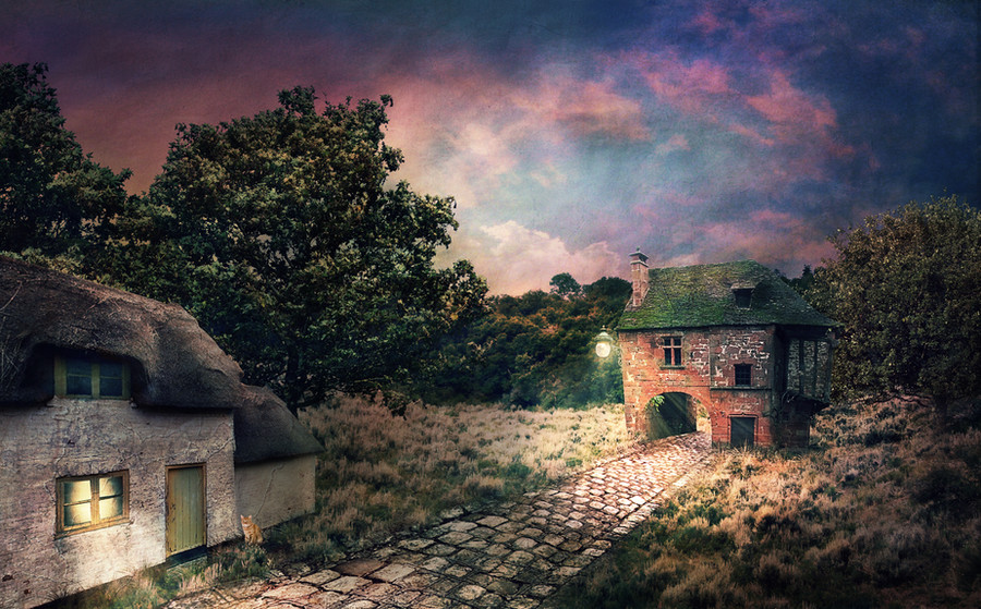
 hakrashika — The Sun Sets on the Town Where Time Stands Still
Published: 2012-08-03 00:02:16 +0000 UTC; Views: 1748; Favourites: 27; Downloads: 0
Redirect to original
Description
It's so hard to find old, technology-free neighborhoods like this one. I miss abandoned house hunting!This is practice for lighting and perspective. I'm mostly happy with it, except I had a hard time blending in the trees behind the left house. No matter how hard I tried I couldn't darken the front sides without making them look like cardboard cut outs!
I appreciate any thoughts and critique on this, as it is just my third photomanipulation!

 Update 8/02: I added extra atmosphere and colors, thanks to HumbleLuv 's helpful advice. Thanks again!
  Stock Credits
 Brick House: montvalentstock.deviantart.com…
White House : aleeka-stock.deviantart.com/ar…
Field : falln-stock.deviantart.com/art…
Road : gothicmamas-stock.deviantart.c…
Trees: gd08.deviantart.com/art/Tree-5… gd08.deviantart.com/art/tree-3…
Skies (4) *: resurgere.deviantart.com/
Cat: dbszabo1.deviantart.com/art/CA…
Lamp: ybsilon-stock.deviantart.com/a…
Texture : solstock.deviantart.com/art/Am…
Light Brushes: redheadstock.deviantart.com/ar…
*All sky photos came from resurgere 's stock packages. I'm unsure which packages include my photos, (the deviation previews don't include every photo in the package), so here are links to all of the sky packages: fav.me/d26monn fav.me/dxz1mk resurgere.deviantart.com/art/P… resurgere.deviantart.com/art/P… resurgere.deviantart.com/art/P… resurgere.deviantart.com/art/P… resurgere.deviantart.com/art/P… resurgere.deviantart.com/art/P…
Related content


Comments: 12

Overall

Vision
Originality
Technique
Impact
I really like the idea of the "old neighbourhood". The colors are great. The perspective would be perfect if it wasn't for the house on the left. It was the first thing that I noticed looking at the picture. That building doesn't go very well with the rest of the picture. If you take a look at the bottom of the building, you will notice immediately, that something is not ok. The bottom line of the building is paralel with the right side of the little street. Like this the house should be more to the right, than to the left. Well, I'm not sure if you will know what I mean...
A second think is the BG. The sky in particular. You have darkened the sky on the two sides, but didn't in the middle. That would not even be a problem, if the most noticable light source wouldn't be there. This way it seems, that the light coming from the front of the house illuminates the sky.
And there's the cat...it's just too big.
Other then these small things, I really like your work. If you take care of these few things, I think it will be a really beautiful manip.
Oh and don't worry about the trees. They look perfect e.deviantart.net/emoticons/s/s… " width="15" height="15" alt="
 (Smile)")
👍: 0 ⏩: 1

Thank you so much for the detailed critique. Every issue you have with my photo are issues that have been staring back at me since I posted it. Primarily I think the discrepancies between the left house and the road is the most obvious problem. I also agree that it doesn't quite fit with the other house, and this may be the result of having to warp it so much to fit it into perspective. By the time I had finally warped the road to fit, I was ready to give the transform tool a break!
As for the sky, I can definitely see how it might look like the streetlamp is illuminating it but I was going for a twilight look, just as the blue hour begins to fade into real night (thus the darkened corners heading toward the center where the sun is setting). I haven't quite learned how to manage multiple light sources yet, so this is probably why I couldn't distinguish the sun and the lamp.
Once again, I very much appreciate all the thoughtful help!
")
👍: 0 ⏩: 0


Very nice work, I like the mood and the light

👍: 0 ⏩: 1

")

I really appreciate it, thank you!!
👍: 0 ⏩: 0

70 layers !!!! Wow !
Very well done ! I like how it came out !
👍: 0 ⏩: 1
Thank you very much! I always end up with tons of layers because I'm way too obsessed with non-destructive editing.

👍: 0 ⏩: 0

I love this piece. Great concept and perspective! The trees could have been blurred just a tad to give a further off look and better blending. The cat is too big but he would have looked really good that size on the sidewalk at the front of the work. Pretty good on lighting for just practice. There's room for improvement, always. The sky colors could be used to highlight rooftop and trees if you want. Just ideas. Keep up the great work!
👍: 0 ⏩: 0