HOME | DD
 halfliquid — City Merge -- HL
Published: 2003-08-23 02:24:30 +0000 UTC; Views: 5361; Favourites: 117; Downloads: 1936
Redirect to original
Description
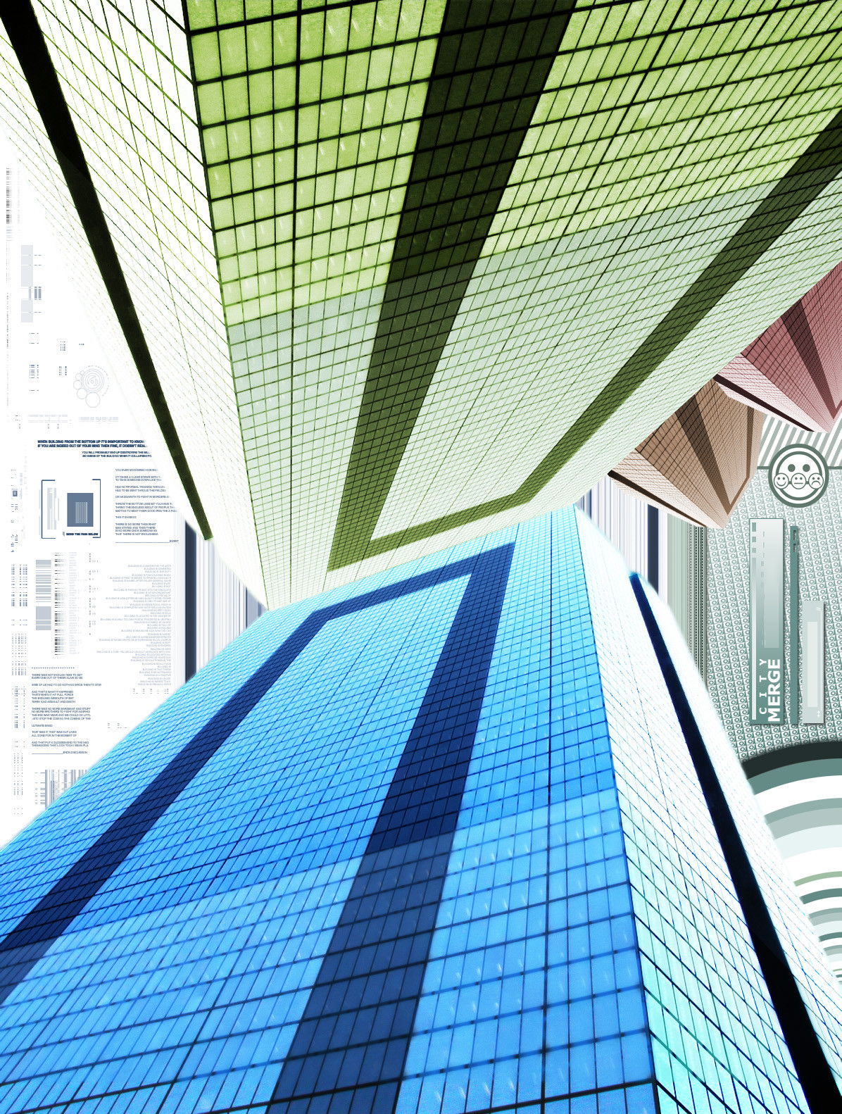
i let myself go with this one. (working on such a large scale was pretty refreshing.)was inspired by a lot of graphic design that i've been encountering on both dA and off in the realms of the internet. was partially working on a web-design [Editor's note: Again!] but it all pulled itself together into this.

i also tryed to leave some texture in the building .. so, when up close, it had a little bit of depth. don't know if i pulled it off or just made it look like it has low quality.

meh -- so here it is, enjoy, if you may.
Related content


Comments: 147


The perspective trick you did here was pretty cool, I'm all for the added complexity of leaving the windows in their more origenal state, it keeps the art from looking too symbolistic. Cheers!
👍: 0 ⏩: 0

so, i'm a major fan of beautiful architectural renderings, and this is sweet in every aspect... i can see how you were influenced by graphic design, 'cause there's definitely a resonance here...my eye travels around and around, looking for something else because you created such a sense of space here. it's almost a logo, too, which really i think is what caught my eye. very pro!
👍: 0 ⏩: 0


i love the clean, modern look of this. I might turn it sideways and use it as a wallpaper 
👍: 0 ⏩: 0

Fantastic! As one user said earlier, there's a great urban feel to this - it's so slick and modern looking, but is also very harmonious with the colours and smooth lines.
Keep it up!
👍: 0 ⏩: 0


I don't know what it is about this that makes me love it so much;
I will suffice to leave this inadequate comment and favorite.
👍: 0 ⏩: 0


great choise of color too
exellent work
👍: 0 ⏩: 0

Whoa... that is the shizz!
10/10!! Maybe its just because I like the squares... *.* lol
I'm supposed to be a critic, and I'm giving you 10/10....wow.. lol
ya so... goooooood job!!!!
")
👍: 0 ⏩: 0
Whoa... that is the shizz!
10/10!! Maybe its just because I like the squares... *.* lol
I'm supposed to be a critic, and I'm giving you 10/10....wow.. lol
ya so... goooooood job!!!!
👍: 0 ⏩: 0

slick design, great colors and that efect of perspective with the background is amazing, faces touch was original
👍: 0 ⏩: 0


nice one.
yes, lots of building chop art around these days. gotta love art trends.
👍: 0 ⏩: 1


But since this was from a couple years back, I'm going to give myself a little bit more credit then just following a trend.

👍: 0 ⏩: 1
and so you should
nice work
👍: 0 ⏩: 0

The texture of the two buildings lets me look right into them. Amazing is the fact that the blue one looks like I can see the ceiling lights inside! Was that what you were going for?
👍: 0 ⏩: 1
No -- not intentional. But I'm glad that you found something that no one else probably noticed.
 (Wink)")
👍: 0 ⏩: 0

I'm in love with this picture. The colors are brilliant and not just because they're my favorite colors....but because they just go so well together. And the whole design..oh I just can't get enough of it.
Extremely well done.
👍: 0 ⏩: 0


The 180 degree symmetry is very eye catching. It’s too bad you don’t see that too often because it gives the image a great sense of balance. I love how the image is a literal representation of the title. The background looks like important documents being passed between two major corporations, and it eliminates any empty space that might have been there otherwise. Excellent use of color, too. The bright buildings stand out boldly against the light background, and the reflection detail in the windows adds a nice touch.
👍: 0 ⏩: 0

interessting... sometimes i don`t like such abstract things... i`m more a "3D modeler type" you know... want to see "realistic" stuff
But i like this one. The composition is very nice, the colors fit great...
So i really like it!
Who knows, maybe you like my stuff too.
👍: 0 ⏩: 0


Looks pretty neat. Would have looked better if you didn't have two different backgrounds (the ones on both sides of the cubes).
Oh, well.
👍: 0 ⏩: 0


Love this! 
And Bobby,thanks again for the helpful suggestions... 

👍: 0 ⏩: 0


Things I like:
1) Original concept and good use of photography in abstract. Mixed media is something that definitely needs to be pushed.
2) Some of the typo is nice and detailed and sits well.
Things I don\'t like:
1) Too much of the typo isnt, and doesnt.
2) Not enough variation. It\'s obvious that it\'s one object that has been arranged around the composition.
It\'s not a bad piece, and it\'s certainly a good idea, but you need to more carefully consider your layouts and composition, think of what mood or message you are trying to project and consider every element and its effectiveness in illustrating that.
👍: 0 ⏩: 0

well indeed its magnificent, fantastic work, love the tones used & revol. angle
well done
👍: 0 ⏩: 0

looks great, kinda tech looking  (Smile)")
👍: 0 ⏩: 0


I liked the sense of changing perspective narrowing and then widening as I scrolled down. Yes, I like the fact that you submitted it in such a large scale.
👍: 0 ⏩: 0


A very weird way to show the reality - nice abstract interpretation of a city scape, I like it. Great job on this one!
👍: 0 ⏩: 0

wowo great peice , sort of dizzying, lokos liek it oculd be any metropolitan skyscape.
👍: 0 ⏩: 0


That looks really good...The colours compliment each other perfectly...definetly
👍: 0 ⏩: 0

I like the angle, and the almost-grainy quality adds a sense of realism to the whole piece. The colors are great, too...
Jess
👍: 0 ⏩: 0

This is honestly one of the coolest things I've seen in a while. I'm going to be going into design more with my AP class next year, so I hope I'll be able to do something like this ^_^
Great job.
👍: 0 ⏩: 0

that is really cool. i love the colors used and the angle. the only thing i don't like is how some of the windows turned out grainy. awesome work though. might look good as a print.
👍: 0 ⏩: 0


The so many angles and perspectives and shapes makes my brain go "whee" in my skull! I adore the colors, too. It makes me want to move with the piece and turn my head. Awesome job, it's very cool, technical-ish and colorful and just fun to look at. ")
PS. I love your icon. I've been staring at it for about five minutes now.

👍: 0 ⏩: 0


it's just so amazing. when you scoll down really fast it makes my head dizzy 

👍: 0 ⏩: 0

Dude this is really wierd! I love the persective it forces the viewer to look as... I also love how you integrated the title directly into the picture, very nice touch, and the writing in the back there is a nice touch too, love the colors you chose; grah
👍: 0 ⏩: 0
| Next =>