HOME | DD
 hangingghost — Tempest

Published: 2005-10-05 22:41:35 +0000 UTC; Views: 169; Favourites: 4; Downloads: 19
Redirect to original
Description
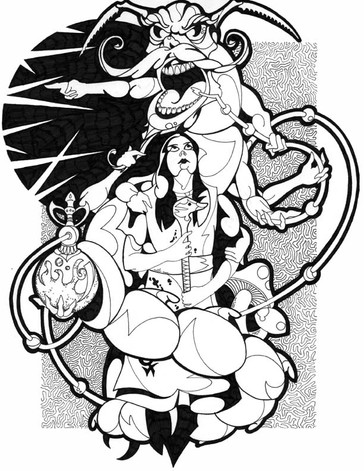
A page from my ongoing gothic-horror manga called "Benendanti". Just trying to experiment a little with toning. Unfortunately I don't have dedicated software for toning but did my best to fake it in photoshop using half-tones saved as TIFF files. I can't decide if it is worth it to get a PC (I have a Mac) so that I can use Comicworks, or just try and create (or scan in) a library of tones for photoshop and clone stamp them. I really like using tones more than just greyscales, as it keeps that black and white aesthetic I love so much. If anyone has any great ideas for using screentones on a Mac let me know!---
In the image, Lord Byron is in a dream world so I played alot with the composition and framing...I fear perhaps a little too much, what do you think?
Related content
Comments: 7

Nice work, awesome detail! The full view as a bit too big though.. Otherwise all cool
I don't know if they work on a Mac, but I got the screentones I use in Photoshop from here [link]
👍: 0 ⏩: 1

Thanks!! yeah, I forgot to shrink the file first...
👍: 0 ⏩: 1

I agree. Stylized framing is nice and all, but it really shouldn't be quite so bold. As far as the composition of the layout goes, though, it's nice. The lines move your eye along to the right panel order, which is usually the biggest problem of page design.
👍: 0 ⏩: 0

A tiny bit too much framing, I believe it really sort of overpowers the main aspect of the composition...
👍: 0 ⏩: 1

Yeah, I designed the frame before I did the panels... I guess that's what happens...
👍: 0 ⏩: 0

