HOME | DD
 HaphazArtGeek — Endeavour Comparison

Published: 2018-04-19 21:52:28 +0000 UTC; Views: 1275; Favourites: 7; Downloads: 10
Redirect to original
Description
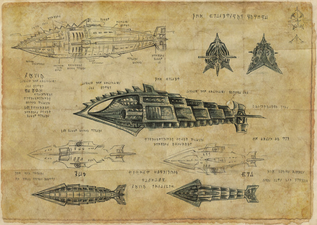
Just made this out of interest, a comparison between Anno78's sketch and the final(ish) version.I tweaked a few angles here and there and carried the "dividers" on the helm console on to other consoles to give a greater since of continuity, but over all it was a good, well thought out design to work from.
(The captains chair move forward was already planned by Anno)
Related content
Comments: 2

aside from myself preferring two stations up front (Helm and Navigation together) Option 1 is VERY NICE. I like the entire layout (except what I noted for two stations up front instead of the one) AWESOME, functional and nothing missed! Thank you for sharing these.
👍: 0 ⏩: 1

There seems to be two main different design families, TOS Enterprise right up to the E goes with two stations, while the Defiant, Voyager, Pasteur and Equinox opt for the single front console. I’d say maybe the more specialised ships go with a single station but then Prometheus splitsthe difference and had one big console with 2 chairs!
Aaaaaaaaanyway, glad you liked it!
👍: 0 ⏩: 0


