HOME | DD
 harikenn — Interface Challenge

Published: 2014-05-09 00:18:31 +0000 UTC; Views: 1591; Favourites: 44; Downloads: 0
Redirect to original
Description
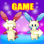
THIS IS A BAD VERSION OF WHAT MY INTERFACE WILL ACTUALLY LOOK LIKE-
I made this as a fun challenge, if I could design a party icon interface in 10 minutes or less. I liked the result, so I added other stuff :3
Related content


Comments: 8
Master-Pixel [2014-05-09 08:53:47 +0000 UTC]
Well I've noticed a problem, as you say it's a bad version - but I'll point it out anyway.
The white font on the light grey is barely visible, so I'd suggest either darkening the background, or change the font colour.
And also conventionally the left Pokemon boxes are higher then the right due to people reading from Left to Right, with the English Language.
I'd think it'd be better if the screen was the size of the top panel, as it's quite a nice size.
But otherwise for 10 minutes of work this is great.
👍: 0 ⏩: 0


