HOME | DD
 HatschYuh — Coastal Guard

#coastal #guard #kthxbye #landscape #tower #yolosweg
Published: 2017-06-18 16:15:29 +0000 UTC; Views: 4774; Favourites: 262; Downloads: 106
Redirect to original
Description
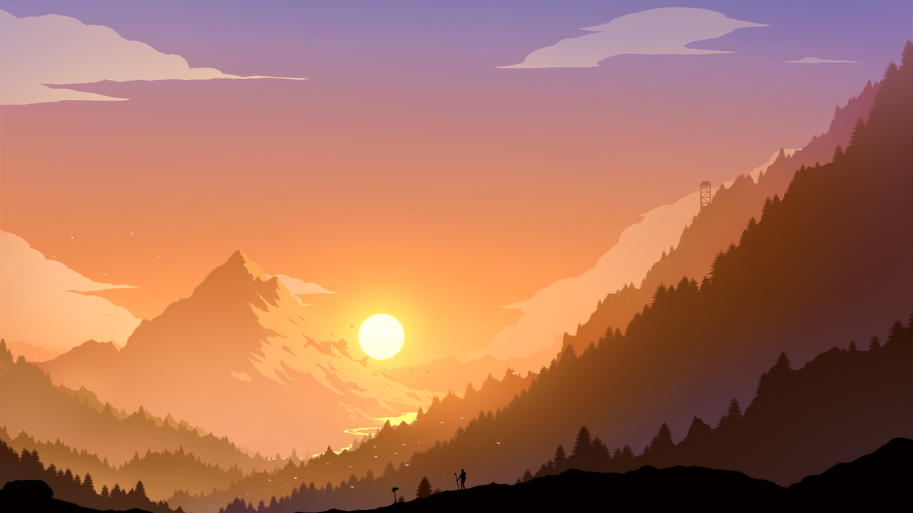
You see, there is this certain tower. It's quite tall and such.While it works as a connection route from the seaport, which is pretty much surrounded by high cliffs and rocks, directly to the main trade-routes, which also leads to the capital - it also functions as a lighthouse for the ships at night as a sea beacon, to offer a safe route. But it's main function is that of a guard tower, in case there's an invasion from the seaside, since this place is an ideal place to fortify for reinforcements. In this case it shoots it's glowing orb on it's roof straight very high into the air, high enough so that the capital can even see it during daytime and react accordingly.
Yeah, pretty much a multifunction-tower or so.
Why I wrote this down? Because I had this idea in my mind and maybe I can find some use for it later, if I ever decide to finally start creating my world or so. :]
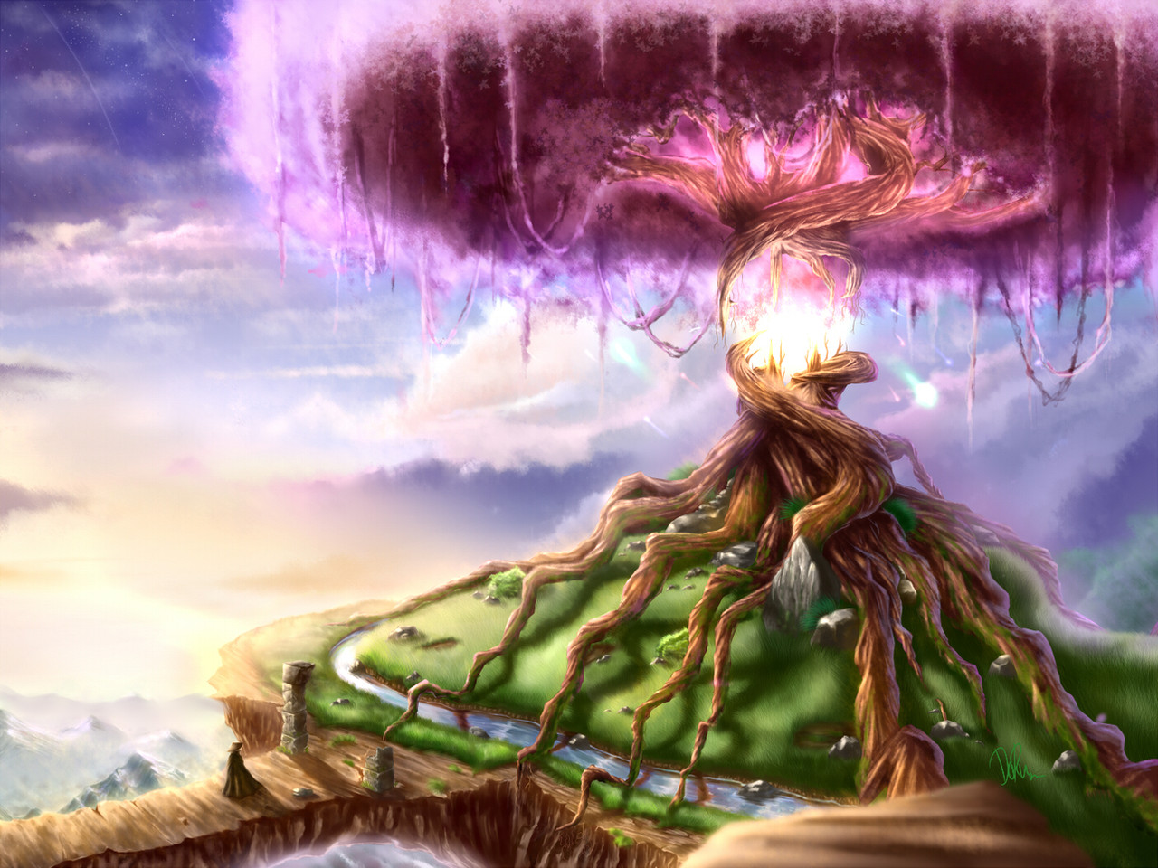
Well, it was quite fun to do it, although I was creating a first version, but quickly realized how stupid and boring it looked, so I discarded it anyway.
Here's the first version :
Done with Paint Tool SAI
~ 8 Hours, 2 for the first version
Anyways, follow me on Twitter , if you're interested in progress-steps and more recent uploads as well as like to have a chat, since I'm a little bit more active over there or so.
")
Related content


Comments: 15


...The tower served one more purpose, as its proud builder (seen on the left) had a really small . Later his great-grandson Kim Jong-un would build similar looking nuclear rockets for the very same purpose.
On a more serious note, I find that the tower looks a little bit like it is leaning to the left. Not that this was unrealistic, but it is a bit of a contrast to the very straight pillars of the bridge and perfectly drawn arches there. Also the bridge looks more narrow to me than the distance in between the small towers on top of it suggests. What I actually did like from the first version was the metal structure on top of it, it somehow was more "readable" and fitting in colour than the more delicate-complicated new version.
As always you create a very nice mood, with amazing sun, clouds, water reflections, sparkling effects and colour scheme. I wonder if adding some big and diffuse cast shadows from clouds or (invisible) mountains on the left side could have emphasized the shining parts of the bridge pillars and made the somehow flat background in the middle of the picture look more interesting.
 (Wink)")
👍: 0 ⏩: 1

Hehe, you definitively got a story there...
Well, I checked my picture again and you're absolutely right with both! It seems to be an error with the sketch I've created and sticked with it until the end. Now that's my bad and I really appreciate that you find these mistakes so that I'm able to learn from it for my upcoming stuff! :]
About the metal-thingy at the top : I definitively see your point and actually had the same metal-thing from my previous picture already doodled, but somehow it stuck out very negatively in terms of its shape and therefore I decided to scrap it. Maybe I should have done a thing in between these two structures.
And that's definitively a good point as well. While I did intend to put the sun at a quite low angle to prevent such shadows, I do see what you mean by "somehow flat background". I do somehow consider to get back to this picture and work at it again, with your feedback here. But only if I have some free-time. x)
Anyways, thank you kindly for your feedback, I really appreciate it! :]
👍: 0 ⏩: 0

This is awesome. I really admire that you were able to, even after investing so much work into it, throw out the first version because you're right; the composition isn't nearly as good as this one. I wouldn't say the first one is boring, but it's calm, which isn't quite what you're looking for in a defense tower.
You create such beautiful work. You should be super proud of yourself.
👍: 0 ⏩: 1
A very belated "Thank you sooo much!" for your kind feedback! I absolutely appreciate it!
And yeah, sometimes one has to drop previous work if it just feels off...not because it's necessarily bad, but the other idea just works better! x)
Well...there's no real reason to be proud of it anyways. For me it's just a work that I very much like to do and in the end enjoy doing without remorse. :]
👍: 0 ⏩: 0

Thank you! I'm really glad you think so!
👍: 0 ⏩: 0

Wow... awesome*o* I really wanted to see your art already!
👍: 0 ⏩: 1
A very belated thank you, I'm really glad you liked it! :]
👍: 0 ⏩: 0

Whoa, this is gorgeous! The tower looks really cool, and I absolutely love the color of the sky and the golden glow cast over everything~ <3
Excellent work!
👍: 0 ⏩: 1
A very belated thank you! I'm very glad you liked it!
👍: 0 ⏩: 0

Thank you, I'm glad you think so! :]
👍: 0 ⏩: 0

Thank you, I'm very glad you liked it!
👍: 0 ⏩: 0