HOME | DD
 hcaep — Butone's Spawn... Colored

Published: 2007-06-21 00:54:09 +0000 UTC; Views: 2320; Favourites: 22; Downloads: 30
Redirect to original
Description
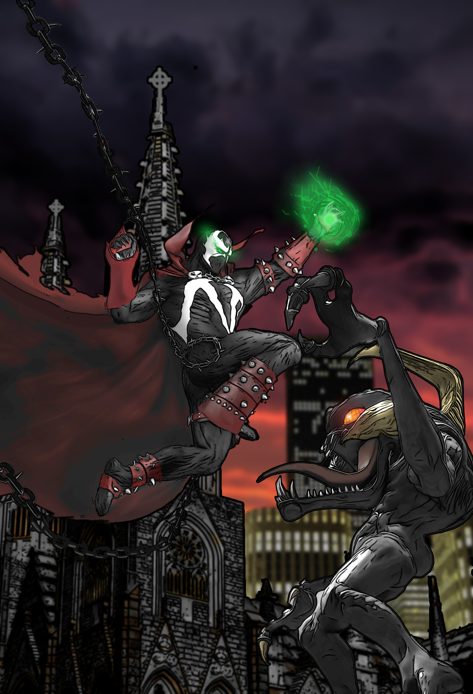
was kind enough to let me ink and color his awesome pencils. Click here to see the original Pencils")
Click here to see just the Inks
Enjoy.
*edit* Toned down the red hues a bit to add some eerieness. (Thanks to for the advice
)
Related content


Comments: 42


👍: 0 ⏩: 1

The movie was good, but the comic was better storywise (at least until it got to the "armageddon" story line, now it just sucks ")
👍: 0 ⏩: 1
I have the game but I really dont like except the cover
")
👍: 0 ⏩: 1


👍: 0 ⏩: 1

But it looked soo cool though....I saw legend the directors cut I saw the table scene.....I don't what is soooo distrubing

👍: 0 ⏩: 1
Earlier there's a scene where he's inside the chair (you can see his eyes opening on the back of it), when he asks her to sit they show this phallic looking thing writhing on the seat...
👍: 0 ⏩: 1
Oh where the chair is kind moving
👍: 0 ⏩: 1
Yep! 
👍: 0 ⏩: 1
Oh ... my.....gosh..
👍: 0 ⏩: 1
")
👍: 0 ⏩: 1


To be honest with you, I think you used too saturated a red for this piece. It would have looked real eerie and such if you had used a desaturated green or grey, using the green light to accent the folds of the fabric. As it is now, the red clashes with the green, and you don't really get that double-light-source effect.
Remember: complimentary light dulls local hues.
Just a friendly tip for next time. Looks real nice otherwise.
👍: 0 ⏩: 2
Then I remembered that you can alter hues in Photoshop! Is that better?
👍: 0 ⏩: 1
Cool! Thank's again for the help!

👍: 0 ⏩: 0
Thanks for the tip! 

👍: 0 ⏩: 0


Thanks! The colors were a lot more fun to do (and less time consuming than the inks). And thanks for the 
👍: 0 ⏩: 0

I haven't read Spawn since issue 50. But some things never change. The colors would definitly fit in the comic.
I like his right arm piece thingy but it looks a little distracting. It isn't clear what it is but the light effects are a good touch.
Nice work.
👍: 0 ⏩: 1
That's one Capullo's huge spiked gauntlets. was doing Capullo's "armored" version of Spawn. It was also the biggest pain in the ass to ink in the whole peice 
👍: 0 ⏩: 1
I stopped reading after issue 50. Capullo had been drawing it for a while. I didn't like the style switch. Or the new costume.
The coloring is what I liked best. It was very fitting.
👍: 0 ⏩: 1
I've read up to the end of the armageddon storyline (issue #163 I think), and initially, I was not too thrilled with the style switch either. I think Capullo eventually got better as the series progressed (his first few with Houdini were terrible) and has done some great work taking over after Angel Medina left. The thing that I find both interesting and frustrating about Spawn is how the story goes though this predictable pattern of getting really good for 6-8 issues, to suddenly dragging for another 6-8 issues. Weird.

👍: 0 ⏩: 1
That's basiclly how it started, story telling wise. Some issues were full of action, some weren't. I admit I only bought the first 5 issues because Macfarlane was drawing. Of course that was the way with all the Image comics(except Youndblood) when they first came out.
I hadn't known of another artist taking over after Capullo. That's how far I got from Spawn. Didn't really care anymore. It just wasn't a comic I wanted to read anymore.
👍: 0 ⏩: 1
I did the same thing. The first Spider-Man comic I ever bought was McFarlane's Venom story-arc. I followed him from Marvel to Image. Although as much as I love Jim Lee's art, I never got past the first couple of issues of Wildcats because it felt like an X-Men rip-off (and youngblood felt like a X-Force rip-off, too. I never really liked Liefeld's style anyway, very tiny feet and no wrists  (Smile)")
👍: 0 ⏩: 1
I used to love the X-Men when Chris Claremont wrote it. Now I avoid X-titles like the plague.
Invincible is the only Image title I read now. I've gotten very selective with my choices. I'm a reader and if I don't get my moneys worth then I don't buy it.
I'm wanting to get rid of my Spawn books. I might put them on ebay or something. Just to get something back you know?
👍: 0 ⏩: 1
ebays probably your best bet on that, good luck. I got pretty selective myself (although I got laid off at the end of January, so I'm not collecting anything right now 
👍: 0 ⏩: 1
Also check out he draws Invincible. And yeah Wanted was pretty awesome.
👍: 0 ⏩: 1
Checked him out. Love his gallery. (Especially the "Don't Ignore Your Spider-Sense" and "Wolverine Vs. Batman"), am now watching him.
👍: 0 ⏩: 1
There are quite a few pro artists here that post somewhat regularly. Which makes me happy cuz they tend to be very help with info, like tools, time spent on projects and a few tips if you ask nicely.
👍: 0 ⏩: 1
I think it's cool that there are so many artists here that are "approachable". At one point or another I've been involved in the film, comic book, & music industries, and I've always hated the egotists (although they have suprisingly been in the minority). It's like a told a certian Heavy Metal singer once, "Dude, if it wasn't for your fans going out and buying the records, you'd be nothing. So show a little respect (I just politely asked if he was who I thought he was, and he said, "Yeah, now go away.")". I also keep in mind that even if another artist is "beneath me" in the quality of thier work, I used to be where they are now and part of what got me to where I am now was the help and feedback of other artist who were "above me". So I think it would be incredibly messed up on my part not to, for lack of a better term, "pay it forward".
👍: 0 ⏩: 1
And that's why I love it here. I get to see so many of my favorite artists and talk to them. There are some problems here and there but I really don't see the cons outweighing the pros.
There'a a few artists that I've run into here who really don't have much talent but at least they put stuff out there. Their quality might be lacking but as I look at their profiles and most are under 20. They have very crude work but the passion for art is there.
I like to think that I'm an "above average" artist in terms of skill but I know that what I have learned in my years could be very helpful to someone else. I always try and give as much as I can whenever I post a comment on someones work. I try and careful with my words. I don't want to be one of those egoists that you've talked about. I know my present skill is a product of where I used to be. And hopefully I can be a "high quality" artists that I look up to.
👍: 0 ⏩: 1
I agree with everything you said 100%  (Wink)")
I have dealt with the egotists in the industry, but thankfully haven't run into any on 

And I agree about the under 20 kids on
The reason I put "above" and "below" in quotation marks is because art is wonderfully subjective. For example, I think my stuff is better than Frank Miller's (in my personal opinion he's a great guy, an awesome storyteller, but an overated artist), but there are plenty of people who would disagree with me, and that's fine. It's different for all of us.
And thank's for chatting with me about this stuff, I really enjoy it.
Your stuff is great!
Post more!!
👍: 0 ⏩: 1
I'm trying so hard to get stuff done. I hve a lot of sketches but nothing that I really want to finish. Hopefully soon something will go up.
As for Frank Miller, I agree. His a wonderful storyteller(with the exception of All-Star Batman and Robin with Jim Lee drawing. That book is crap.) and his earlier woirk was great but he has become much more "stylized".
I have fun chatting with you as well. It's nice to know that the other person gets what I'm talking about.
👍: 0 ⏩: 1
Cool! looking forward to seeing more stuff whenever you're ready. Just don't sweat it, I got a whole bunch of crap I'd love to finish and post (hundreds of pics that'll hopefully never see the light of day
And I agree about Miller's earlier stuff. His art on the Wolverine mini-series and Spectacular Spider-Man was very awe-inspiring.
👍: 0 ⏩: 1
Just put one up.
I want to be more like John Cassidy in terms of realism. I totally digging his work right now. Also I would like Mark Bagley. He is a top notch professional. Never late and extremely consistant. Those two are my heroes.
👍: 0 ⏩: 1