HOME | DD
 hclay — the gloaming

Published: 2007-07-14 20:47:44 +0000 UTC; Views: 588; Favourites: 34; Downloads: 6
Redirect to original
Description
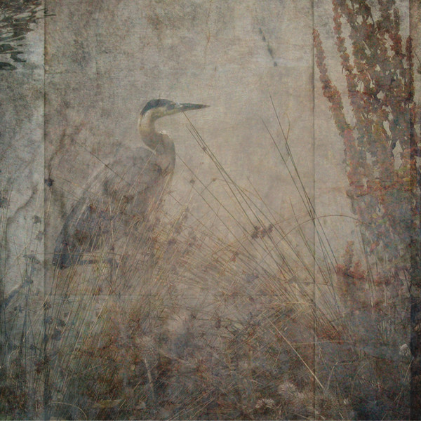
sun going down over puget sound.buy prints: [link]
Related content


Comments: 17

This picture is so wonderful - have you ever thought of selling prints of it?
👍: 0 ⏩: 2
Are you kidding - I love this picture.
👍: 0 ⏩: 0

ive never actually done the print thing on here...im not sure how complicated that is to set up. although to tell you the truth, i wouldnt mind if you downloaded the original and made your own print. id just be honored to know someone wanted a print of it, hahaha.
👍: 0 ⏩: 0

Im in love with this
Radiohead reference? XD
They will suck you down to the other side
To the shadows blue and red, shadows blue and red
Your alarm bells, your alarm bells
Shadows blue and red, shadows blue and red
Your alarm bells, your alarm bells
They should be ringing
This is the gloaming
👍: 0 ⏩: 1
haha, i adore radiohead. that is exactly what i was thinking of.

👍: 0 ⏩: 1

This is mastery of the selective use of colour.
👍: 0 ⏩: 0


i dont know what i would do without it. there would literally be three pictures in my gallery.
👍: 0 ⏩: 0

I really like the color variation in this one. Awesome, as usual.
👍: 0 ⏩: 0

Wonderful! How do you get that effect. It's so compelling
👍: 0 ⏩: 1
thank you so much! its all just photoshop trickery.
for this picture, i have two layers on top of the original picture, which was taken at low light with a fast (1/1600) shutter speed, so its pretty heavy on the contrast, the weeds themselves are almost completely black. i set the focus/aperature to capture the weeds and leave the background blurrier. the the layers i used are both pictures of concrete, one layered as a "color burn," and then spot adjusted with the burn and dodge tools to even out the color contrasting. this is what gives the sort of dark, heavy contrast color effect, the actual concrete layer has pretty uniform color, so most of the color coming through is burned from the scenery picture, but those dark orange colors would never really come out well on their own. then the other concrete picture i layered as a "screen" which has the effect of kind of brightening the entire field, but more importantly it will overlay the dark colors with that light grey texturing.
this is probably more information than you wanted, haha. concrete makes fantastic textures, though, if youre looking to get into texturing i highly recommend it.
👍: 0 ⏩: 1
Thanks for the mini-lesson. I wanted to make sure I didn't lose the instructions before I answered you, so I copies them to an e-mail to myself! So. It wasn't more information than I wanted ---- Did you "create" this technique yourself? It's really pretty cool, you know
👍: 0 ⏩: 1
hmm...maybe? i certainly didnt learn it from anyone, although im sure im not the only one that uses it, either. mostly my technique consists of randomly putting textures on, trying the different overlay functions in photoshop, then putting something else on, futzing with that for a while, etc, until i like the finished product.
 (Smile)")
👍: 0 ⏩: 1
Well -- your futzing is marvelous. Futz-away some more!
👍: 0 ⏩: 0

