HOME | DD
 HCWhitArt — My Process - How to draw a horse

#drawingprocess #drawingtutorial #equine #guide #horse #howto #process #stepbystep #tutorial #stepbystepprocess
Published: 2020-12-24 22:35:34 +0000 UTC; Views: 4160; Favourites: 22; Downloads: 1
Redirect to original
Description
I decided to throw together a quick guide on how I draw my horses. This is also kind of a preview of what's in store for the semi-realistic equine adopts I have planned, which should be done in the next couple of days.I've been drawing horses for as long as I can remember, but my skill at actually drawing them accurately really took a jump when I watched the "How to draw Sprit" tutorial that comes with the disc of Spirit: Stallion of the Cimarron. My process is basically a tweaked version of that process (and that process is also why I still usually add eyebrows to my horses). That tutorial is really helpful, so I recommend giving it a watch if you want some help with your horse art.
Anyway, here's a breakdown of my process.
Materials used: basic #2 pencil, Prismacolor tracing pens, Prismacolor colored pencils.
1. I start by sketching out a box to give myself a general idea of how large I want the horse to be on the page. This is especially helpful if I'm drawing multiple horses on one page. It should either be square or slightly longer than it is tall - this will help you keep the body the right size for the rest of the horse later on in the process. I also jot down any notes I want to keep in mind for later on when I color it, like a name and an idea for the color.
2. I usually start with the shape of the shoulder, then use that as a starting point for getting down the basic shapes of the body and neck. I try to keep the body contained within the square I've drawn, so my horse doesn't get larger than I want it to. This will also make sure the body isn't too short or too long.
3. I add in the rough outlines of the head, legs, mane, and tail. For the head, use a circle to suggest the cheek, and then draw an elongated snout from that. I use a lot of gestural lines for the hair, and I don't try to be too exact. I can polish stuff up later. For the legs, draw each "bone" as a straight line and each "joint" as a circle or some other identifying mark, and you'll usually be able to create a pose that looks realistic. The legs shouldn't extend much outside the box you drew earlier - again, this will help you keep the proportions for your horse right. Getting the hoof shape and position right can be tough, but basically they're triangular rectangles that have a slightly smaller range of motion than the knee or hock joints. That's the best I can tell you. Really, getting the legs right takes some practice. Expect your early attempts to look vaguely spider-like or weirdly contorted.
4. I add in details, like the eyes, nose, and major muscle contours. I also darken the outline to make it easier to follow when I'm tracing it. I still wouldn't press too hard, though, just in case you want to make any last-minute changes when you trace it.
5. I get out my tracing pens and outline everything I want to be in the final drawing. This is your last chance to change anything - here, I changed the angle of the tail slightly. Then I erase every single pencil mark, so the drawing looks nice and clean. I also add in my little signature at this point, usually down at the bottom or in a corner, where it isn't so obvious that it distracts from the actual art.
6. Normally I would also outline the markings of the horse in ink, but in this case I chose to only outline them in pencil. This gives them a softer and more natural look, rather than a sharp outline. There's pros and cons to both strategies - you can pick whichever option fits your style better.
7. I block out the basic base colors, and fill in all of the markings with a white pencil. For bases, I tend to use browns, tans, blacks, and other natural shades, so that when I add brighter colors later on, they won't be neon-bright and the color will still look like it could be natural. I try not to color too darkly, so that it's easier for me to build up shading and highlights later on.
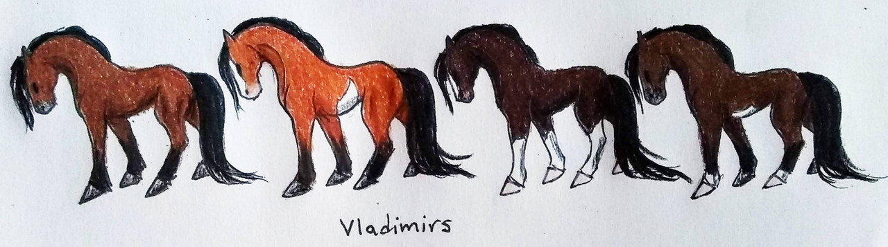
8. Now I go in with brighter colors, like reds and golds, to build up deeper colors and add gradients to the coat. This turns a plain brown bay into a bright blood bay, or a flat black into a deep blue-tinged black. In the case of semi-realistic designs, this also allows me to make everything pop while still keeping the original base color clear. In this example, I've taken a blood bay tobiano and added some brighter fiery shades to move it from realistic to semi-realistic.
9. Finally, I go in and add the shading to the body and add the final details, like the eye and hoof color. This makes the whole horse pop off the paper and gives his design a finished look. And now, he's all done!
Keep an eye out in the next few days for this guy's adopt batch. And let me know what you think of my little tutorial, or if you want some more examples like this! Remember, skill comes with practice. Keep drawing horses, and pretty soon you'll be able to bang one out in no time!
Related content


Comments: 2

👍: 1 ⏩: 1

👍: 0 ⏩: 0