HOME | DD
 HeartGear — Gerudo Link - Color? Help Decide
by-nc
HeartGear — Gerudo Link - Color? Help Decide
by-nc

#femalelink #genderbender #gerudogirl #gerudolink #breathofthewild #botwzelda #sidonxlink #sidonprince
Published: 2020-03-16 22:28:36 +0000 UTC; Views: 60214; Favourites: 364; Downloads: 72
Redirect to original
Description
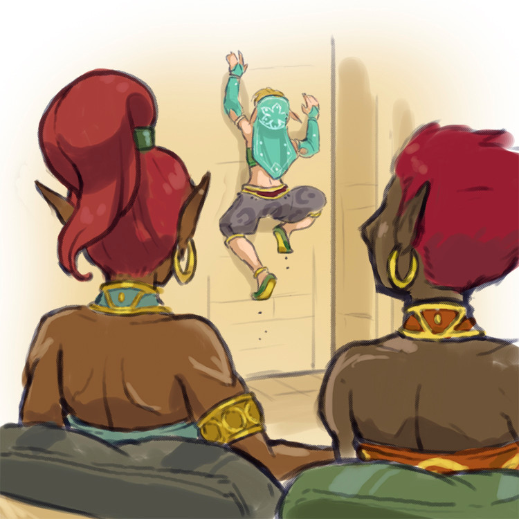
Hey Ya'll!Almost finished with the next Gerudo Link post! Should be posting tomorrow.
Related/Unrelated, how does everyone feel about color over monochrome?
Please leave comments below. I'm looking for feedback, and depending on how strongly people feel, or if this gets a ton of favs, I'll consider changing over.
Thanks everyone!!
Be well, stay safe
-Heart
EDIT - Added the monochrome! Might be helpful
Related content


Comments: 84

👍: 0 ⏩: 0

Maybe a bit of each? Do monochrome for the more "everyday" stuff and save the coloring for the "special" moments.
👍: 0 ⏩: 0


They both look great IMO, but I super love the colored version, it brings so much life and vibrancy to the characters!
It could be really cool to see the comic getting more colorful as Linkana grows closer to a life she loves.
👍: 0 ⏩: 0

👍: 0 ⏩: 0


I do like the monochrome, but the color still has more personality. That would be my preference. It has a nice watercolor vibe that feels like BotW, too. Very serene and pretty.
The monochrome was fitting for the Gerudo desert setting, but the colors look so nice and would carry the personality of the other regions far better.
But if you're afraid colors will slow down the process too much, you could compromise. Save colors for dramatic beats, coloring integral places, characters or objects when they are introduced or having an important moment? It becomes an emphasis. Just an idea.
👍: 0 ⏩: 0

👍: 0 ⏩: 0


I'd really like color, the similar hairstyles in monochrome are making characters hard to tell apart. Color should help with that some.
👍: 0 ⏩: 0

l like the colour version better,but l would be fine with either.
👍: 0 ⏩: 0

I have no idea what I'm looking at, but it looks cool.
So, what is this? Something along the lines of a "What if Link was born as a Gerudo girl"?
👍: 0 ⏩: 2

Yeah, it's a sequel comic to an illustration series I did a while back. The Gerudo catch Link breaking into Gerudo town and decide to prank him by pretending they're going to turn him into a Gerudo. And then, oops, they accidentally/permanently do.
The illustration series was more silly, but this comic is gonna be more serious. You don't have to see what came before since there will be a recap in the comic, but if you like you can check out the illustration series. I think random person sayshi linked to it?
👍: 0 ⏩: 1
Ah, thanks for the answer.
So, does Link suffer PTSD from Majoras Mask in this one? ^^
👍: 0 ⏩: 1
Linkana is struggling with who she is now that the world is saved and her adventure is technically over
👍: 0 ⏩: 0
no,this picture is for a squeal comic to a comic where crossdressed link caused too much attention to be drawn to himself when infiltrating gerudo town,and as punishment for being a male in the town,he was forced to be made over into a gerudo look alike,but do to some bloodmoon/mask magic,the makeover became permanent,complete with a race change. lf you want to read it (you should,its great) then click here
👍: 0 ⏩: 1
Thanks for the answer.
I'll have a look at it at some point.
👍: 0 ⏩: 0


Colour, please!
I think the art is more beautiful and eye-catching
👍: 0 ⏩: 0

Forearm bump, instead of a handshake!
These two Cool Dudes And/Or Previously-Dudes know how to express BRO-SHIP in the age of CORONAVIRUS
Be like them, Kids! Stay cool, and stay healthy!
...Also I feel that color is almost always a better option when possible, BUT you have a good sense of what it takes to make monochrome express its visuals well, and I feel the more important factor in this project would be the time it would take to colorize everything. If you could add that level of color with a negligible or minor increase in production time, that would be ideal, but I personally would rather see a new page a day or two earlier, if that was the tradeoff.
And like others have suggested, there's plenty of in-between options as well, including coloring only the occasional important panels, character introductions, or that sort of thing!
👍: 0 ⏩: 0

👍: 0 ⏩: 0

I personally prefer monochrome, although your colouring is really pretty. ^^
Others suggested to vary between them to put the emphasis on certain pictures, which strikes me as a brilliant idea.
👍: 0 ⏩: 0

👍: 0 ⏩: 0

Color looks great but if it takes a lot of extra time, well...
👍: 0 ⏩: 0

👍: 0 ⏩: 0

👍: 0 ⏩: 1

I like color but monochrome also looks nice
👍: 0 ⏩: 0

👍: 0 ⏩: 0


Hmm, interesting decision, as I think each brings its own benefits. I like how the color panel pops, though. You've always had a good eye for complimentary colors, and I can't help but notice how the use of teals and golds make Sidon's bracers and Linkana's forehead decoration pop from their skin respective skin tones. Color helps immensely when discerning details.
The general benefits of the monochrome are it's greater simplicity and ease of construction. The way you've used it thusfar has also done a great job of creating a sense of rustic homeliness. Slightly drab, but comfortable. I think that color will sacrifice some of that easy-going feeling.
Conveniently, one of the images on the little sidebar for this page is your previous work, "Mistle-No", wherein you used a flatter color for the focus characters and a sketchier monochrome for the background. Perhaps something along those lines would work? Just a thought.
I hope you're having a fun quarantine, and that you and yours are safe and well.
Edit: I just went back and looked at the first page for this story and realized that you were already doing exactly what I proposed. I am really impressed with how that first page looks, if that helps.
👍: 0 ⏩: 0


I actually prefer monochrome, it brings attention to the lines and shading.
👍: 0 ⏩: 0

👍: 0 ⏩: 0

Color is nice honestly, it feels more vibrant although depending on how much more difficult it is, it's up to you which one you take!
👍: 0 ⏩: 0

I like the color more, but do whatever is easier on you, because they're both good.
👍: 0 ⏩: 0

I personally like monochrome, but whatever you like!
👍: 0 ⏩: 0

I'll admit, colors does give it more life. It's better quality. Though I can imagine it takes more time.
Might be an idea to use the monochrome for special occasions? Like flashbacks? Or even in dark places like caves?
👍: 0 ⏩: 0

I like the color a little better. but i'm a fan of black and white art too.
👍: 0 ⏩: 0

I like the color more, but I don't dislike the monochrome. If it's too much of a hassle I'd say stick with the monochrome.
👍: 0 ⏩: 0

Personally, I haven't had a problem with the monochrome pages but I do think the color definitely stands out more when you put them side by side. With that in mind, would limited use of color be an option going forward? For example, having this kind of shot of Linkana and Sideon meeting in color for emphasis of the moment and the rest of the page in monochrome. That way, when a scene has color it really stands out.
As an alternate thought, I looked back through the older pages and was kind of caught on the blues of Zora's Domain on the first page. Depending on how many regions the comic would be running around in, I'm growing a little attached to the idea of monochrome but changing the base color to reflect the region the comic is in (red for the desert, blue for Zora's Domain, green for forests or fields, white and grey for snowy mountains, etc). So each area of the story would feel different based on it's regional color, if that makes sense.
👍: 0 ⏩: 2
This is a really clever idea. I like it a lot.
👍: 0 ⏩: 0

Y'know, I'm going to second this.
👍: 0 ⏩: 0


While the comics coloring already looks pretty good, I think the top option (color) does look better.
👍: 0 ⏩: 0

👍: 0 ⏩: 0

👍: 0 ⏩: 0

I prefer the color version myself, but I do understand that it might take more time over the monochrome version. Colors would add a little extra something, though.
👍: 0 ⏩: 0

I do like the color version, but if you don't have time for coloring or if you like the monochrome better that's fine as well.
👍: 0 ⏩: 0
| Next =>