HOME | DD
 HeartGear — Gerudo Link - Color? Help Decide
by-nc
HeartGear — Gerudo Link - Color? Help Decide
by-nc

#femalelink #genderbender #gerudogirl #gerudolink #breathofthewild #botwzelda #sidonxlink #sidonprince
Published: 2020-03-16 22:28:36 +0000 UTC; Views: 60229; Favourites: 364; Downloads: 72
Redirect to original
Description
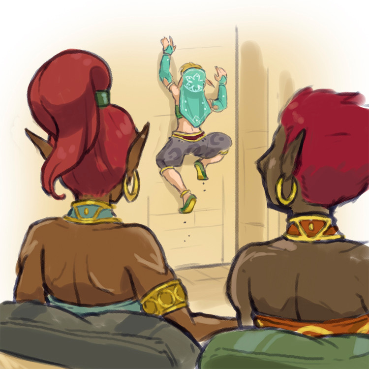
Hey Ya'll!Almost finished with the next Gerudo Link post! Should be posting tomorrow.
Related/Unrelated, how does everyone feel about color over monochrome?
Please leave comments below. I'm looking for feedback, and depending on how strongly people feel, or if this gets a ton of favs, I'll consider changing over.
Thanks everyone!!
Be well, stay safe
-Heart
EDIT - Added the monochrome! Might be helpful
Related content


Comments: 84


The monochrome look has served the series pretty well so far, but I'd be lying if I said the addition of color didn't make the scene pop more -- and admittedly, a large part of Breath of the Wild's visual charm is its deeply-saturated and varied color palette; that said, I know that adding color creates more work for the artist, which is presumably why you've been sticking to coloring only on special occasions, like the cover page and assorted promo images.
Personally, I'm cool with whichever -- color would look sweet, but I don't mind the manga-esque monochrome, either. I'll defer to you.
👍: 0 ⏩: 0

👍: 0 ⏩: 0


Color is amazing
Though I'd do without if it means it's easier for you to make pages.
👍: 0 ⏩: 0


I really prefer color over monochrome, but if it's causing too much work for you to color everything or is slowing things down a ton for you, I'm not going to get worked up about it
👍: 0 ⏩: 0

The Colour works wonders, but monochrome is a good substitute if time is against you or you’re overworking yourself
👍: 0 ⏩: 0

👍: 0 ⏩: 0

Colour i think works best! but your art, your rules!
👍: 0 ⏩: 0


I think color looks a little better but its far from a deal breaker due to the quality of the general art. it could be a bit of a time eater I imagine maybe just color for special pages kind of like old newspaper comics were only color for the big Sunday spreads.
👍: 1 ⏩: 0

the subdued color doesn't pop out at me so I think monochrome would be best
👍: 0 ⏩: 0

Personally, I'm okay with either, but I feel monochrome gives the art more of its own identity. It's stylistic and a nice style~
👍: 0 ⏩: 0


It would make them pop out dramatically
 (Smile)")
👍: 0 ⏩: 0


I prefer colour, at least for the main characters, or whoever is the focus of attention. I think the background stuff can stay monochrome.
👍: 0 ⏩: 0
Pixelplaytoy [2020-03-16 23:09:40 +0000 UTC]
Much prefer your use of full colour. The way you use colur always looks so nice, i find your use of very soft colours really cute to look at ^_^
👍: 0 ⏩: 0

I understand that color takes more time to make. Something that I see a lot of comics do is have one or two pages per chapter be in color and the rest monochrome. Usually it is the most impactful page or the cover art that is in color in that case. You could also go midway between color and monochrome, by highlighting the monochrome pages with colors on things that you would like to pop, like the golden accents, or to draw attention to certain parts of a page.
👍: 0 ⏩: 0

👍: 0 ⏩: 0

Hmm, I prefer colour, mostly because it makes Linkana's new skin and hair colour pop more, and it's adorable.
👍: 0 ⏩: 0

Art in whatever way you want cause it's all super amazing
👍: 0 ⏩: 0


I'd suggest limited color; such as bringing in red specifically for Sidon being around, or dictated by the mood of the scene.
👍: 3 ⏩: 1

+1 for this. Color is more work, and using it sparingly really helps the impactfulness of the panel or page.
👍: 0 ⏩: 0


I love your art either way! Whichever feels more fulfilling!
👍: 0 ⏩: 0


👍: 0 ⏩: 0
