HOME | DD
 heavy-rotation — Identiti
Published: 2001-05-25 13:07:16 +0000 UTC; Views: 8185; Favourites: 7; Downloads: 2342
Redirect to original
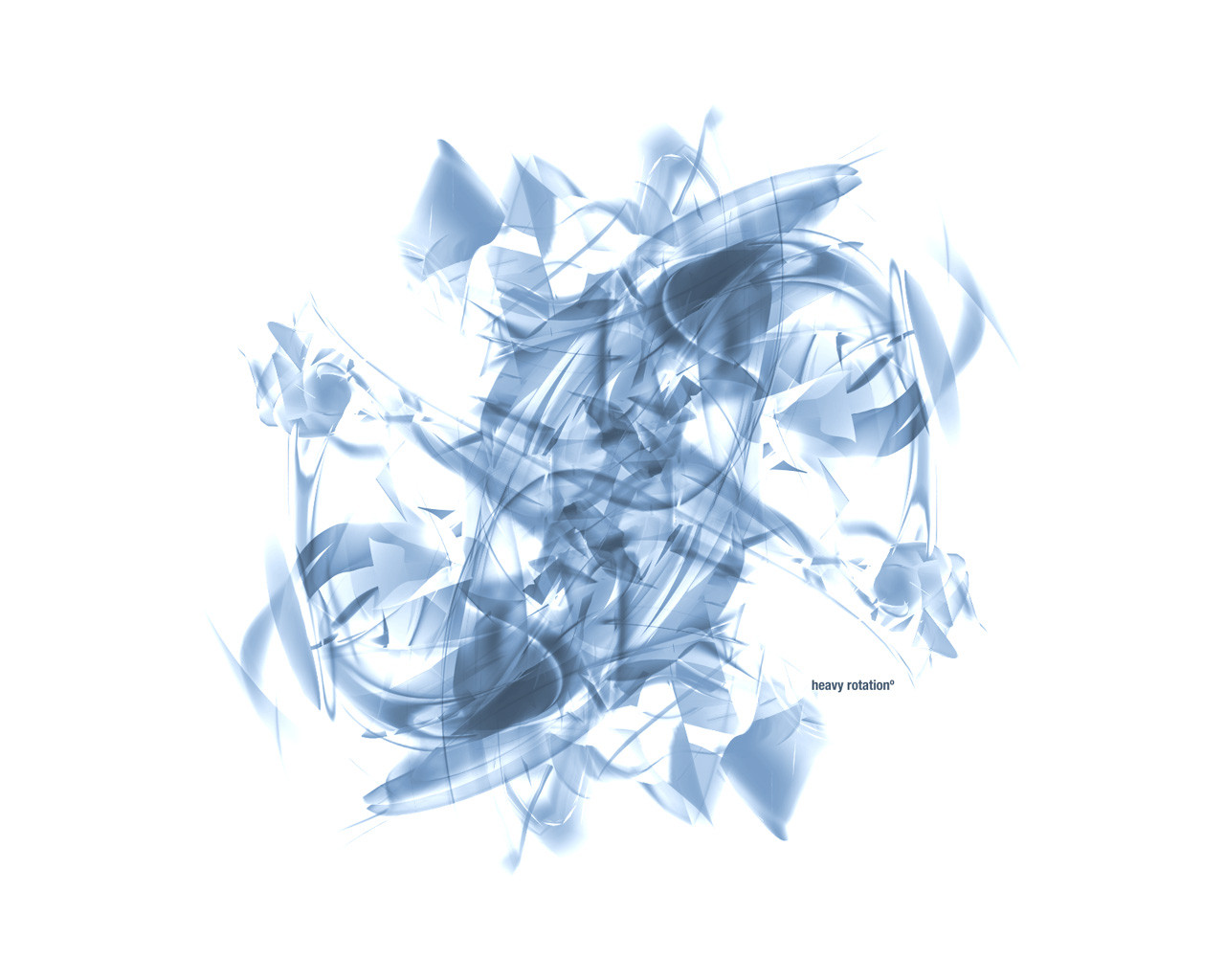
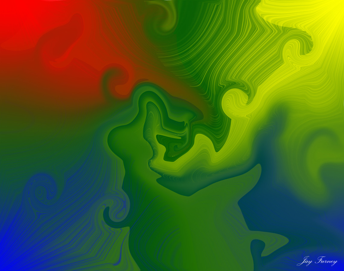
Description
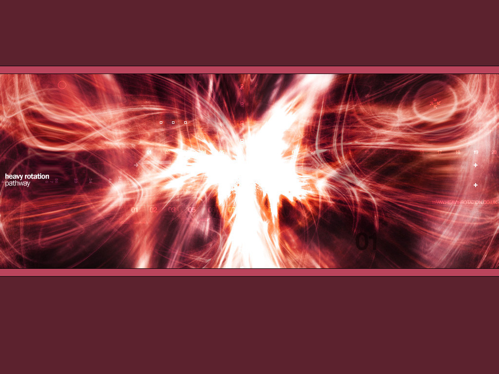
The zip includes 1024x768, 1280x1024 and 1600x1200 resolutions. You can also download it at 1280x960, 1152x864, and 800x600 from [link]Related content


Comments: 49

argh!! I've seen this AGES ago and I couldn't find it!! gah!! SO har-py!!
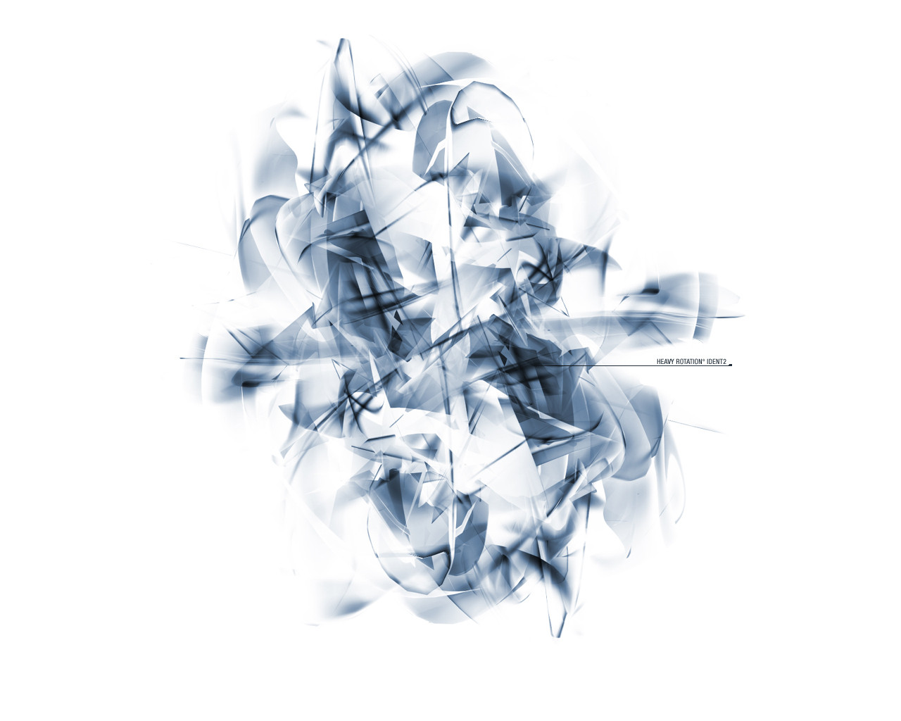
the playing with light and curves is just... awesome and breathtaking
it's like the light has turned blue and has become beautiful strands of ribbon dancing in the air, all twirled up and creating a sort of chaos
yay another new wallpaper! and another favvie!
-----
SnOwMaSk
. . . close enough for me . . .
mystuff@[link]
👍: 0 ⏩: 0

meant to comment on this piece much sooner. i really like the contrast between the angles and curves.the motion is terrific.love the choice of color as well.
👍: 0 ⏩: 0


It boggles the mind. Very Nice.
------------------------
tigert
👍: 0 ⏩: 0

I do like the motion here, the framing is kind of dull though, dead center, with perfect symmetry = not my taste, but there is some serious skill there. Keep up the solid work, i look forward to future works!
-g.host
👍: 0 ⏩: 0

. . . . . . . . . . . . . . . .
¦ Clean ¦ Light ¦ Diet ¦
¨¨¨¨¨¨¨¨¨¨¨¨¨¨¨¨¨¨¨
......¦3up¦......
The Design-UP
¯¯¯¯¯¯¯¯¯¯¯¯
👍: 0 ⏩: 0

::looks::
::learns::
::gasps::
Incredible! Just enough to keep interest without looking overloaded, and the rotations come out beautifully.
I must ask, where were these DD whiners when jark killed it for a day? Maybe he'll do it again - for good. It will deprive skilled artists of the attention that they deserve, but it will make a point to all of the whiners.
On a lighter note, well done!
👍: 0 ⏩: 0


great organic feel given off here.. love this style that you seem to have created... very nice to see you submitting here...good work
[ trodden ]
👍: 0 ⏩: 0

i'm glad your uploading your stuff here....that's gonna raise the level a bit
👍: 0 ⏩: 0

must be annoying to read all of these comments, i would probably like it a lot on the other hand, but man, this is my style of art, i love blues and details like this and this is just great man. great job on dd too.
[When your work speaks for itself, dont interrupt]
👍: 0 ⏩: 0

Sweetness and perfection. But i think its just a bit plain. I think you should work more on it, to bring in more elements and colors.
Great work, keep it up!
necron|designs v3
http://straumsheim.tripod.com
👍: 0 ⏩: 0


WHOA!!!!
that's enough. I think you get the point.
👍: 0 ⏩: 0

^ nuff said
[]---http://hankeyshangout.cjb.net---[]
[]---http://corefx.cjb.net---[]
[]---http://come.to/the_core---[]
👍: 0 ⏩: 0

this is amazing in my book. I dont know if anybody asked you yet ( i didnt want to read everybody's comment) but how in the world did you make that?
👍: 0 ⏩: 0

Wow! cool blue colors! i like it. Im gonna use it as my desktop wallpaper right away.
👍: 0 ⏩: 0

wiu... i like the colors!
congrats on the dd
- i am alive and tell you, that you are free
👍: 0 ⏩: 0

great work. the text has a great effect on it, making it more appealing. The use of colors is great.
Worthy of being a DD but not as much as to be called a trendsetter since it reminds me of stuff i've seen here already.
-------------------------------------
[acid_bird] http://acid.quadrent.net
-------------------------------------
👍: 0 ⏩: 0

Looks cool - like a mental bunch of flowers or something, and the minimal typography is just right!
----------------------------------------
He who stands of tiptoe is not steady.
He who strides cannot maintain the pace.
-- Tao Te Ching (24)
👍: 0 ⏩: 0

i like to look at it... heh maybe you should try to incorporate more into this.. this would make a neat background idf added to or made bigger making whatever you put in the forground look co0! this is rotation fun!
[ idlejam ] - [ iji ]
i changed my mind i take it back
erase and rewind
high descent anyone? http://www.highdescent.com?iji
👍: 0 ⏩: 0

All I can say is that this's an amazing piece, and it well deserves the DD (me most in liking of nice swirly stuff like this). I was in need of a new WP, and this one hits the spot. Great work!
👍: 0 ⏩: 0

I like white/blue wps, I like minimilistic pieces, I also happen to like the chaotic 3d amalgamation style, though I agree with Digi in that this wp doesnt interest me as much as I had expected. I actually like the thumbnail better.
The number of layers used, however, doesnt mean a thing.
==============================
I swear by my life and my love of it that I will never live for the sake of another man, nor ask another man to live for mine.
==============================
👍: 0 ⏩: 0


im sorry...but this doesnt move me in the slightest....and it looks like you have about 5 layers...i like the red wallpaper with the yellow that youmade...but this..i dont like
DIGI
http://www.awedigi.com/optic
👍: 0 ⏩: 0

wow thats beautiful man, very very nice work the design is great prefect lighting incredible design, id love to know the technique/programs used if ya get a chance
congrats on DD
Dont be anyones slogan, you are your own poetry
👍: 0 ⏩: 0


pixelphreak [2001-05-26 06:27:12 +0000 UTC]
shit dats nasty
great
___-_________________-_____
http://dekonstrukted.com/ - what world is this again?
👍: 0 ⏩: 0


Brillant.
Cheers
--------
Sir|Morphix -- Aim:Sirmorphixx
Asuka rocks, so does blue.
--------
The prophecy of blue is starting...
--------
👍: 0 ⏩: 0

amazing, i have both soiled and wet myself looking at this piece of art, i like it very much, even though its bright.. incredible technique.. im goign to dl it and tone it down a little though.. congrats
👍: 0 ⏩: 0

I think the balance in this one is great. The tone and feel of it are both hard and soft at the same time. But I am curious as to the placement of the words.
👍: 0 ⏩: 0

Simply...astounding...
--
TheWill
www.AOE2.com
www.focstudents.com
👍: 0 ⏩: 0

Man, i must say, i just love your work!
its so awesome, and i checked out your site, thats nice too.
Your goin in my favs hands down
Congrats on the DD, well deserved
--stylez
👍: 0 ⏩: 0


chaotic bliss. clean and crisp. fresh and awesome.
👍: 0 ⏩: 0


congrats on the daily dev. you know how much i adore blue on white! and a minimalist one!
go to his portfolio:
http://www.heavy-rotation.co.uk
👍: 0 ⏩: 0

Why, it's a blue tasmanian devil in full whirl mode! Cool stuff. I'd love to read a bit about the technique. Congratulations on the DD. I'm off to check out your other work!
👍: 0 ⏩: 0

I knew you'd win DD today..
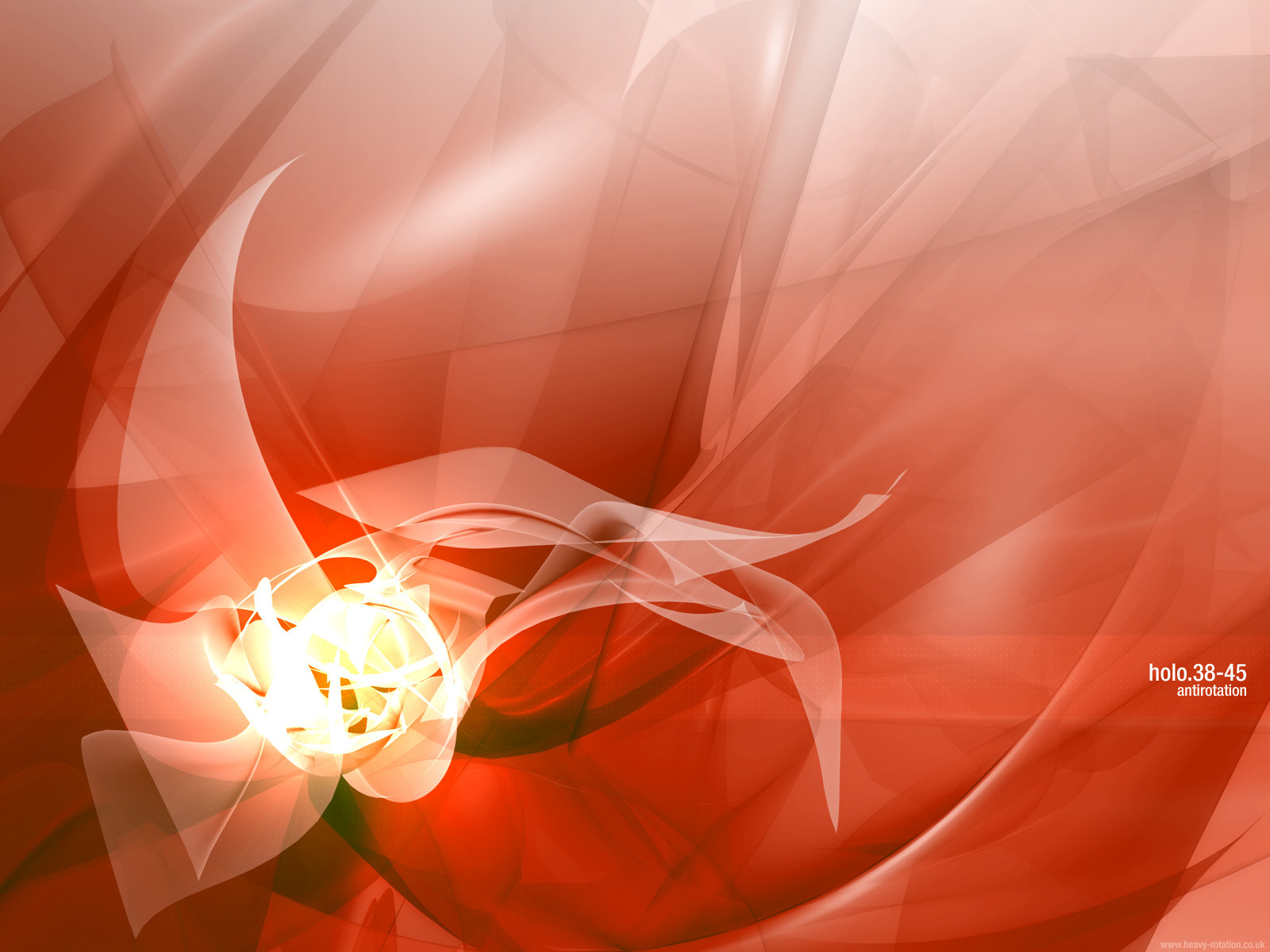
go check out his other walls, especially Holo, they are better than this one imo
virtual mirage : v2
http://www.vmirage.net
👍: 0 ⏩: 0


nice, like it, even though it is bright, this is like the first bright wallpaper i have realy liked. Nice Work.
----------------------
Digital Infection - http://digitalinfection.uptohere.net
----------------------
baddelini
👍: 0 ⏩: 0

now thats an awesome manipulation
Nicolas (Cype)
nicolas@dmusic.com
👍: 0 ⏩: 0

this just kicks the most ass ever. awesome work dude. keep this shit up dude!
👍: 0 ⏩: 0

holy shit....this is everything i love in a wallpaper!! lovely blue tones, amazing detail, motion and wait...a white background!! beauty mate!
º¤~tùñä~¤º
👍: 0 ⏩: 0

.
......
..
wow, kool dude.
nice.
.
......
..
👍: 0 ⏩: 0
Pretty cool, reminds me of scott's work
http://www.static5.com
virtual mirage : v2
http://www.vmirage.net
👍: 0 ⏩: 0