HOME | DD
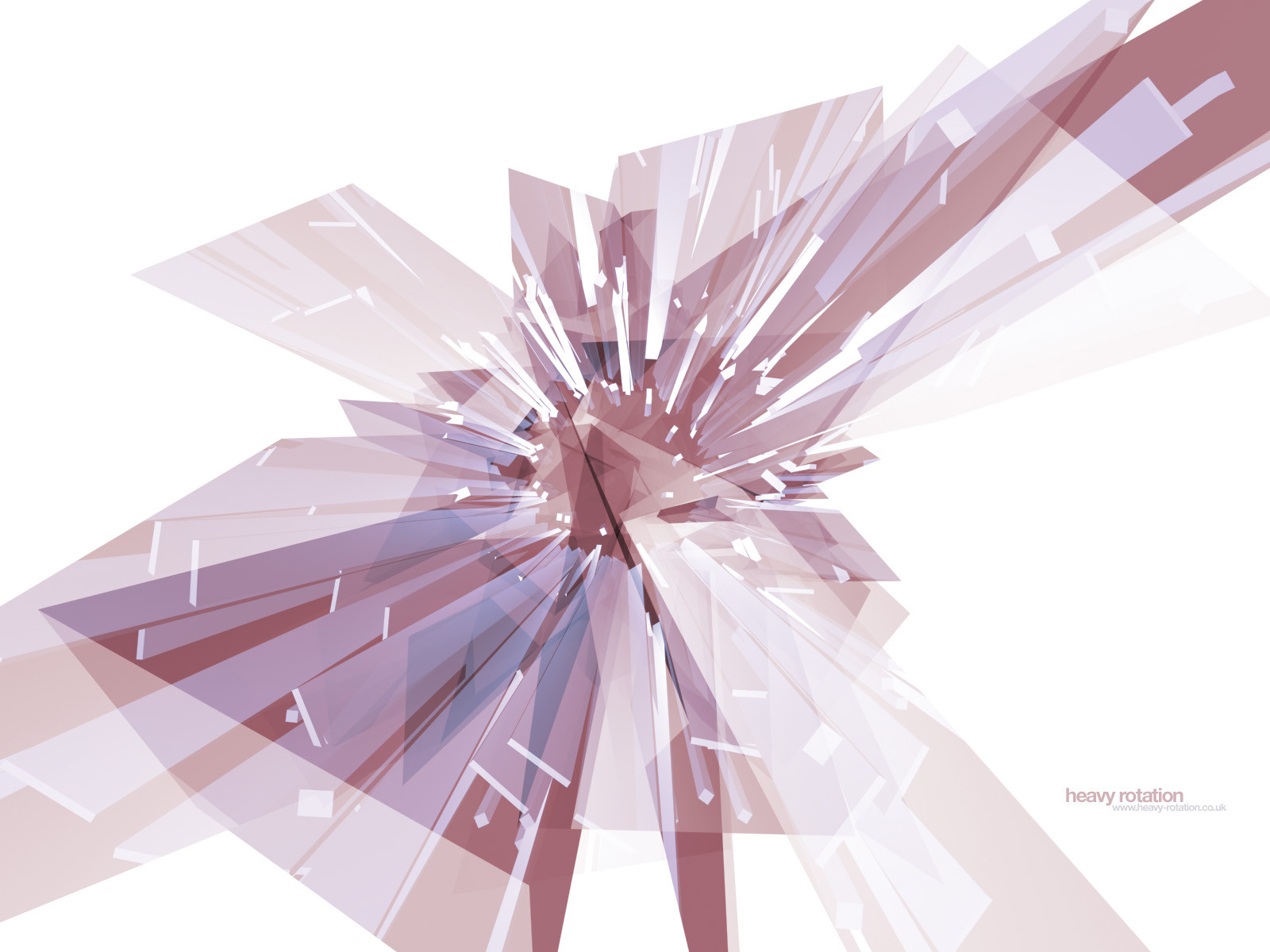
 heavy-rotation — Still
Published: 2001-05-25 13:13:14 +0000 UTC; Views: 528; Favourites: 0; Downloads: 219
Redirect to original
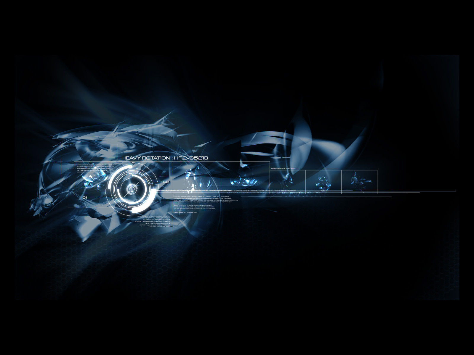
Description
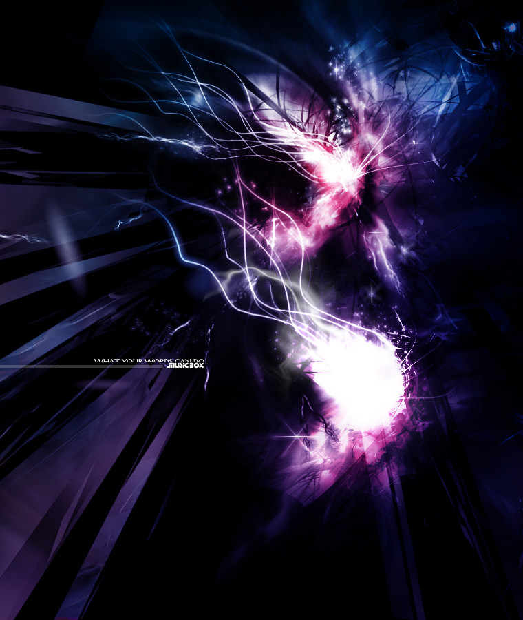
The zip includes 1024x768, 1280x1024 and 1600x1200 resolutions. You can also download it at 1280x960, 1152x864, and 800x600 from [link]Related content


Comments: 8

I like this one too. Its like some big digital, abstract flower, and the shards are the petals. Very nice.
-----
Family: The Other White Meat.
👍: 0 ⏩: 0

The hell with the rest, I really like how this came out. The convergence in the centre really brings a focal point to the image and there is plenty of space for icons.
Well done!
👍: 0 ⏩: 0

nice, not your best...but still very good....
[ trodden ]
👍: 0 ⏩: 0

hmm, it just looks a lot liek a crystal form that ive seen as a tutorial, this looks more like something that you must have done while waiting for the others to upload.. still way beyond things i can even approach doing though.
👍: 0 ⏩: 0

awesome shapes and color mixtures
Nicolas (Cype)
nicolas@dmusic.com
👍: 0 ⏩: 0

This piece would be ten times better if everything didn't come together in the center. It would be great if you coul everything to come together in like the top left corner or something. Leave a lot of white space. I think that would help.
I happen to like the colors.
Jeremy Sinon
--------------------------------
All of my desktops are for view at http://www.omnera.com
Check out my personal site at
http://www.jeremysinon.com
👍: 0 ⏩: 0

yeah... i liked it at the time i did it, but looking back, maybe its not so good afterall...
weak colours... the original grey was better (its a still from an aftereffects experimentation movie)
👍: 0 ⏩: 0

I don't like this one as much as the others i've seen from you. The way it all comes together at the center, I don't especially like it.
Still very clean and perfect for a desktop. ; )
virtual mirage : v2
http://www.vmirage.net
👍: 0 ⏩: 0