HOME | DD
 Heilos — Eclipse Feedback: Profile Page Adjustments
#layoutdesign #staff #eclipselayout #deviantart #eclipse #feedback #suggestions #userinterface #uidesign #deviantarteclipse
Published: 2020-07-09 20:17:26 +0000 UTC; Views: 4348; Favourites: 51; Downloads: 6
Redirect to original
Description
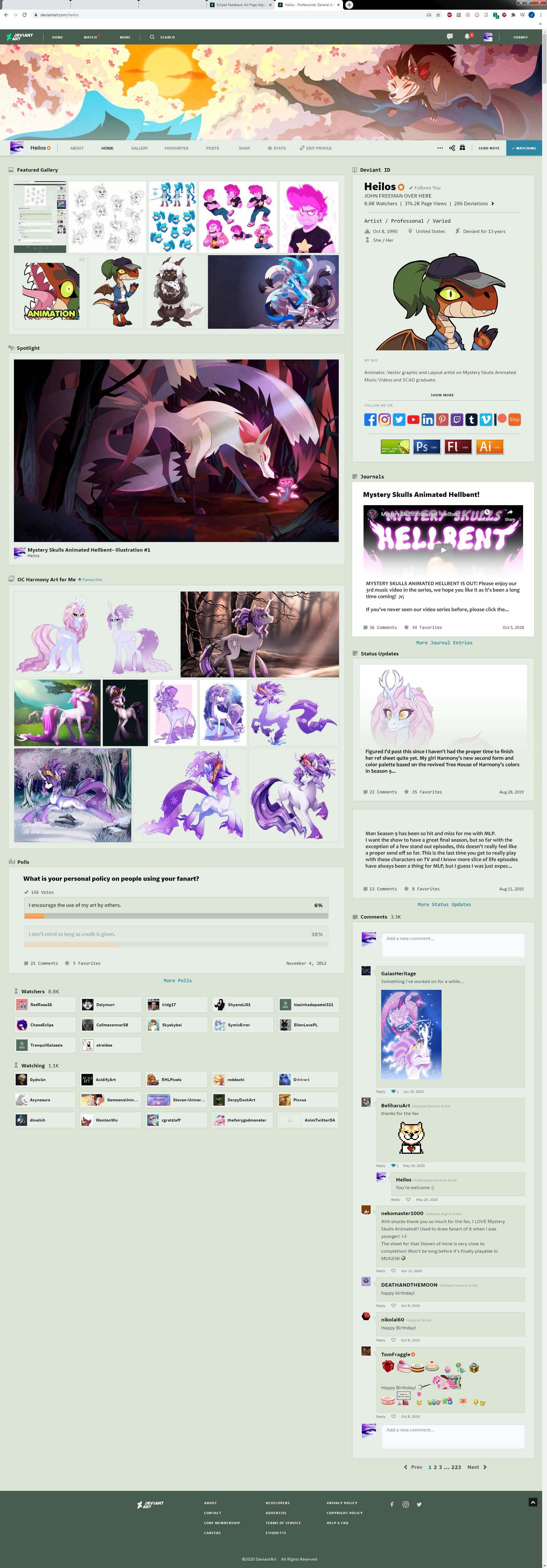
I'm submitting this so I can link to it when sending in feedback.Back with more Eclipse stuff, this time for the main profile page. As feedback is still being considered, I wanted to make additional adjustments to pages I currently have the biggest issues with. This one took a bit longer, about a few days on and off, since there was plenty of problem solving while moving many things around for hopefully a more coherent, compact and cohesive look. (Quick note: anything to do with the custom boxes, carousel gallery or customizable journal options I left out for the time being since I don't have much experience using those features from the previous site layout. Also my screen in this image is stretched to a 1920 x 1080 monitor).
Here's a list of what I changed:
1) Made the colored dot on "Watch" red so that it matches the notification bell color
2) Took all the UI elements and reduced the spacing between each piece so there's far less scrolling and a much more compact look
3) Added back in pagination with page numbers and ellipsis function that lets you click and choose which page of comments you'd like to see
4) Added an outline around all boxes including comments, galleries, journals ect ect...
5)Navigation bar under the banner now stretches across the entire screen instead of cutting off on the ends
6) Banner no longer cuts into the page layout under the Navigation bar. Makes the page look less floaty and cleaner.
7) Username and page stats have been moved over into "Deviant ID" aka the "About" box section on the right side of the page
8) Added a smaller user icon and username to the navigation bar on the left side similar to how is appears when you scroll down
9) Created and modified new icons next to each major section to give the profile page some more personality and flair
10) Added standard social media icons that are visually larger to see
11) Below the social media icons is an added custom section in the "Deviant ID" box where you could easily add fun images, stamps, and gifs
12) Removed the gradient effect in the "Deviant ID" box and instead left the "Show More" option for the user "Bio" to give off a cleaner look
13) Added "Edit profile" button to the Navigation bar. I want to view my page like a visitor would. Constant feedback from active editing tools/gradient overlays makes the page experience very frustrating
14) Added in a larger "Follows You" message in the "Deviant ID" section so it's clear who is a mutual follower
15) Fixed an issue with gif previews scaling up too large in the gallery section.
16) Separated out journals, status updates, and polls on the page. "Posts" button on the Nav bar still links to all post types, but now you can go directly to individual post types too
17) Polls were given a graphic overhaul to match the rest of the UI boxes as well as adding back in the orange bar color
18) Status updates and polls have a favorites option added. I think all post types should allow for comments, favorites, and daily view count
19) Embedded videos and images should show up again in journal posts and status updates. No current visual cue like before makes them look like straight base text posts and i'm less likely to click on them
20) Added an additional comment box on the bottom of the comments section
21) Not shown here, but I hope for movable widgets to make a return in the future or at least editing tools that let you move all the page elements around like the previous layout
Only thing that's odd on this mock up is that I didn't have the exact font available to recreate the text in the description, so if it looks a tad thick compared to the rest of the text, that's why. If you have any other suggestions of things that bother you about the functional or aesthetic parts of Eclipse, feel free to mention it in the comments as I might overlook something obvious that could be useful feedback.
LINKS TO OTHER LAYOUT MOCK-UPS
Eclipse Feedback - Art Page Adjustments
Related content


Comments: 16

👍: 0 ⏩: 1

👍: 0 ⏩: 0

👍: 1 ⏩: 0

👍: 2 ⏩: 0

👍: 3 ⏩: 1
👍: 2 ⏩: 1
👍: 2 ⏩: 0

👍: 1 ⏩: 1

👍: 1 ⏩: 1
👍: 0 ⏩: 0

👍: 1 ⏩: 1
👍: 0 ⏩: 1
👍: 1 ⏩: 0

👍: 3 ⏩: 1
👍: 3 ⏩: 0