HOME | DD
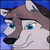
 Hellknight1000 — Fall Breeze

Published: 2010-02-19 06:46:23 +0000 UTC; Views: 4935; Favourites: 202; Downloads: 0
Redirect to original
Description
Something I originally made for #ILikeASSClub back in the fall. But I never got around to finishing it until now. XDHope you like. <3
Related content


Comments: 74

Wow, thanks for taking your time for such a massive wall of text. I truly appreciate it and the advice and comments you have to share.
👍: 0 ⏩: 1

But omg I did tons of mistakes! >_< I should have read it once before hitting send. I hope it wasn't too hard to read lol
👍: 0 ⏩: 1
Haha, gotta love when you do that. XD
It was fine to read, don't worry. Again, I appreciate it.
👍: 0 ⏩: 0

Overall

Vision
Originality
Technique
Impact

Hello!
First off, I think you did a good job with the picture. The colours are what drew me to this picture to take a further look at it.
THE GOOD: I think you are on your way. Again, I really enjoy the use of colours. It is a very soft picture and easy on the eyes. I don't have to strain to look at the picture. I also like how there is a certain movement to this piece. I can feel the character turning his head around and the wind blowing. You did a very good job drawing the back view and the back view is very difficult to draw. e.deviantart.net/emoticons/e/e… " width="15" height="15" alt="
")
WHAT NEEDS IMPROVEMENT: While I do love the colours, it might help to use blue-grays or other hues of grays instead of a true gray. This is a tip that I learned, just as one shouldn't use true blacks or whites. It helps the eye more. The human eye is a very picky thing! e.deviantart.net/emoticons/e/e… " width="15" height="15" alt="
e.deviantart.net/emoticons/e/e… " width="15" height="15" alt="
All in all, you did a great job, and with practice, I'm sure each work will be better and better! Thank you for sharing this with us! e.deviantart.net/emoticons/e/e… " width="15" height="15" alt="
👍: 0 ⏩: 1
Yaaay critique~
Many thanks for the tips and such, I'll hopefully be able to work hard and improve over this, keeping everything in mind. Digital art is not my forte, though I've been trying my best.
Maybe something else I can improve on is making her look more feminine, since a lot of people have actually been confused or wondering if she is male or female. XD
I'm glad you like it! Thanks again~
👍: 0 ⏩: 1
No problem.  (Smile) - :)")
As for making her look more feminine, I can't see the picture right now since I'm on my message page, but some tips for drawing the ladies involves lots of softer, curvier lines (which is hard for me because I have sharp angles in everything). For generic male torso shapes, I tend to draw a kidney bean. For female generic torso shapes, I tend to draw a figure 8.  - :D")
It can take awhile to get used to digital art. Just keep at it and it'll feel super natural soon! Actually, I'm the opposite. I can't do traditional art very well! LOL It just requires getting a feel for digital (or traditional, I guess).
Good luck!
👍: 0 ⏩: 0
Looks incredibly beautiful and gives a Native American feel to it just looking at it.
👍: 0 ⏩: 0


Yup! A wolf and husky sort of character. ^^
👍: 0 ⏩: 0


I definitely like the background. More than anything I could do.
👍: 0 ⏩: 0


wow really nice work love it by why is only the head outlined??
👍: 0 ⏩: 1
I still need improvement on my colour choices I guess. XD
Thanks~
👍: 0 ⏩: 1
It still looks cool though ^^
👍: 0 ⏩: 0

well I don't think you heard me when i said ............... PINK FAGGOT
👍: 0 ⏩: 1
👍: 0 ⏩: 1

 - :P")
XD Very mystic indeed. >:3
👍: 0 ⏩: 0

not bad, but your airbrushing skills could use some work. when using the graphics tablet to air brush and give the final tone and shade to your picture, shoot to kill, make one good clean stroke that flows over the area you want to shade or highlight keep trying even if it takes a few attempts to get it right. avoid making your highlight color to opaque or to transparent, you want it to be just thick enough for your audience to notice that's its there.
also avoid crossing strokes, on the same layer, this can lead to making a perfectly good stroke too opaque thus ruining it. instead, make different strokes on different layers and use the eraser to set on low opacity to blend the noticeable are into consistency. a translucent sweep of black can be used to add depth to the picture and a low opaque eraser setting can get rid of the areas where the shade should not be...
your making great progress and your line-art is perfect but don't let coloring bring you down, keep practicing and you'll soon find that both it and shading is way easier than I made it sound.
👍: 0 ⏩: 1
Holy crap, thanks for that~
I'm a n00b digitally painting things, and I definitely agree with what you're saying too. Something I just need to work on... My professors here have been running through a lot of neat tricks and they DID bring up about playing with the transparencies and whatnot.
I think I need to stop using the watercolour tool so often. XD
👍: 0 ⏩: 1
what program are you using, corel?
👍: 0 ⏩: 1
I use Paint Tool SAI. Some japanese program I downloaded off Google. XD
👍: 0 ⏩: 1
I've heard of it... how is its work flow compared to PS or open canvas?
👍: 0 ⏩: 1
It's like a really really simplified version of PS, and relies solely on paintings rather than photo manipulation. Doesn't have NEARLY as many options available to you, though the quality of the lines and colour are much more crisp and clean compared to PS.
It's a very cool program~!
👍: 0 ⏩: 1
but it still has layers and opacities right?
👍: 0 ⏩: 1
Oh yeah, of course. :3 So I can easily apply your advice to whatever I want to try next~
👍: 0 ⏩: 1
if you ever need any help just ask.
👍: 0 ⏩: 0

Very nice man. I remember when you were first showing me the sketches of this ^^
I Really like the concept of it, and it'll stand out imo of the fact it's less " Perverted " than most submissions to the Assclub, and more of a serious setting I suppose you could say ^^.
A couple things I'll mention though. While I know it's possible for just 1 mountain peak, I think a ridge and other mountains farther in the BG would have given in more depth. Maybe Clouds as well ( not necessary, but just an idea, considering it could be a clear sky ). I also agree with Tony about the base color of the mountain in the BG. Also for another 3D effect, considering that there seems to be a breeze with her hair, and it being a Fall related pic, and the title itself for that manner, that maybe some leaves blowing in the wind would be a nice touch ^^.
all in all, I like it alot :3. I really like the tones/color in it, and the concept in general

👍: 0 ⏩: 1
Haha thanks for the awesome comment man. XD I'll definitely take what you and Tony mentioned into consideration for next time. ^^
And flying leaves were actually supposed to be in the pic originally. I guess I forgot about them. 
👍: 0 ⏩: 0

Holy wow dude O.O The detail is so amazing... Nice. Im starting to like this kind of art.. You warped my mind D<
👍: 0 ⏩: 1
CONVERSIONS?? NO! NOT THIS SHIT AGAIN. DDD:
XDDD Thanks.
👍: 0 ⏩: 0

Okay, I'm just going to skip the part with the Witty Phrase and just press *fave*.
👍: 0 ⏩: 1


I'm sure you've realized by now (42 favourites as it stands), but this is very very well done.
👍: 0 ⏩: 1
Yeah I did notice. Flattering. o_O
But thank you.
👍: 0 ⏩: 0


your too good.XD I really like the pose,it's really...passionate.When I saw this pic,I saw her eyes they were piercing my body into my soul telling me how much she wants me.lol but that's how i see it personally,i like the pose and the passion in this. faved.
👍: 0 ⏩: 1
Haha, it can be interpreted however the viewer wants to see it. XD
Thanks a lot for the comment~
👍: 0 ⏩: 1

Nice job man, I really like what you did with the mountaintop in the background and how it combines with the lighting to give the effect of the sun just barely peeking over the top.
I have a bit of critique to give on your shading and highlights, though
The way you have the mountain as one solid color really makes the background feel two dimensional
I think if you made the base of the mountain darker, it would seperate the foreground and background better and give the whole composition a bit more depth
also, watch using pure white for your highlights and lines, especially on the tree and her back
light is not often pure white, it carries with it some of the color of the object it reflects off of
so when you're hilighting the brown of the tree, use a light brown or orange-brown depending on your light source, and save the white for mabye a very shiny edge if the bark is wet
and on her back, use a light grey because it will combine better visually with the fur of her back, and not seperate the areas of her body with the bright intensity of pure white
man, sometimes I wish I had a sub so I could write this in the critique section instead of leaving these massive comments XD

👍: 0 ⏩: 1
Thanks man!
<--- Fails at backgrounds.
But I'm trying to get better. XD Thanks for the tips! For that and the highlights too. I'm new to highlights and tried to reference them a bit.
And I could give you a 3 month sub if you like. It's only like, 10 bucks.

👍: 0 ⏩: 1
Yeah, I'm still pretty bad at shading too >_<;
my 2D design class is really helpint though, with color theory and everything
If you ever want any more advice or citique, just ask. I'd be happy to help
Thanks for the offer, but I think I might just get a year long one after my next paycheck and as soon as my computer is fixed
👍: 0 ⏩: 0

You did the tone of this picture really well. Also her facial expression really helps with her character.
Great picture man.

👍: 0 ⏩: 1
Thanks a lot for the comment~! <3
👍: 0 ⏩: 0
| Next =>