HOME | DD
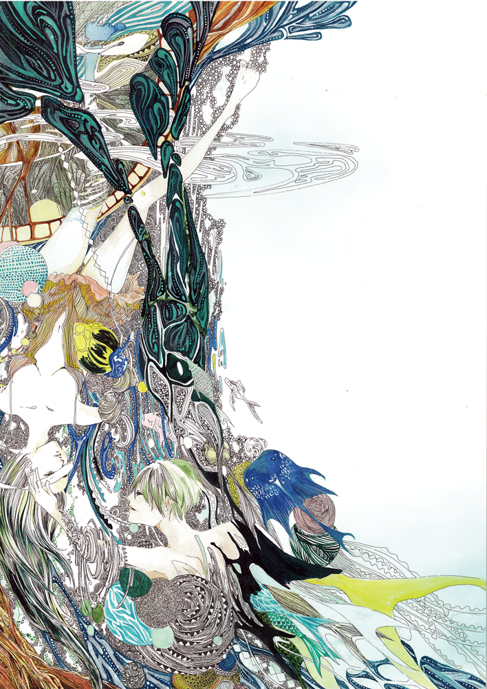
 Hellobaby — Deviantart Logo
#deviantartlogo
Published: 2014-12-05 02:20:07 +0000 UTC; Views: 30328; Favourites: 1463; Downloads: 142
Redirect to original
Related content


Comments: 92

This Logo is very Artistic... Then again, what site am I on. I like the old logo because it was familiar, however, the new logo is larger, and different. It seems to be to much? I am not sure what it is that makes me feel that it is to large to be this website logo. However, this is an art website, and that is ok with me.
👍: 0 ⏩: 0


me too....
the old one is better for me ><
👍: 0 ⏩: 0


I love it~
It should be an artist meme.
It's just that against the black background we can see imperfections in what I suspect are your masks maybe?
We can see a white shadow (right of the girl's head) and a shadowy stroke (near the bird).
👍: 0 ⏩: 1

Change it, thank you. I don't even know where I should put it in

👍: 0 ⏩: 1
Well it would really work as a meme.
I could imagine it on every artist's main page. It would be awesome~
👍: 0 ⏩: 0


I like what you did with the new logo. It's a lot more interesting.
I'm not sure how I feel about the new logo it's weird.
👍: 0 ⏩: 0

okay, I'm gonna say it. I don't get the new logo. It doesn't make sense to me. Somebody please explain why the old one or some variation of it wouldn't work?
👍: 0 ⏩: 4

Actually... It's a "d" on the left glued to a "A" on the right... You can see briefly how they got to that point if you watch the video here youtu.be/gg77AHDEHac on the 7th second.
I didn't got it before and I think it's far fetched.
Pretty art is pretty though!

👍: 0 ⏩: 1
and yet somehow it looks like a Z..or something. I don't know. I still think its pretty stupid and borderline intentionally confusing...Or maybe just confusing on purpose. To "Make people think" which is incredibly pretentious if you ask me.
👍: 0 ⏩: 1
It's true that the “we love it because people might not get it right away” threw me a bit off because that's just... counter-productive. Don't they want people to understand right-away that it's them?
That said, that's the change I least expected and that is least needed. All in all, I consider its importance to be minimal but they lack artists with words/communication within the staff.
👍: 0 ⏩: 0

Yeah. It looks more like a swastika than an A to me.
👍: 0 ⏩: 1
Or a "Z" as JollyJack pointed out here.
jollyjack.deviantart.com/art/S…
👍: 0 ⏩: 0

I don't get it either. I'm not against edgy modern art but this doesn't seem to say 'welcome to DeviantArt' more like... its a jab that the site is half of what it used to be.
👍: 0 ⏩: 1
Half is being generous.
👍: 0 ⏩: 1
Well its to point out that we're getting half a logo. But then perhaps yeah I am being generous.

👍: 0 ⏩: 0

well its half an "A"… of "art" …
👍: 0 ⏩: 1
Half of an A...so half of the art? *looks at the front page and see half of it is naked women in suggestive poses taken by cell phones* Yeah, that is actually really fitting. Well at least dA is sort of acknowledging what is has become. Even if its on the subconscious level.
👍: 0 ⏩: 1

Look up at the actual DA logo...
Hellobaby just did the same logo, but filled things in with her art. Both the 'd' and 'a' are present. Also, you can always turn the mature filter on, and get more actual art that way.
👍: 0 ⏩: 1
I'm aware of the meaning and all that, I simply this its stupid and full of itself. The problem is there is often great art with mature subject matter or nudity. I turn on that filter and I'm more likely to miss it. Its not a problem with maturity as much as its my problem with smut on this website. The photography category on this site is practically a porn thread. Nudity in photography is fine but I think at some point a line needs to be drawn. Art is impossible to define objectively but too much of these photographs only serve to draw attention or be jerk off material. That or it gets so pretentious that you can almost see the artists disappear up his/her own ass.
👍: 0 ⏩: 1
I realize that you may miss some great works of art, but that's when following people really becomes important. I make sure to look for the artists that I like that take/create pictures with potential nudity and follow them, so that I don't miss one single piece. It sucks that doing this whole roundabout thing is the only way to avoid the horrendous crap on Deviant, but it is what it is. :\
👍: 0 ⏩: 0

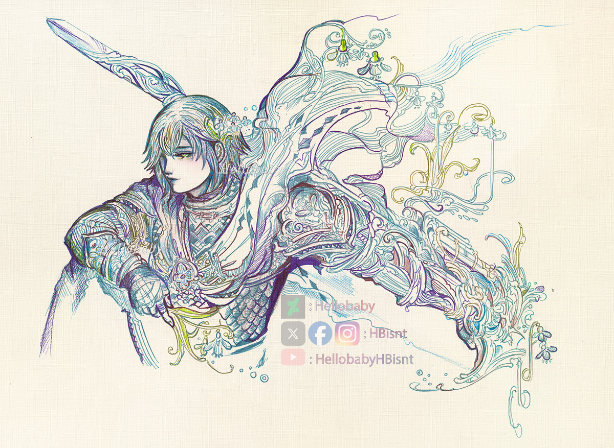
Some of white is not properly erased around the icon - I'm just saying because it disturbs a little and it's a shame for such a pretty picture.
I love your drawing here, it so much fit the shape of the icon <3
👍: 0 ⏩: 0


")

I love it. Deviantart is coming to WiiU & 3DS at Nintendo eShop. We've so happy for it.
")
👍: 0 ⏩: 0

It says deviant fart lol but seriously having a character in it would make the logo less hateable.
👍: 0 ⏩: 1
Then this would not be logo anymore, it would be a drawing. Logo needs to be simple and easily recognizable at the first sight.
 (Smile)")
👍: 0 ⏩: 3

I have no idea what the logo is supposed to represent, and I think that is unarguably a bad thing. If I show it to people, will they understand? Not really, because it looks like... I dunno, the letter z with a slash through it? Too abstract.
But anyway, its just a logo. I only wish the people running this place could be satisfied with their appearance and deal with the things the community actually cares about. A feather won't break a camel's back, but the camel isn't happy you are ignoring it.
👍: 0 ⏩: 0
Doesn't make the logo any less terrible.
👍: 0 ⏩: 0

I just want to say that's not always the case: see the Final Fantasy Logos - they're very easily recognizable regardless.
👍: 0 ⏩: 1
To be honest I always had a giant problem with Final Fantasy's logo. ^^'
It always did seem like a unreadable scribble to me and very unprofessional.
Also it was first created long long ago, and Design developed a LOT since then(but they didn't want to change it - maybe because people are too used to this one already-it's ok) - nowadays this(what I said) is how the logotype works. Most big companies redesign their logotypes to the more simple and often with hidden meaning(if they revamp at all of course) because this is how brand identity design works nowadays - it's possible that it will change in the future, but this is how it is for now.
I did study design and have a degree in it so I'm not making these information up.
Also some examples:
1.bp.blogspot.com/-WQGrmjsfEwQ…
blakesnow.com/wp-content/uploa…
cdn1.tnwcdn.com/wp-content/blo…
www.logodesignsense.com/blog/w…
It evolved from obvious drawings to simple icons with meaning.
👍: 0 ⏩: 1
I'm not questioning your degree in study design or that logos haven't changed/simplified through the years - that's not the issue here.
"It evolved from obvious drawings to simple icons with meaning."
Sure, that's true for many things but there are examples of logos that do feature more complex things (e.g. Sun Maid and even then she has undergone simplification, however the premises of the logo remains the same) and for you to originally dismiss them and say "Then this would not be logo anymore, it would be a drawing" is remiss. You are definitely correct in that they have to be "easily identifiable" for certain.
And that brings up my personal problem with the deviantart logo as it is a simple icon, but I have no idea what meaning it's supposed to have (to me, it looks like a piece of bamboo). However, I disgress as this delves into a completely different direction.
(Note, I have never once said I do not like simple icon logos, merely stating more complex logos do exist and are still easily identifiable all the same.)
👍: 0 ⏩: 1
I must agree with you here. ^^
👍: 0 ⏩: 0

I love the version you did, but the new logo just sucks all sorts of everything.
👍: 0 ⏩: 0


<= Prev |