HOME | DD
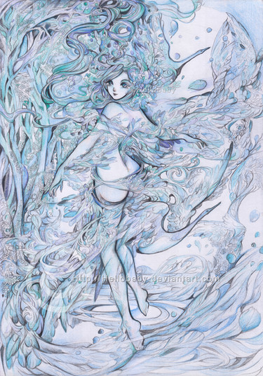
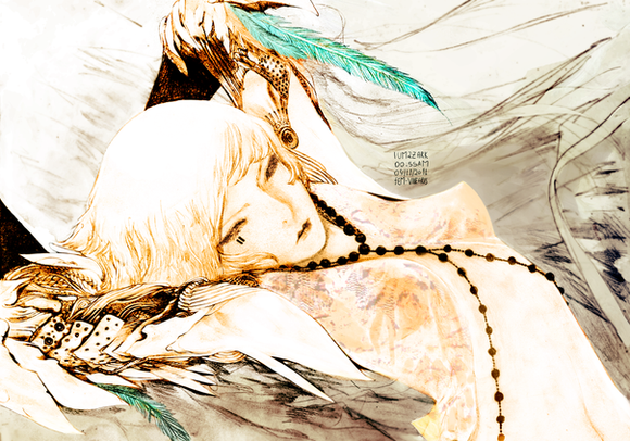
 Hellobaby — Deviantart Logo

#deviantartlogo
Published: 2014-12-05 02:20:07 +0000 UTC; Views: 31485; Favourites: 1460; Downloads: 142
Redirect to original
Related content
Comments: 92

I almost prefere it in white.. its just so hulk green
👍: 0 ⏩: 0

Definitely have thank LostKitten for featuring this and leading me over to your art domain! I simply love your style. This is such beautiful work!
👍: 0 ⏩: 0

Brilliant! I love the use of the new symbol and your art! It takes courage to post something with the new logo right now, well done!
👍: 0 ⏩: 0

how do i put this? I like the design but i don't like it as DA's design? if that makes sense. =\ other than that this is beautiful!
👍: 0 ⏩: 1

Well I can see both the 'd' and the 'a'. Just pay attention people, geez.
Nice job again, Hellobaby!
👍: 0 ⏩: 0

A logo? Oh well, I am new with what yet is going on, but it is art and I love your style "Baby"! Hats off to you. You are unigue on what you do! I haven't seen anoher logo like the one you created, me, personally do not like sameness. Comformity is like a still life, yeh, it is just there! I prefer the vexing of things, . . . never saw a sunset or sunrise that was the same, . . . as to your art, you are definitely a sunrise!!!
👍: 0 ⏩: 0

See I'd prefer this- the green of the logo being negative space and the black being solid- so the space in the middle is like a "looking Glass" since they did use the "rabbit hole" reference...
it would make a bit more sense but I still am not feeling the new logo due to it being, well, unrecognizable. If it was a new company I can see it, but dA has been around for YEARS. It's not new.
Any who- that and the new logo looks too similar to a russian company's logo [there's a journal pointing it out] that I'm pretty sure in the long run it'll mess things up...
👍: 0 ⏩: 1

I agree with you so much. So much.
👍: 0 ⏩: 0

How can you make such an ugly logo into such estatic beauty?
👍: 0 ⏩: 0

I REALLY do not like the new logo, but if they used this drawing of it, I wouldn't mind at all!
👍: 0 ⏩: 1

They're trying to fool us into liking something absurd and not representative of us at all. If it were just a random shape, it'd be nice, but here I find this ...vicious. It disturbs me a lot what they're doing.
👍: 0 ⏩: 0

You draw beautifully like always, but the new logo is not to my liking though. On my search bar where it is sized down it looks like a badly drawn green cross made with crayons and it is not the easily spotted logo it sued to be, which is the whole point of a log. That it stands out and is easy to recognize. This new one does not stand out as recognizable and I find myself searching for where to click.
👍: 0 ⏩: 0

I don't why why But I this new logo looks to sterile.
👍: 0 ⏩: 0

I actually do not like the new logo, but your picture makes it suck less. Great work!
👍: 0 ⏩: 0

Why did you scare me?! When I opened DA, this morning, I saw a different logo and I thought "what's happening?! This isn't DA!!!".
Ok, it's DA 


Love it!
👍: 0 ⏩: 0

This is amazing! So captivated by the phenomenal design!
👍: 0 ⏩: 0

Your art looks most beautiful, always, however the logo is very bad, does not relate to da at all (before I read the explanation I was like "what the hell is this weird Z symbol mean?").
👍: 0 ⏩: 0
| Next =>
