HOME | DD
 henryporter — Samurai

Published: 2005-07-06 02:09:16 +0000 UTC; Views: 25742; Favourites: 297; Downloads: 717
Redirect to original
Description
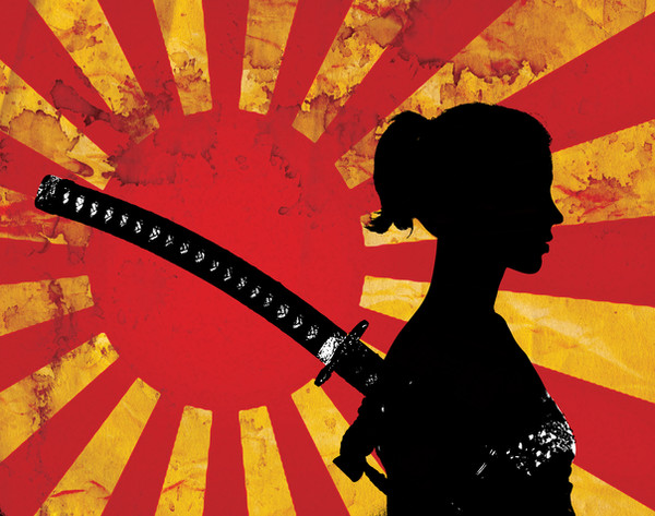
Used a sketch by an unknown artist as a reference for the figure.The symbol in the sun is tomoye, it signifies the revolution of the universe (I think it's shintoist but I could be wrong).
The Japanese word says "samurai" (so I'm told!).
Not too confident in my vector work, hence the advanced critique option selected... please comment!
Related content


Comments: 25

👍: 0 ⏩: 0


I like it. I do alot of vector work and I find that I am most satisfied with the simple smooth works. I think the Samurai silouhette looks great, maybe more definition in the face.
👍: 0 ⏩: 0


")


thats high praise, there's a lot of samurai images on DA!
Thanks
👍: 0 ⏩: 0


sugoi! the symbol in the sun is of the ryukyu kingdom, there are three parts of it. thats all i know.
👍: 0 ⏩: 1

Its called a Tomoye or Tomoe. It means universe. And is a Shinto symbol.
👍: 0 ⏩: 0

I like this piece very much. The colours are excellent; they fit together and blue gives a calm effect which (I think) is perfect for this picture. Using different shades on the hills gives a more natural feeling, the last one almost blending with the sky (like it does in misty mornings when the horizon line disappears).
There was one thing that I noticed though: the sword is too long to be a wakizashi and too short to be a katana. It's a small thing in a big picture and not worth fretting about since it could be a perspective matter or even a completely different type of sword 
Adding contrast could also serve it's purpose as it would become more energetic and aggressive (especially because of the red sun) but the calm mood would decrease. So it depends which one you're aiming towards more.
Overall, good one, good one
👍: 0 ⏩: 1
Wow, thanks for the fantastic comments, it's really cool when someone actually takes the time to properly critique.
In reference to the washed out look of this, I was trying to achieve "misty" without making things too obvious and cluttered.
I hadn't noticed the issue with the sword but you are totally correct, I think I'd probably imagined it was perspective but I see now it doesn't quite work. I may have to look at fixing that.
👍: 0 ⏩: 1
By all means  (Smile)")
👍: 0 ⏩: 0


The Japanese word says "samurai" (so I'm told!).
[link] It does.
wikipedia is excellent site - for everything (Japanese stuff too)
👍: 0 ⏩: 0


Very nice! I don't know much about vectors but i think u did a great job with this!

👍: 0 ⏩: 0

looks to me like you're good enough with basic general shaping of vector objects to move on to something more detailed, hint hint
you have a very diverse gallery, i'm looking forward to seeing further submissions!
")
👍: 0 ⏩: 1
Thanks for the comment, my gallery is only diverse because I get bored easily!
Took your advice and tried some more detailed vector work but I didn't want to lose the simplicity, check it out here: [link]
or ignore this if you're not that interested!
👍: 0 ⏩: 0

nice vector, clean and simple. but i do notice youre kinda modest with the vector, dont be afraid to explore too much, although it can be frustrating and shit, i usually have a hard time with it, but the best way to learn is to just fool around like crazy
👍: 0 ⏩: 1
Thanks for the comment.
When you say modest do you mean that it's very simple, nothing too intricate? I always struggle with natural-looking curves, I am probably just over-working them though, I have a really bad habit of tweaking...
👍: 0 ⏩: 1
hmm you know, im not exactly sure what i meant, im pretty tweaked up on painkillers right now.. i think i was thinking bout the hills mostly, you could give them some more character or maybe add even more.. altho those colours make them look very nice
👍: 0 ⏩: 0

