HOME | DD
 herms85 — Backstage Awkwardness

Published: 2005-12-16 21:04:53 +0000 UTC; Views: 11024; Favourites: 99; Downloads: 967
Redirect to original
Description
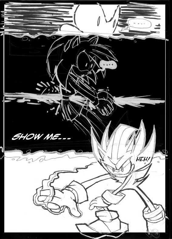
Page 3 (of 4) of a redraw of Sonic the Hedgehog #153's "Songoose" story. Redrawing from another artist's visual material isn't at all like drawing from a script, but this was just practice and layout portfolio. (Wink)")
Sonic readers are notorisouly divided on who True Blue happens to hook up with. The bigger schism being in the Mina/Sonic/Sally area. Every comic has its "comic geek" arguments. Gray Hulk or Green Hulk? Gwen Stacy or Mary Jane? Ultimate or 616 Marvel? Dick Grayson or Tim Drake? Etc. Sally or Mina just happens to be Sonic's.
")
"Songoose" seemed to be set up to address Mina's relationships with both Sonic and current beau Ash. Ash isn't very secure in their relationship - he gets jealous. And usually emotes this by folding his arms and scowling. Alot. So the big thing I wanted to work with on this page wasn't layout so much as character body language.
In panel 4, I wanted to change it so that Ash catches Sonic and Mina still embraced. Yet he's leaning against the doorway. Trying to act cool, like it doesn't bother him.
In panel 5, he's got his girl on his arm. He's smug. Confident. Mina adressed him as her boyfriend first, as opposed to her manager and THEN her boyfriend, like she used to. That "I got the girl" attitude doesn't last long though, as...
In panel 6, Ash's got a hand on her shoulder. He's between her and Sonic. He's back to glaring, and he's ushering her out of the backstage room.
This was about as "traditional layout" as I got in these samples. Boxing in Mina's face to break the top panel into Panels 1 and 2 was a decision I was back and forth on. Judging by the original page, chances were good it was scripted that panel 1 was to be a closeup of Mina's face. So how do I follow that AND establish a backstage room with the presence of the other characters? The box-in seemed the best move.
Ash's character design was based off of Jon Gray's original model for him, when he designed him for StH #134.
StH153::"Songoose"
Written by: Karl Bollers
Originally drawn by: Ron Lim
Related content


Comments: 18


Keep it coming! Keep it coming!
I shall never stop nagging you about the lack of color. It would look SOOO cool.
👍: 0 ⏩: 0


Too bad I havent gotten my hands on any of the latest issues... ")

Anyways, it's still looking mighty good...  (Smile)")
👍: 0 ⏩: 0

This is what the comics have turned out to be? Who Sonic shacks up with?
No wonder Sega is turning to Shadow. He's too emotionally distant (and naiive) to bother going with anyone who isn't blonde, human and dead.
Oh wait that's right. I saw in one comic I bought there's a Maria look-a-like. DAMN YOU WORLD!
Nice work as always.
👍: 0 ⏩: 0

XD that's crazy man! I like the guy with the angry smiley on his shirt
👍: 0 ⏩: 0

Loving the detail as always man. You got me updating my portfolio. But I don't have the guts to try archie. I'm going to try image and darkhorse.. and the company who does gold digger. ( I think my chances with them are better.) ^^ Good luck.
👍: 0 ⏩: 0

and also...freaking awesome layout/art stuff. is nice.
👍: 0 ⏩: 0

Man that is just Awsome! im just i awe with what you can do!
👍: 0 ⏩: 0

Most excellent re-representation of that page. I loves it! ^_^
👍: 0 ⏩: 0

whatz up matt....hightower.have a kewl christmas...hightower
👍: 0 ⏩: 0

Wow just wow
you better be older than me cuz your just too good to be my age...
just wow
👍: 0 ⏩: 0

Very awesome! I can definately see the awkwardness in those last two panels. XD Mostly just in Sonic's expression.
I love how you put so much detail into a layout and not make it look cluttered. x_x I writhe in envy. Gyarrgh.
👍: 0 ⏩: 0

hmmm....you're a lot cleaner than me. Nice juxtaposition.
👍: 0 ⏩: 1

Thanks man! I keep it clean by doing all my sketching stuff on an 11x17 sheet of printer paper.
")
👍: 0 ⏩: 1
See, now you got me into wanting a light table!! X|
My stuff... red is everywhere! I cannot seem to focus on one drawing for reproduction for that long. Stupid ADD!! XD
👍: 0 ⏩: 0