HOME | DD
 HernanCabrera — Roman 2

Published: 2012-04-17 22:24:13 +0000 UTC; Views: 4490; Favourites: 29; Downloads: 61
Redirect to original
Description
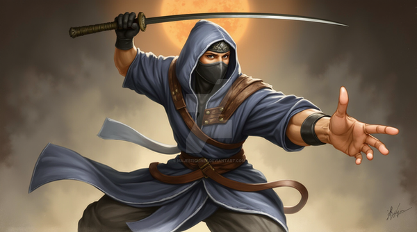
Prueba de colorDibujo: Mariano Navarro
[link]
Color: Hernán Cabrera
[link]
Color test
Drawing: Mariano Navarro
[link]
Color: Hernán Cabrera
[link]
Related content


Comments: 17

it's another word for sweet, awesome,cool,bomb-diggidy XD
👍: 0 ⏩: 1

Oh, Great then! :-D
👍: 0 ⏩: 0


Numero 2! Aparte de que me guste mas la desaturación del rojo, este coloreo acentua mas la "materialidad" del traje y la verazidad de la iluminación no llegando a hacer realista.
Por lo menos asi lo veo yo.
👍: 0 ⏩: 1
Gracias! A mi también me gustó más este
")
👍: 0 ⏩: 0

Buenísimo también. Es como un intermedio entre el estilo previo y el actual, ¿puede ser?
👍: 0 ⏩: 1
Algo así. La idea es intentar acercarme al "estilo Marvel"
👍: 0 ⏩: 0

Me gusta me gusta, otro retoque del color y le queda muy bien
👍: 0 ⏩: 1
Gracias! Qué retoque le harías?
👍: 0 ⏩: 1
mmm para mi esta bien asi, el anterior me parecia mas luminoso este es mas opaco, le queda mas natural asi.
👍: 0 ⏩: 1

I like this one better. The colors flow together the way they should. Great job
 (Smile)")
👍: 0 ⏩: 1
Thank you! I think that too!
👍: 0 ⏩: 1
Not a problem my friend. You are an excellent artist
👍: 0 ⏩: 0