HOME | DD
 HiddenInMystery — I have no good titles lol

Published: 2012-03-01 20:22:04 +0000 UTC; Views: 358; Favourites: 15; Downloads: 8
Redirect to original
Description
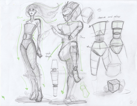
Because i obviously do a lot more digitally now
Critiques are very much accepted, if not even needed.
I know the neck is damn long.
Related content
Comments: 16

Whoa, now this is really something, you really did well on this one, the realisticness of this is fantastic.
👍: 0 ⏩: 0

the body is great but i think, too me, it looks like the body needs to be turned a bit more to.. the right?
and i think her 'bust could be moved up a bit higher? but what do i know i cant draw women i think the space between her collarbone and the rim of her shirt is a little off i think that might help?
but that's all i could really see other than that is awsome! :3
👍: 0 ⏩: 1

okay, actually the boobs are right, i actually used myself as reference here xD That's one thin i always realised oon anime artists, they move the boobs a bit too high, making them seem like they don't apply to gravity at all. Boobs move down, not stay up x3 Also she has big boobies, so yeah, lol XD
Yea, i think the body could be turned a slight bit more because the position of the neck is a bit awkward here, the neck bothers me in general.
Thanks for the feedback ^.^
👍: 0 ⏩: 1

ooh i see xD i didn't even realize that, so i learned something today XD
nothing wrong with big boobs lulz xD
is it because the neck is a little long? i think it looks fine~
<33 no problem~ :3
👍: 0 ⏩: 0

I feel bad sometimes, looking at your titles and descriptions - you really shouldn't be so hard on yourself. It almost makes me self-conscious for liking your art... you could go for more positive descriptions.
That said, I'll try and be constructive. I really like a lot of things about this one - the hair looks stylized, and the lightplay on it is very neat. It looks a bit like it's tied up in the back, from the way the lines move towards the center - I don't know if that's intentional or not. The face has a lovely 3D feel to it - it looks like a porcelain doll. The eyes are always great.
I think the neck is fine. What I find a bit odd-looking is the chest. Somehow, the angle of the breast "facing me" doesn't look right, as if it were smaller than the other, somehow, and the shading on the other breast looks too heavy - maybe that is what I find strange. It gives the cleavage an odd shape because the shading bends sort of sharply and looks very thick in the middle, too, creating an odd shape. And the folds in the crease of the underarm look a bit too long and somewhat flat, as if the shoulders were concave. I'd shorten them a bit, to give the shoulders a rounder feel.
I hope this helps?
👍: 0 ⏩: 1

It's probably because i don't want to saw "Hey yeah i'm good, better than most of you, you mad?" I hate this attitude to bits, and that's probably why i end up saying negative stuff about the things i do. And it became a habit of mine, really.
In my mind i go "wow, looks way better than i imagined" but then i end up saying "fuck, that's horrible" once i see the mistakes, and somehow the good aspects get lost.
Actually the boob "facing us" looks bigger than the other, to me at least, but okay, i think the shading is at fault here. (My light source was off, so i just referenced the form from my own body, not the shading. lol yea i hate my boobs for size C) Also, at a certain size breasts dont have a circle, but a tear shape, as far as i have observed on my own body, not sure if i made it visible for anyone else but me here.
And for the creases, yes, my main problem in clothing, i just can't do them :I
thanks for the feedback! I'll see what i can do about the clothing ^^
👍: 0 ⏩: 1

You could try for more "neutral" titles and descriptions, if that makes more sense. For example, the positive extreme would be "Super special awesome Ryou portrait", negative is "Fuck I can't draw Ryou ignore me argh" and neutral is "Portrait - Ryou". I'm bringing this up because I have very mixed feelings when an artist "bashes" their own work before I could even say anything, and it personally makes me self-conscious and somewhat reluctant even to comment on it, and especially discourages me from making any suggestions or give constructive criticism in fear that I might hurt the artist's feelings when they already seem frustrated and dissatisfied with their work. Sometimes, showing a bit of positiveness or neutrality helps ease people into the mood of commenting - you know? I hope I make sense...
That said, you are welcome, and I hope these helped! 
👍: 0 ⏩: 0

This is amazing, dont say you cant do traditional cause you can do it!
👍: 0 ⏩: 1

Thank you <33
I'm just really used to digital now xD So i thought to try and do something with a lot of shading again x3
👍: 0 ⏩: 1

oh i see XD no shame, it really does look good though~
👍: 0 ⏩: 1


