HOME | DD
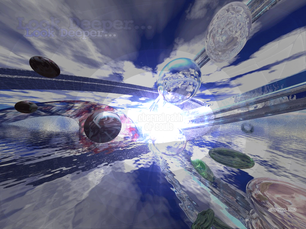
 higgs — Eternal Path Of Souls
Published: 2002-02-01 00:35:28 +0000 UTC; Views: 452; Favourites: 2; Downloads: 98
Redirect to original
Description
:// My interpretation on life.. rotated the view a lot until i got the render i needed for my ps pleasings.. :lrender: 25~min.
Related content


Comments: 13

Wow, you're stuff makes me feel like I dropped acid or something
It looks incredibly like what the title says, maybe a sort of utopia?
👍: 0 ⏩: 0


Getting better and better mate. Added to my faves
Doesnt matter if you win or you lose. Its all bollocks anyway
👍: 0 ⏩: 0

I'm still disturbed by the large amount of 'default bryce stuff'.
you dont need eyes to see
you need vision
👍: 0 ⏩: 0

Well It marked me for a couple of hours -4371 comments!!!!!!!!!!!!!!!
mmmm
Interesting composition but you lost harmony in some point.
The craziest deviant since Nov 19, 2000
👍: 0 ⏩: 0

tight, it reminds me of flying threw a time warp or somthing and seeing diffrent moments in time frozen in orbes, yeah, im wierd
_________________________________
For every apprentice there is a master
Adopt a Deviant https://forum.deviantart.com/150391
-------------------------------------
!
-
👍: 0 ⏩: 0

thanks for the comments --
Deviant ~higgs; 22 New deviantMessages (0H:0N:1C:21D)! :: Logout
I got 5 but it only sent notified me 1 so far (tdawg's) that's strange... anyone has have that prob?
:// fear what you dont understand >
~higgs aka jon
👍: 0 ⏩: 0

i love the clouds..the intense blue sky looks great...the lighting in the middle looks great..nice movement to this peice...
::the new state of design::
are you ready? https://tdawg.deviantart.com
👍: 0 ⏩: 0

some of the contrast on the metal balls looks a little too high , bit too bright for me but i still like all the reflections and what not
👍: 0 ⏩: 0

I love this, I just wish it wasn't so dim. The colors and everything would be amazing brighter. Great work ^_^ Take Care
👍: 0 ⏩: 0

Yah, looks a bit cluttered, but cool idea.
-amphex (Dan)
[A Penny For Your Thoughts?]
👍: 0 ⏩: 0

bold content and interesting idea.
i think it might be stronger w/o the type in this case.
👍: 0 ⏩: 0

hmm looks kinda cluttered.. i think it would look nicer if you made it all monochrome er somethin! nice shapes tho! *cant do anything 3d related if her life depended on it* eeep..
....................................
kina loves you ^^
http://www.kina-ink.com
👍: 0 ⏩: 0