HOME | DD
 himynameiznate — Feed The Machine V2

Published: 2002-05-26 01:51:45 +0000 UTC; Views: 925; Favourites: 3; Downloads: 87
Redirect to original
Description
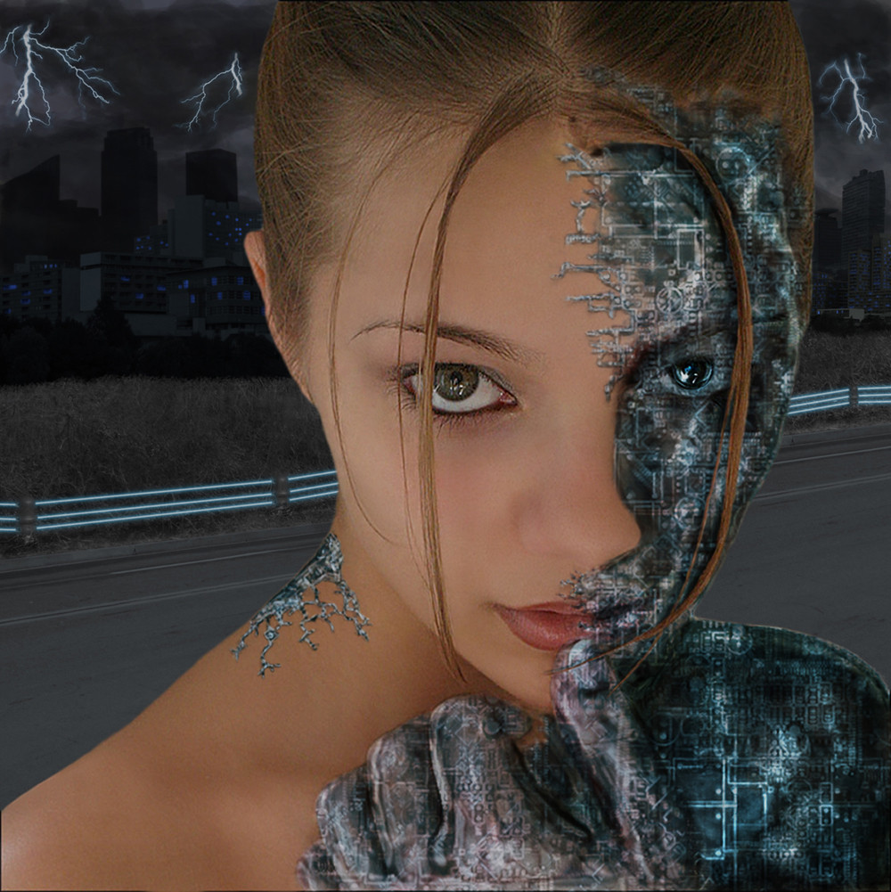
Okay, here is version 2. Worldhurricane brought up a good point about the last one, that it didnt really look like part of the image. Well, I hope this one fixes that.Jen also said she didnt comment on the last one because she didnt like the skin. Just for the record, I do not want all positive butt kissing comments. I want constructive criticism. I dunno. Please just give me your thoughts
Related content


Comments: 17

jeezous chrzst.. i'd be here a while goin through your 500+ devs.. but every now and then you might see me drop a line..
this thing is tight.. i'm down with your will to utilize so many colours.. i'm kind of a themed based person.. but thats just me.. but whe I see pieces like this that just explode with life in the colours and detail.. i'm down with that..
i wanna see more!
keep in touch, this rocks ass
btw, thanks again for doin some kick ass work with our photoBreed stock..
👍: 0 ⏩: 0

She reminds me of the android nanny in AI. Nicely done.
👍: 0 ⏩: 0

There's something quite different about this piece to your usual style. I think it's because of the rendered elements, rather than photo-manips. I think it's also because the face lacks a texture, which you've often featured in past works. I think in V1 the blending of the photo & rendered elements looked a bit off.. mainly because of the lack of texture and other realism of the 3d bits. In V2 however, I've noticed you've really worked on the surfaces, and added reflections and stuff, which I gotta say makes a huge improvement. There's just two little niggling things about this for me, in this otherwise sensational piece.
One is that large object connected to the side of the head. Not the object itself, but the way it's joined to the head. It's quite harshly blurred at the edge, and is just too vague to be satisfying.. especially in contrast to the crisp edges that almost everything else has.
The other is that little section cut out of the girl's cheek. I'm guessing you did that to show that the face is more like a mask.. and that it's not really solid. Well in any event, it doesn't really work for me.. just seems like an unecessary distraction. Maybe it's just the contour of the face that it's cutting against that makes it awkward for me. Like if you made the hole bigger, and cut around the edge of the cheek it would look nicer. Myeah.. but I think best without the hole at all.
Yeah, so anyway.. this really is brilliant work here. I can tell a lot of work went into it, and it was worth every second. The background looks beautiful too
👍: 0 ⏩: 0

The face still doesn't really fit in the hole picture, but I don't think that it's the face's fault.
More the backgrounds fault. Now you've overlapped some color on the face (above the eye on the right) wich doesn't work couse it should be in the bg!
Try some differant stuff with the bg is my suggestion!!!!
Otherwise it's a really nice piece as are all the others!
👍: 0 ⏩: 0

to be honest, genius touchs, im just paralyse, i love all you do, my style!
👍: 0 ⏩: 0

this is awesome - very cool cyberpunk stuff that really reminds me of the floating cyborg face on the cover of dieselboy's album the sixth session - just amazing! the detail is very stunning and the whole picture just seems to MOVE on its own (and no i'm not on drugs) - i can just imagine this thing floating around in cyberspace or something like that - great work man!
-----
-cxi
[link]
👍: 0 ⏩: 0

Looks great. I dunno why, but at first that looked like a young Elizabeth Taylor, I know it's not though.
👍: 0 ⏩: 0

to be honest i think this would look a hell of a lot better with out the face completely. i dunno why i just think the 3d and colours is good enough to stand on its own. that is my opinion
-----
SPONGEART [link]
👍: 0 ⏩: 0

this version is definately much better!
-----
_. [link] ._
👍: 0 ⏩: 0

awesome work nate, i love the muffler coming off the back of her head. damn, looks so great. fantastic
-----
+_____////angelsfaith
+_____////[link]
👍: 0 ⏩: 0

Wow, I dunno what to say. It's like sooo awesome! Very very cool indeed! Great work!
-----
___________
+ + + + + www.njyn.tk
👍: 0 ⏩: 0

very cool atmosphere here man and how you made the face 3d
very cool
👍: 0 ⏩: 0

the little improvements helped a lot. adding the little touches of color around the eyes, as well as the changes to the rings behind the face, really helped bring it together.
suggestion: there's a lot of activity happening on the left side of the composition, and very little on the right. you should (if you feel like doing a v3) add more to that side to pull your eye throughout the piece, instead of having to push it. i also think that it would look better if you moved the face & accessories down just a hair and slightly to the left.
-----
«WorldHurricane»
----------
Yoda is a pimp. He has the pimp walk and the moves to back it up.
----------
👍: 0 ⏩: 0

very nice work man, i think that the starfield thing is a very nice touch. The 3D is just AWESOME, although i think the belding could be a TAD and i do mean a TAD bit better. It's almost flawless. Very nice work nate
-----
-
++ WastedYouth Programmer - [link] ++
++ deviantMAG Staff (Software Reviews) - [link] ++
👍: 0 ⏩: 0

I love the new additions in this one. The face and tentacles really blend in with the background now. Great work on that. But, I still have the same complaint. The hole in her cheek really looks very fake in comparison to the rest of the manip work.
-----
-amphex (Dan)
👍: 0 ⏩: 0

thats pretty crazy, I like how you have that little drop down on the cheak that has the hole in it... its lets you see the thickness of the "face" I love the galaxy look, and its just so sweet... It kind of reminds me of the movie A.I.... while the movie sucked, this does not... I enjoy this very much infact
-----
May the Force be with you!
Jedeye.com [link]
👍: 0 ⏩: 0

i like it, i'm not so sure about the hole in the lower part of her cheek but i do like, and some of the metal makes it look kinda like a bryce render, other than that, looks pretty sweet
👍: 0 ⏩: 0