HOME | DD
 himynameiznate — Slackwire Wallpaper No 3
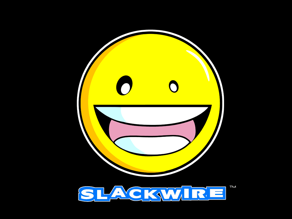
Published: 2001-06-25 08:28:05 +0000 UTC; Views: 602; Favourites: 2; Downloads: 113
Redirect to original
Description
Here is my 3rd wallpaper for my Tshirt company, Slackwire. The smiley guy is derivative of the crash space avatars. I think Ill use this on a tshirt. let me know what you guys think.Nate
Related content


Comments: 6

Awesome shirt design, I'd buy it, where ya gonna have it at?
ReoCON
Dead and Forgotten
👍: 0 ⏩: 0

This is just so cool! So much is working well in this image, yet when you first look at it, it seems quite simple. And that is another thing that works: the simplicity. I dig your illustration style, and the smiley is just so nice. Simple shapes working together cleanly to portray a wonderful image. And the shading is crisp and clean and works, as well as the highlight. I also like the eyes, as that really adds character to the piece. But not only that, the choice of colors in the yellow and the blue work perfectly. Then you have a bit of cohesiveness in the white of the text, and the white of the smiley, so it all brings it together. And I also agree that the black background was a nice choice. I also like the white outline seperating the smily from the black. Really makes it pop, ya know? Very well done, and very artistic methods used to make this wall as good as it could possibly be with the minimal elements used. Nice!
👍: 0 ⏩: 0

hahahahaha....
/me wonders how this has anything to do with slacking wires
-Rhow
👍: 0 ⏩: 0

ooo clean!!! nice... yellow and black look awesome together!!
same same. but different.
👍: 0 ⏩: 0

I tell ya yo9u are the best at doing these t-shirt thing... this is good on a black t-shirt but I like the spray paint one you made long ago more
: :
End Of The World http://www.darkomen-networking.com/karn/
👍: 0 ⏩: 0

i think the letters ruin the thing
people might not wear it for that
personally i would like to see the letters real small, so that u are drawn into the art and want to know more-
but then again
u do your thing
the letters suck next to that amazing show of graphic design in the face
👍: 0 ⏩: 0