HOME | DD
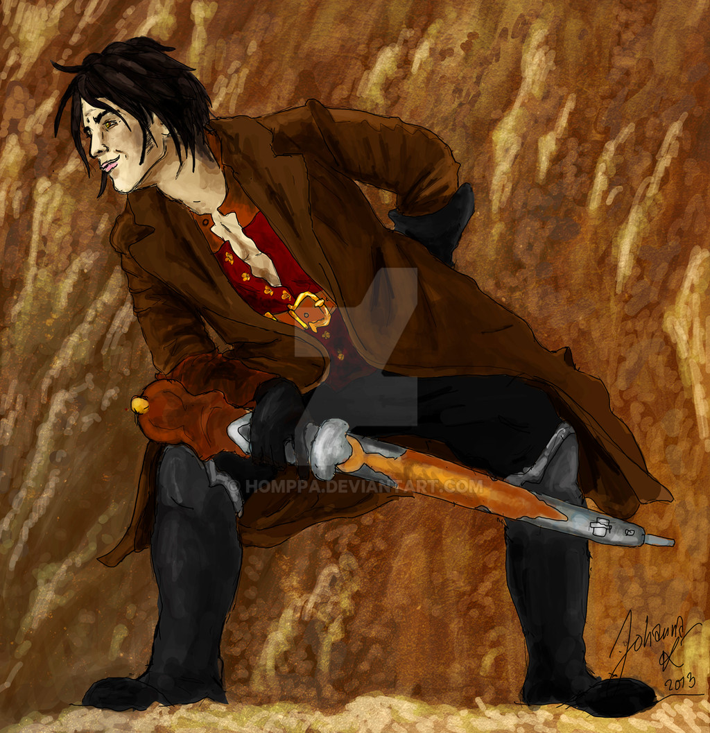
 homppa — Ready for hunt
Published: 2013-01-14 21:16:30 +0000 UTC; Views: 458; Favourites: 6; Downloads: 0
Redirect to original
Description
More and more digital paintings. I think I'm finally starting to get the hang of it... slowly but surely!This guy here's my OC.
~PhotoShop CS5
Related content


Comments: 21

I like it! The proportions, perspective and pose are great!
👍: 0 ⏩: 0


good proportions love the pose and expression ! nice detail ")
But digital art is a bit tough to grasp XD which is why I still stick to painting watercolor it's more relaxing T_T; then dealing with photoshop brushes lol
👍: 0 ⏩: 1

Yes I'm still kinda looking for my own "painting style" with PhotoShop if you know what I mean? It's so hard! D:
Also I've noticed that since my PC is already very crappy and old, it doesn't show the colours in a right way. (Honestly!) I opened my works at my school's mac computer and I realized that I can't keep doing digital paintings until I get a better computer! 
Thanks for the comment and love
👍: 0 ⏩: 0

First of all, this is pretty good for only being your fifth digital painting!
Since you said you wanted feedback on painting techniques I'm going to leave out the whole talk about anatomy, though I have to say that you did a pretty good job with that!
I see that you have a good sense of colour, for the colours you used fit together well. You also didn't just make shadows black and highlights white, which is great.
Nevertheless you could be a little bit bolder and use lighter and darker colours that are not quite like the base colour, but slighly more blue (for the shadows on his trousers for example) and red (for shadows on his face). Be careful with the saturation though, you wouldn't want him to look all red and blue  (Smile)")
Concerning your shading technique. Your shading kind of lacks blending. There are many ways and techniques on how to go about it, and you'll develop your own method some day. Until then, it's wise so learn from others. It's kind of hard to explain how to do shading shading in a comment alone, so I'll give you some links to some awesome shading tutorials instead: [link] [link] [link] [link] . There are many more to be found here on dA (on many different topics as well), so you might want to search for more yourself!
One little thing I noticed are the black outlines; they look too sketchy in some parts. You could paint over them (see sahding tutorials), or simply clean them up a bit. Maybe make the lines thicker in some places and thinner in others (that makes the whole picture look more dynamic), or colour them with them same colours you used for clothes and skin.
All in all, this is a very good start, and I think if you practise shading some more, you'll be great soon! Keep it up
PS: All of the above is solely my own opinion, so you're free to disagree with all of it of course!
👍: 0 ⏩: 1
First of all, thank you so much for taking the time for the feedback!
I've been drawing for years and I can say that I rarely have any trouble with that (and sometimes anatomy doesn't have to be that serious, depending on your drawing style). I'm a beginner with painting and I really need to combine my drawing skills finally with color!
Just a moment before I read you reply, I've been going through some great tutorials about making shadows with saturations. It totally makes sense now that I know about it. And I also read a lot about blending. And, now that you mentioned those things in this reply, I really have to try those out. Thanks for the links!
Thank you! 

👍: 0 ⏩: 1
You're most welcome!
One can definitely see that, your sense of anatomy is great! You're right, it really depends on the style
That's great! There are a lot of useful resources around here
No problem, I love to look up tutorials^^
My pleasure! Aw, that's good to hear, I'm glad if I could help!

👍: 0 ⏩: 0

I don't know a lot about the style, medium, or subject, but I'll see what I can come up with...
He has an interesting pose, although it may feel a tad strained. The colors are good here too, although the lighting could have a better direction--it often is pleasing to the eye when there is one dominant light source, providing highlights to one side of the subject, and contrasting shadows on the other side.
👍: 0 ⏩: 1
Thank you for the constructive feedback! I'm a beginner when it comes to digital painting so all feedback is welcome
👍: 0 ⏩: 0


Hi there!
You've been featured here for this week's Feature Friday
Have a nice day

👍: 0 ⏩: 1
Thanks a lot for the support
Have a nice day as well

👍: 0 ⏩: 0

This is really cool! With practice you will get what you want! NEVER STOP and improving slowly is better than not improving at all! I see you have a great future and great work!!! Keep on going..
👍: 0 ⏩: 1
Thanks so much!
And you're totally right, never give up
👍: 0 ⏩: 0


Very nice work! It's much fun to see your style done in digital form
👍: 0 ⏩: 1
It's so hard but I'm trying!
👍: 0 ⏩: 0

I'll start off by telling you that you did a nice job with his pose. The character is also proportioned well, however the chin is a bit large. The line art and coloring are not clean but that's just the style you have going and it works here. Some things to improv on would be trying to clean things up, but thats only if you wan to go for a neater finished piece. If you like the style you have then stick with it.
Overall this is a nice OC and you really are getting the hang of it so keep it up! We hope to see more from you.
👍: 0 ⏩: 1
Thank you for the constructive feedback
👍: 0 ⏩: 0