HOME | DD
 howling — Schoolwork Civilization

Published: 2004-10-31 10:31:11 +0000 UTC; Views: 1761; Favourites: 18; Downloads: 191
Redirect to original
Description
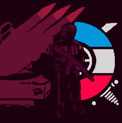
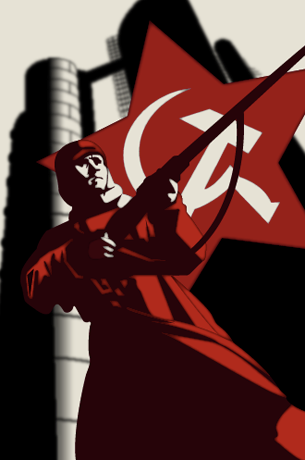
This is the last one for now. It's one I used for a quote similair to "Art is the signature of a civilization". I thought that - seeing how everything's in red, that being the color I have to use - communism fitted best. Personally I love how the smokeplumes turned out.Photoshop Vectors
Related content


Comments: 35


Looks great, the only thing I didn't like is the weird O in Soviet.
👍: 0 ⏩: 0


cool, the smoke looks great, but the best part is the planes in my opinion. its a great composition though.
👍: 0 ⏩: 1

*notices your avatar* I can see why you like the planes the best
👍: 0 ⏩: 0

With exception to the person, who looks strangly odd to me, thats a great piece
👍: 0 ⏩: 1
")

your stuff is incredible - you're a very talented digital artist. this, and your pixelart peices i particularly like. How long have you been doing this kind of stuff?
all the best, Lukieboi
👍: 0 ⏩: 1
Thanks, i've been working with Photoshop for years. On my portfolio there's a bunch of it (not all).
Thanks for your kind comment
👍: 0 ⏩: 0

Ooh I like this!
Vector illustration fits very well to the communist propaganda theme...
Opens up surreal possibilities
👍: 0 ⏩: 1
Thanks 
👍: 0 ⏩: 1
I mean keeping the soviet propaganda feel
but with different content
very far from that feel itself
it would make for some interesting contrast
Like the logo of that old TV show "Amerika"
The word America spelled with a K and with a communist symbol in it
👍: 0 ⏩: 1
I don't know that show  (Smile)")
👍: 0 ⏩: 0


Wow, nice work. Though I think with the guy it would be cool if his other hand was raised into the air as a fist.
👍: 0 ⏩: 1
Yes i'm not so keen on the pose of the figure aswell, I used a real statue as reference though.
👍: 0 ⏩: 0


")

I really like the overall compostion! (And I'm as sucker for all things soviet, but you can tell that by my icon.)
What's that font called? I've been looking for it everywhere!
👍: 0 ⏩: 1
The font is conveniently called Soviet.
Thanks
👍: 0 ⏩: 0

Good work! His left hand is a little small though...
👍: 0 ⏩: 1
Yeah I know, ah well school won't mind
Thanks
👍: 0 ⏩: 0


Very nice work.
I like that type face...I've used it for a few things myself.
👍: 0 ⏩: 1
 (Wink)")

Wicked, I love the striking composition, like the three planes and the large chimney things.
You've got the style down really well
Great use of colours


👍: 0 ⏩: 1
Thanks man, I tried to go for the whole "Look at us being magnificent" thing
👍: 0 ⏩: 0