HOME | DD
 HowXu — Weekly art#36 sitting in a tree
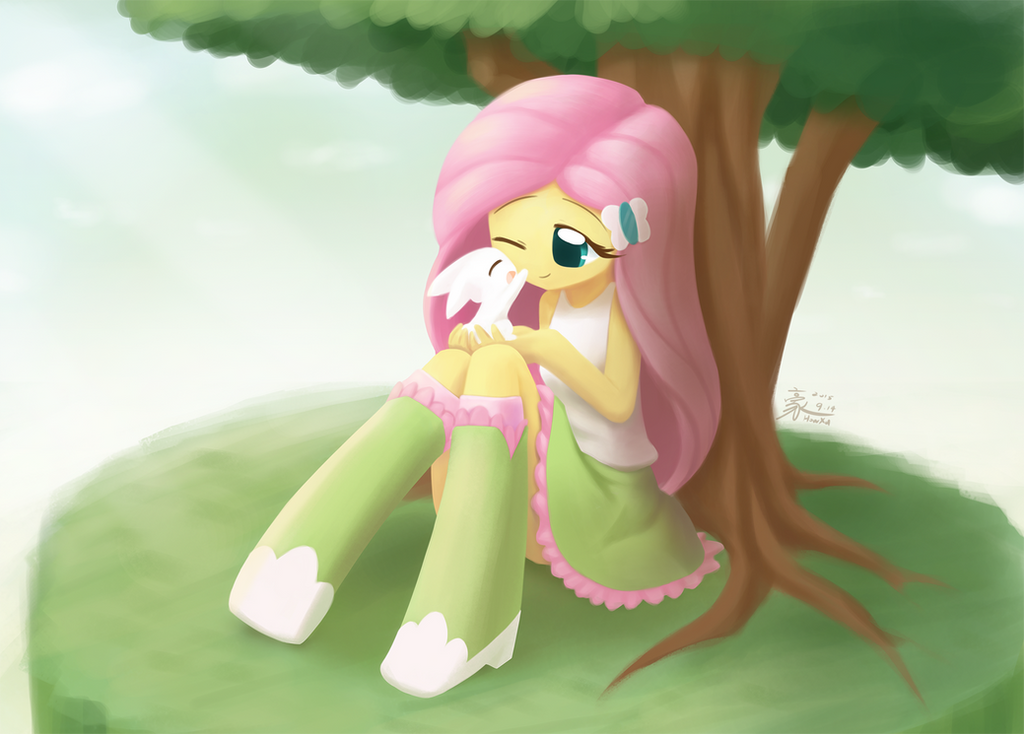
#angelbunny #fluttershy #equestriagirls
Published: 2015-09-17 15:21:40 +0000 UTC; Views: 13003; Favourites: 782; Downloads: 283
Redirect to original
Description
Sorry being inactive for two weeks. I got a little bit busy and unfortunately my Tennis elbow start hurting a again. So I took some time for resting. I feel much better now.My art teacher point out that my illustration have too little color variation, which make it look dull especially in pure color area. So in this practice, I tried to add more color to some pure color area.
Doesn't seems to be very successful.
 Got to trry harder next time.
Support me creating arts and comics on www.patreon.com/howxu?ty=h
Related content


Comments: 45


me cry can i sid next to you please
fluttershy shake her head for said yes
i sid next to her keep crying
fluttershy blush in her head i sould ask im why is i crying
me cry what is your name
fluttershy fluttershy
me cry what
fluttershy im fluttershy
me cry im raphael
fluttershy why you cry
me cry because the girl i love date a other boy i is name big mac
fluttershy do you want take my bunny in your arm its can make you fell better
she give me her bunny
i take her bunny
me cry its true i feel a bit better
fluttershy i tink angel like you
me cry its imposible nobody like me
fluttershy hug me
fluttershy keep hug me i tink we can become friend
me ok
fluttershy ho i will be late at the animal slhetter
im that my only friend leave me
fluttershy tink i look sad
fluttershy to you want come with me
me yes
we go to the animal slhetter
we take care of the animal for the rest of the day and some of them have notice that me and fluttershy are in love
angel and a oter bunny push us for we kiss
me blush sorry i i i dont want to do this i just love you
fluttershy i love you too to you want become my boyfriend
me yes
our kiss
👍: 0 ⏩: 0

I broke my mouse from spamming the favorite button too much
")
👍: 0 ⏩: 0

Fluttershy and Angel are so lovely together... 
👍: 0 ⏩: 0


")


do you realize how hard it is for me to spam like everything you make? >:l
Hope your arm feels better
👍: 0 ⏩: 0

WHY YOU DO THIS HOWXU!!! DO YOU HAVE NO MERCY ON MY FRAIL HEART; THESE FEELS THERE- *sob* THERE- *sob* THERE- THERE TO MUCH TO HANDLE!!!!!
👍: 0 ⏩: 0


Aw! That is so cute and so adorable. Nice work. Love the picture.
👍: 0 ⏩: 0

WE REGRET TO INFORM THE TALENTED HOWXU
THAT APLREACH IS CURRENTLY EXPERIENCING
SERIOUS SEIZURE, INDUCED BY CONCENTRATED
FORM OF FLUTTERBEETUS, AND IS NOT CAPABLE
OF DELIVERING HIS COMMENTARY REGARDING
THIS PIECE OF ART OF YOURS. IT IS NOT KNOWN
IF HE IS GOING TO GET BACK TO HIS SENSES ANY
TIME SOON. HAVE A NICE DAY!
👍: 0 ⏩: 0

This Deviation was featured in the following Equestria Daily Post www.equestriadaily.com/2015/09… Thank you for providing pony material for all of us to enjoy  (Smile)")
👍: 0 ⏩: 0

Awe. So fluffy, light, bright, and adorbs. Angel actually looks well-behaved and peachy here. Fluttershy looks peaceful and happy, it's great
Good job X)
👍: 0 ⏩: 0


I think your teacher has a good point. And if you were going for colour variation in this, I too think you could have taken it a fair amount further than you did.
I also think cormy1 has a good point when he commented:
More colour huh?
I think that calls for more complex scenes. More developed backgrounds.
In addition to that, I would also argue that the drawings we typically see from you are somewhat simple and clean in their style, and personally, I do not think colour variation is that big of a need in that regard. I think that some of the things your teacher would describe as "dull", I would call "simple", and simple can have its own stylistic charms too.
But I can think of a few examples where I would agree that some colour variation would be nice. For instance, the very last thing I noticed about this particular drawing of yours, was the background, and the fact that you drew an actual sky with clouds and rays of light back there. For most of the time looking at this drawing, I only saw the background as a plain white blur. Had you applied some more colour variation to the background it would probably have stood out more and been more noticeably appealing.
Take care.
👍: 0 ⏩: 1

Thank you for your sharing, WhiteOni.
Your opinion is actually what my teacher said. She understand that the way I paint color are always tend to be simple. SO she didn't instruct me with realistic drawing doctrine, instead she encourage me to try add some different hue of color to the light and shadow area. Such as add a few dark brown to the shadow of green skirt, add a few dark orange to the shadow of the yellow skin...etc. And the result has indeed better than just adding dark green or dark yellow to the correspondent area.
As for the background. Well, since my goal for this illustration is to practice the tone and coloring of the the subject. I thought the background wasn't really important and it shouldn't stand out either, for they serve to make the subject stand out instead capturing viewer's attention. So I didn't spend much time rendering it. But I think both you and Cormy1 had a pretty good point that the scene itself wasn't complex to be appealing. I'll try to construct a more complex illustration next time.
👍: 0 ⏩: 1
I see.
I kind of figured that the downplayed background was for those exact reasons. And although I can appreciate the idea, I just thought it was a bit of a shame. Because I realized that the background was also so very pretty and nice looking - but I almost missed it!
But then again, I assume this was more of an exercise rather than an all-out drawing for you. In that regard, I can understand the way you went about making this.
Keep improving and keep up your good work. 
👍: 0 ⏩: 0


More colour huh?
I think that calls for more complex scenes. More developed backgrounds.
👍: 0 ⏩: 0


Sorry for pointing this out, but her hip doesn't quite line up right. Judging on the curve of the front of her shirt and the back of her skirt, there's no way the bottom of her right thigh is that far to the left.
It's still a beautiful picture, though.
👍: 0 ⏩: 2
Well, the structure I drew in my initial sketch didn't look that distorted:
But Appealingly, the way I manage the skirt make it look like the anatomy of the character has been distorted. ^ ^;
👍: 0 ⏩: 2
This sketch looks more sensible. In addition to the skirt, you yourself mentioned, I also think that in this sketch, she seem to be leaning back against the wall/tree. But in the final version, due to the angle of her back, she seems to be leaning slightly forward instead. That in combination with the folds of the skirt makes it seem like her butt is sticking out behind her, rather than bending out in front of her.
👍: 0 ⏩: 0
Maybe she just has a really... Really big butt in this.
But seriously, I agree. It does not seem to line up right, but I also think it is somewhat inconspicuous. I first saw it after you had pointed it out. But on the other hand, had I taken a bit more time to look at the image before reading the comments, I think I would have eventually noticed it too.
And it still looks beautiful after all.
👍: 0 ⏩: 0


