HOME | DD
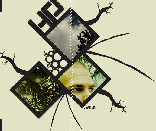
 hp0 — Germs

Published: 2005-10-28 01:06:30 +0000 UTC; Views: 1255; Favourites: 22; Downloads: 202
Redirect to original
Description
germs are bad. Respect to ywft.Related content


Comments: 24


yeah, really nice vector, i like the sense of depth that it gives !
👍: 0 ⏩: 0
spritek [2005-10-28 17:32:03 +0000 UTC]
The composition and the colours are great
Great work
👍: 0 ⏩: 1

Thanks a lot for checking it out! Wonderful comment!
👍: 0 ⏩: 0

looks like a stencil
did you had a lil blur or something?
👍: 0 ⏩: 1
no stencil, no blur just vector a vector trace of a sweet looking building.
👍: 0 ⏩: 1

Big ups and thanks for checking it out!
👍: 0 ⏩: 0
Thanks Paul, your the man!!! Did you like the mix? Some parts were a bit ruff.
👍: 0 ⏩: 1

Im just listening to it at the moment, I'll comment at the Reailty Detached forum when its finished.
👍: 0 ⏩: 0

i don't know but this is so perfect, really!
maybe i might electrify you now again <> i thought over if i write something or not.
well i dont agree on the 2 forespeakers, nothing 'wrong', that graphic here is more than simply amazing
it tickles me how that can be processed in a brain.... *thinks and comes to no answer* >> wow really. and that is again so unclear to me - you should drown in pageviews, don't uderstand it, my.
what is ywft?
really for your own sake you should head on to a graphic-industry and blast those there away
👍: 0 ⏩: 2

geez man, you leave such wonderful comments. Thanks so much for checking out my work and making me feel really good about it.  (Smile)")
👍: 0 ⏩: 1


Man, that is SICK. Although I do agree with Visination about the comment of the diagnol-lined typography, I till think this piece is awesome. Seriously man, this is an instant fav.

👍: 0 ⏩: 1
Thanks alot man!!! Im going to uplaod a new one tonight.
👍: 0 ⏩: 1
Nice! I'm looking forward to it.
 (Wink)")
👍: 0 ⏩: 0

i like your color choice and lineart, and i feel it has a nice concept. The shapes toward the left of the piece are a little lumpy, but i like the overall composition of the image. The main typography looks good aswell, but i feel the typography with the diagonal lines through it really throws me off from the germs text
👍: 0 ⏩: 1
very true, it does take away from the work. Im going to make a few changes.
👍: 0 ⏩: 0