HOME | DD
 Hubby72 — CrimeScene
#action #crime #suspense #thriller #daz3d #murder #octane #poser
Published: 2016-02-22 18:33:10 +0000 UTC; Views: 1626; Favourites: 27; Downloads: 79
Redirect to original
Description
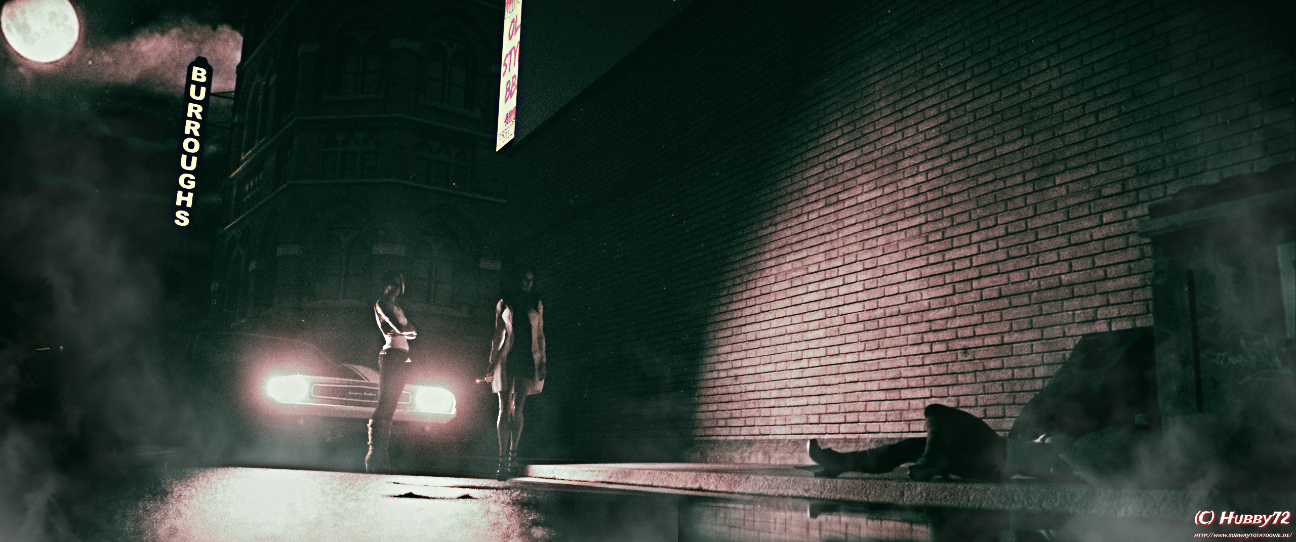
After i had lots of fun playing with light in black and white scene i wanted to do more of it.This time a did something with a crime or suspense thriller.
Related content


Comments: 15

👍: 1 ⏩: 0

It has it own kind own magic somehow  (Smile)")
👍: 0 ⏩: 0

Very nice vision. I only have one suggestion...
The big section of brick wall is begging for some sort of design. It is right in a prime spot of real estate and looks like of plain.
Maybe a shadow from one of figures? Or something scrawled on the wall? Nothing too over the top that it distracts from the over all image... But just something to break up the repetitive brick pattern.
👍: 0 ⏩: 1
To be honest i started the scene with that approach. But the more i worked on the scene the more i come to the conclusion that the shadow is to much an eyecatcher and is distracting to much.
So i come out with this. There is still a shadow from the persons when you follow the line up from the victims knees, but the shadows are very smooth and just as a small aspect here now.
But many thanks for you suggestions. I love to get such feedback really
👍: 0 ⏩: 1
I can envision what you are saying and can see how that would be a distraction.
The issue I see is two fold... The brick pattern is pretty repetitive. And the light of it is right at the hot spot that a viewers eyes goes to first.
(The Rule of Thirds, Golden Rules, etc.)
Because of that, the presence of the body is easy to overlook.
Something needs to pull the viewers focus down to the body, without being an obvious sort of arrow. Maybe stains on the wall that lead down... Or an old poster at an angle so that the corner acts like an arrow?
Or maybe something as simple as a slightly different camera angle, that moves the body closer to prime real estate?
If this was a movie poster or the splash page of a comic, I could easily see the title of the story being in that light circle. Which might be what is so jarring to my eye. My mind expects there to be something important in the spotlight, but there's nothing there.
By the way, thank you for taking the criticism the way I intended. The image is really well done. The noir aspect comes through as the image doesn't appear to be forced black and white. There is little hints of subdued color that create the atmosphere very well. And the framing of the other aspects is spot on.
👍: 0 ⏩: 1
I guess i know what you mean but i think i have a different approch here.
At first i would say if the dead body could be obviously be seen it would not lay there for hours until soemone in the night found here and informed the police. I mean the dead person was brought to the garbage box to be unseen.
And at least it is not important that it is dead body , it could also be an explosive or whatever is seen on a crimescene.
The important things are more on the left of this scene. These two persons on in the lights of the car.
The rest is more to distract and give the eyes something to look at without being pointed to the obvious things. I mean the detectives were not there if there were not something around.
The dead victims legs has a strong contrast with the light on the wall without presenting instant what it is. I am pretty sure that it is more interesting to first grab the intention and in a closer look recognize what it is then showing it directly. I think this makes the scene more different and the time you need to watch and recognize is longer. At least this means itis more "interesting" and less boring.
But nevertheless you have good points
 (Wink)")
👍: 0 ⏩: 1
I think I pinned down why I felt so compelled to comment...
Your image immediately reminded me of this:
comicbookbrain.com/_imagery/20…
Not specifically this image, but most of Eisner's Spirit splash pages.
Which is by no means a bad thing.
I just wasn't connecting the dots in my own mind. So my own preconceived notions of what my imagination was looking for.
👍: 0 ⏩: 0

Another great work with light, shadow, and atmosphere
👍: 0 ⏩: 1
