HOME | DD
 hugomaster5 — The aggregation of the lost
by-nd
hugomaster5 — The aggregation of the lost
by-nd
Published: 2013-06-25 03:02:22 +0000 UTC; Views: 537; Favourites: 17; Downloads: 0
Redirect to original
Description
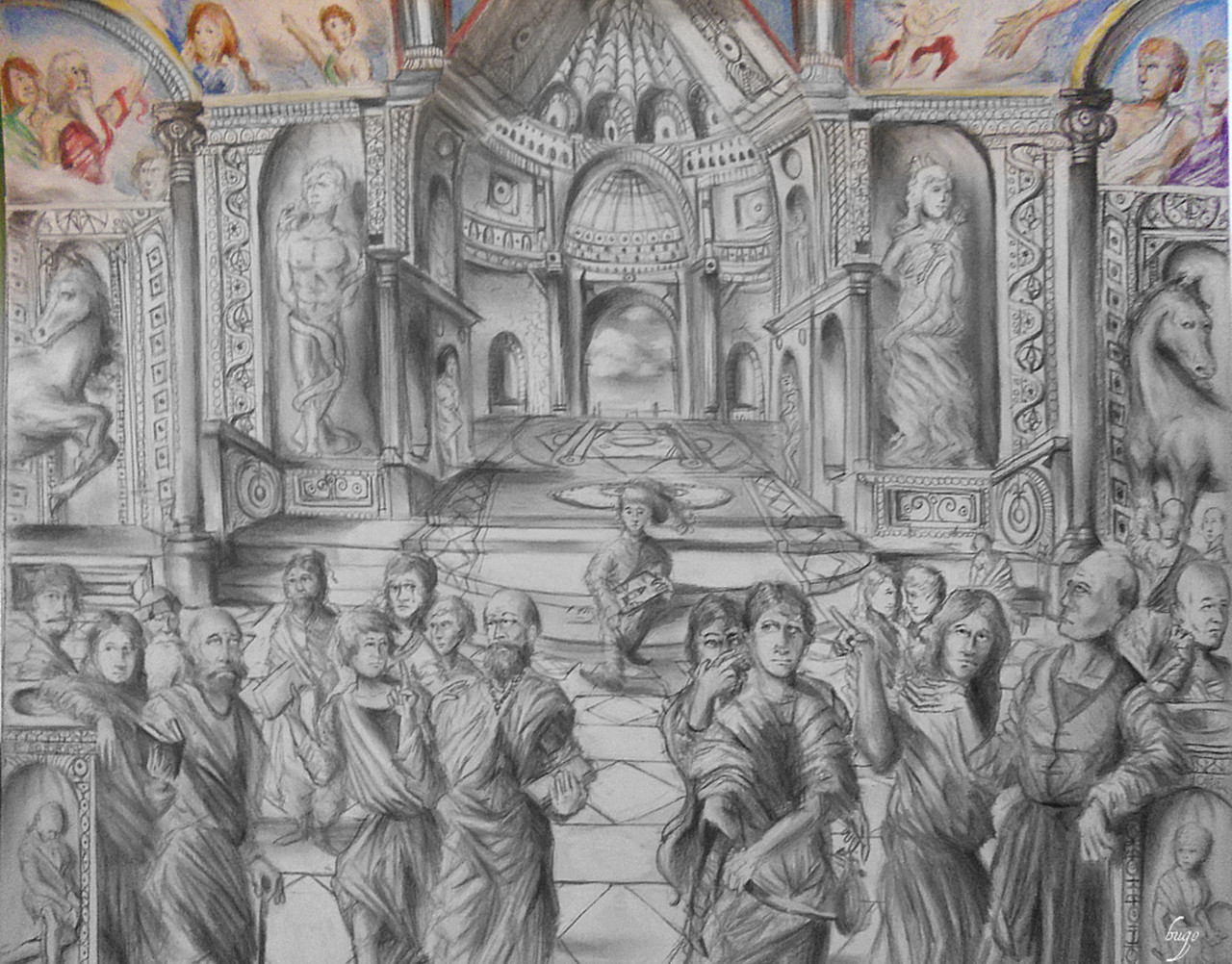
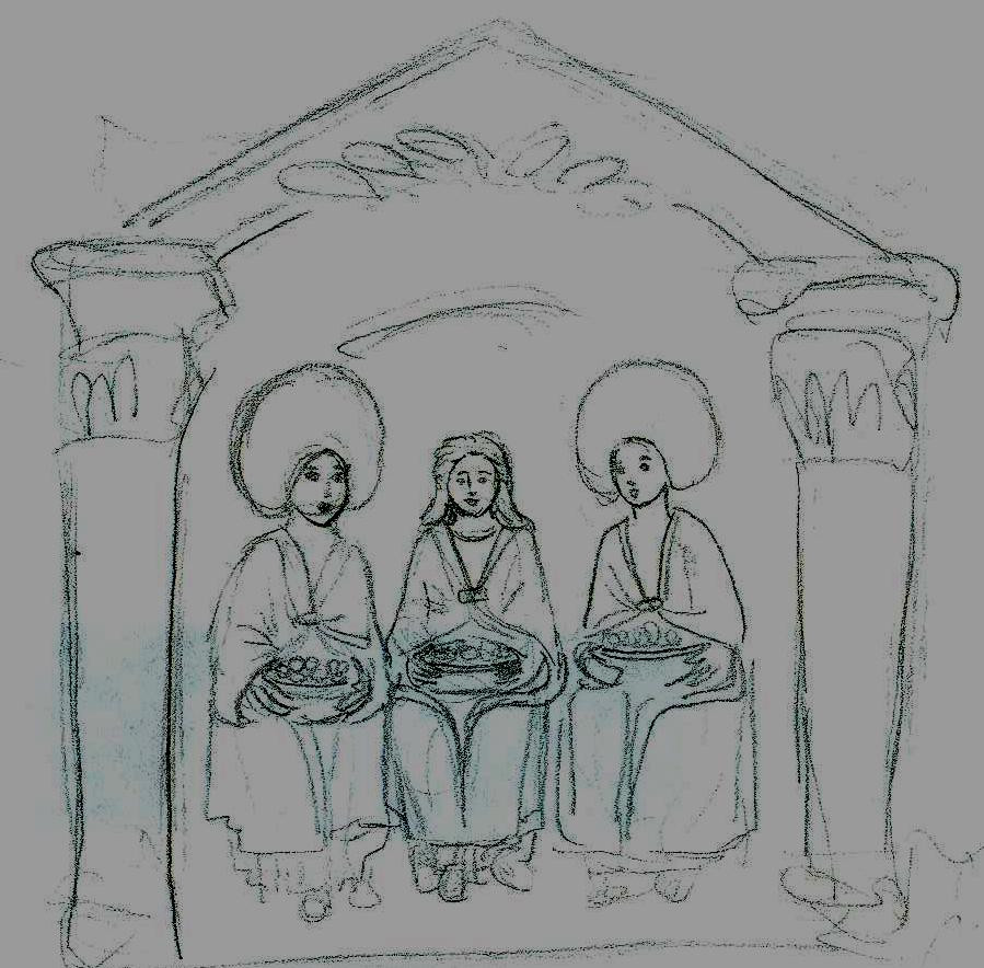
Completed on Smooth Bristol 14"x17"(35.6 x 43.1 cm). About roughly 10 days put into the piece along with some sweat and determination. I used about every single pencil you can think about along with Derwent, Coloursoft colored pencils. Though the real hero and props goes straight to my lucky 0.7 mechanical pencil. The purpose for the name? the drawing? you tell me, and as always ... enjoy.Related content


Comments: 28

I really like your shades and attention to detail.
👍: 0 ⏩: 0


Amazing detail.
I love how it goes from colour to pencil, like an unfinished masterpiece well done
👍: 0 ⏩: 0

A Stunning Masterpiece! 
I'm blown away by how much detail and shading is put together in this awesome piece, love their facial expressions and the perspective.
I was instantly drawn to those murals in the back, color always stands out in a B&W sketch 
Excellent artwork

👍: 0 ⏩: 0


Wow, that's some awesome detail! And I love the relation to the ancient Greeks, and their many, many postdecessors getting up to our time!
👍: 0 ⏩: 0

Really great! I love all the tiny details you did
👍: 0 ⏩: 0

Awesome! It reminds me of a church. What was the inspiration behind this piece?
👍: 0 ⏩: 0


I can tell you worked long and hard on this. I feel that the color/ black and white contrast is an intentional statement about the bland indifference of the majority of people who view art. Still, I would like it if this whole piece were colored. Your composition is good, but this drawing could use some more deep shadow and contrast to add depth. Dark charcoal is great for this. Nice job. Keep it up.
👍: 0 ⏩: 0

Colourful ceiling, colourless everything else... I'm sure that has a purpose
You did a good job on this ")

👍: 0 ⏩: 0

Reminds me of both Roman frescoes and the famous "School of Athens" painting.
👍: 0 ⏩: 0

This aint bad. Great perpective and understanding of form is clear
Ive got to problems though:
One is that if you are making a naturalistic portrayal, then you must try your best to conform to the rules of nature  (Smile)")
Other problem aint that big, i just feel that your picture is a little dull. More intense contours are missing-darker black and lighter light
Hope this helps!
👍: 0 ⏩: 1

yea i certainly am not used to working on such large scale pieces. Outlines were placed to better differentiate what was a person and what was the background. With color this is not a problem because flesh and say for example granite or marble are very different. I really tried overall to get a good picture of it all. Editing helped a bit but contrast, sharpness, highlights were all a tricky thing to balance. I only wished i had a scanner lol. All in all i was pleased with it regardless of its small errors. Anyway thanks for your tips and explanations
👍: 0 ⏩: 1
Its very well done
👍: 0 ⏩: 0

Grest work. it is very detailed, i love this
👍: 0 ⏩: 0

It reminds me of something I saw on a wall in Italy. Very nice!
👍: 0 ⏩: 0

Cool! I like especially the great contrast between the colorful ceiling and the b&w room
👍: 0 ⏩: 0

Awesome work! The little hints of color at the top really make it interesting. I like all the details!
👍: 0 ⏩: 0

Amazing art! I love how the scenes of heaven are in color, but not the poor souls still bound to earth. ^^
👍: 0 ⏩: 0

The composition in this is so fucking nuts. The shading, the perspective. It looks like a classical Renaissance painting minus the realistic qualities. What I'm saying is...you nailed it, man. Shading, perspective, composition. It's all there. And it works. It also has a sweet title! You should be proud of this.
👍: 0 ⏩: 0

10 days you say? But how many hours? 0.o
As always, good stuff.
One day you should through in some hidden things like, a skull or clock for symbolic meaning.
👍: 0 ⏩: 0

What a great composition and the combination of b&w art and some colors, cool!
👍: 0 ⏩: 0

Derwent colorsoft.
👍: 0 ⏩: 0

wow!!!!!! Im in awe
👍: 0 ⏩: 1
thank you it really means alot
👍: 0 ⏩: 0