HOME | DD
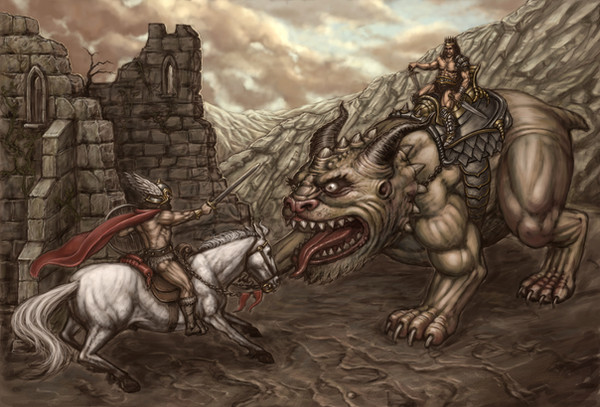
 Hungrysparrow — The Challenger.
Published: 2007-05-24 02:06:22 +0000 UTC; Views: 1566; Favourites: 22; Downloads: 78
Redirect to original
Description
Painted entirely in photoshop. I shall probably come back to this at some time as there are a few areas that are still bugging me. But for now I feel I have spent enough time on this and need to do something new so that I can return to it with a fresh perspective. Having said that, I am pleased with the clouds.Download the fullview for extreme detail.
Related content


Comments: 29

hey patrick i was looking at some old pictures in your gallery to use for a wallpaper and i just noticed you have the big file available for download and wanted to tell 
i really like it, hope you dont mind if i use it as my desktop wallpaper!

👍: 0 ⏩: 1

Wow I feel genuinely honored. 
Thanks for the heads up.
👍: 0 ⏩: 1
Yep!
 (Wink)")

👍: 0 ⏩: 1
Just saw that thanks so much!  (Smile)")

👍: 0 ⏩: 0

Thanks a lot for stopping by!
👍: 0 ⏩: 0


")

I really like the beast, and the horse's pose. The palette works very well too.
👍: 0 ⏩: 1
Thanks- I had a lot of fun designing the beast.
👍: 0 ⏩: 0

NicE!!!!
I see what you mean about the details though. And those are some really sweet clouds.
Just kidding!
I mean, they're not bad but they pale in comparison to the rest of the pic.
👍: 0 ⏩: 1
But they're soo fluffy!
👍: 0 ⏩: 0

Like a 'mine is bigger than yours' confrontation.
Amazing detail, especially on the background...
👍: 0 ⏩: 1
Thanx I spent ages on the details.
👍: 0 ⏩: 0

Wow, I see what you mean about details!
The values of the beast are a bit close to the values of the rock face; the saddle sort of blends into it from a distance. A bit of separation between the castle wall and the rest of the background wouldn't hurt either.
Overall, nicely done. Cheers!


👍: 0 ⏩: 2
Made some slight moderations- hope they have improved it.
👍: 0 ⏩: 1
Yep. Definitely looking better.
👍: 0 ⏩: 1
Yeah and it is looking a bit brown overall. I shall definately come back to this- I'm just sick of it at the moment.
👍: 0 ⏩: 0


Well he is the bookies favourite.
👍: 0 ⏩: 0

that's pretty sweat work there.. like the muscle structure on the horse and beast.. nice texture work of the stones to.
just one thing that sticks out to me is the back wall seems to stick out like it's pasted in. just needs a touch of the back ground color on the edges to blend it into the background more. But that's just my opinion
👍: 0 ⏩: 1
If you zoom in you can see that I have put a little on the edges. But when I come back to it I shall add some more. I wanted it almost silhouetted because of the light from behind. Thanks for the feedback its all usefull and most welcome.
👍: 0 ⏩: 1
ah I see... ya it was just the top part of it that looked pasted in, the bottom blends nice
Your very welcome.. hope it helps...I know I like to get feed back on my stuff.... but never seem to get much of it, so when I do it's great.
👍: 0 ⏩: 1
When you say the top part you mean the bit in the foreground right?
👍: 0 ⏩: 1
the back section of wall above where it's crosses the hillside, but now that I look at it in day light with out my desk lamp turned on it looks betters... I think it's just the values.. I see what your doing with it and it makes total sense in the way of lighting... maybe it's the edge of the blocks faces that don't seem to have much depth to them so it gives the illusion of being pasted in.
I'll mark out what I mean and post it for you
👍: 0 ⏩: 1
Well I've made some slight alteratons to the piece. Gonna start some thing new now.
👍: 0 ⏩: 1
right I here ya there..... after tackling one like that ... the need to move on, is large... that one must have taken a bit to do.
👍: 0 ⏩: 0