HOME | DD
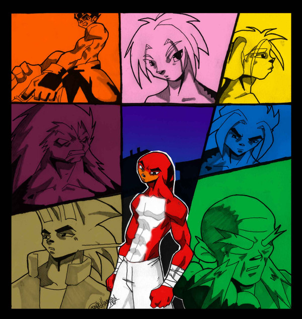
 hyperking — Pretty colors
Published: 2007-02-14 08:02:44 +0000 UTC; Views: 338; Favourites: 4; Downloads: 10
Redirect to original
Description
Hyperking™©Deon Williamson. All Rights reservedRelated content


Comments: 16

That guy looks like a cross between Knuckles and a Dragon Ball Z character.
👍: 0 ⏩: 1

Cool style! Looks like a manga cover of some sort
👍: 0 ⏩: 0

ok
well to me, the boxes that look wierd to me are the orange, purple, blue and the central guy
its probably because of the facial structure..actually the central guy looks fine
the picture overall has a wierd composition based on color,(i hope im using that word right)
and thats because most of the the boxes are darker colors such as purple and brown, opposed to the yellow, maybe make it darker
and also,
some of the the boxes are more heavily inked than other ones or some have more detail in the hair while others dont
the two bottom corner ones look fantastic and the lineart of all of them are very clean
the top left one, i think the fingers should be longer, specially with the perspective
and im a little confused on what the thing left of his left hand is :/
good job covering the whole page, i like how almost all of them have different facial expression

👍: 0 ⏩: 1

Thanks I struggle with colors never took any classes and I'm self taught so far. I think color composition is the correct term.
if you were talking about the left guy in orange its a gun... I goofed...
that whole panel now that I look at it is a odd ball, besides the yellow color box.
every other image is of a face.
Thanks again
👍: 0 ⏩: 0
so what the hell are the other 4
👍: 0 ⏩: 1

steping stones to this one naturaly. all sweet but still leading to the end product.
👍: 0 ⏩: 0

this is nice stuff ,i really like the difference in colors and how theres a character in each different color..nice stuff,i have to fave
👍: 0 ⏩: 0


great job. Nice characters, as alway yon never fall to impress.
👍: 0 ⏩: 1
Thanks ... every now and again I explode!!! (with art)
👍: 0 ⏩: 0

hmmm. I'm not sure that I like this one as much as I likd the second one but I think its cause of the colors that you used for this...
Illusion
👍: 0 ⏩: 1
Thanks ...
The colors aren't picked based on any rules just how I was feeling...
I should take a class on colors.
👍: 0 ⏩: 0

eeee! now i want to know who all the people are because im nosy
")

👍: 0 ⏩: 0