HOME | DD
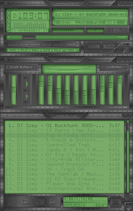
 hyperzoid — HYPERZOiD v1 1
Published: 2002-03-10 00:52:51 +0000 UTC; Views: 844; Favourites: 4; Downloads: 242
Redirect to original
Description
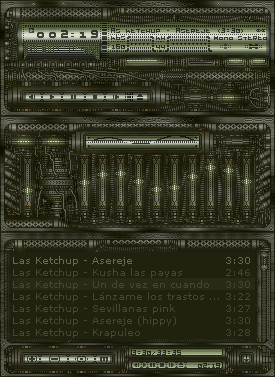
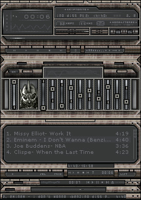
mY fIRTS SKiN +13-It is exactly similar to the first one but with +13 of contrast
-As you commented some of you, really this a little faded for that reason I have corrected it
........................................ ........................
-I have corrected a little error in Playlist when it expand
Sincerely thanks to all for the comments :]
Related content


Comments: 15


woah, details galore. Very, very nice work ... and you can't go wrong with those colours Those details, esp. those "bolts" all around the skin, really make the interface feel "solid" ...
The only thing that puts me off about this skin is the numbers font, seems a tad too big to me ... maybe it's just me
👍: 0 ⏩: 0

im impressed, im very, very impressed, your first wa skin?
superb!!!
-----
joneonline.com
👍: 0 ⏩: 0


nice details, and I love the colours to
-----
hhhmm, time for a sig?....NO!
👍: 0 ⏩: 0


wow, very cool. great work on the highlights.
-----
👍: 0 ⏩: 0


fn awosme me use
-----
-------------------------------------
up..
👍: 0 ⏩: 0

It looks good for a metallic/industrial, tho' I don't like them.. The green is nice, and it really does look metallic. Good work.
-----
jDm, second generation art.
👍: 0 ⏩: 0

I like it. Its very precise.... And green is always a good colour.
👍: 0 ⏩: 0