HOME | DD
 ideck — siteLayOut.03

Published: 2006-12-17 21:30:08 +0000 UTC; Views: 1314; Favourites: 14; Downloads: 32
Redirect to original
Description
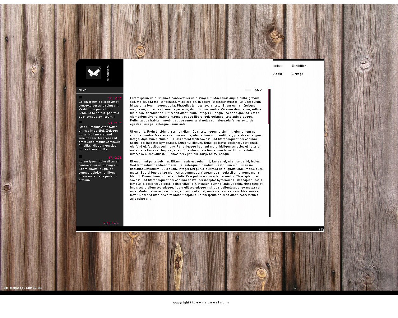
another simple layout that i love... i love this style and simplicity (Wink)")
comments welcome
 (Smile)")
keep in touch all...
(damn da bugs...had to upload 3 times)
Related content


Comments: 38

This is slick. +fav +watch +++++++ everything else. Great work.
👍: 0 ⏩: 0

looks pretty sweet man! ")
i like the whole idea of the design
👍: 0 ⏩: 1

jeeez thx
keep in touch
👍: 0 ⏩: 1
")

thx ^^
keep in touch and happy new year
👍: 0 ⏩: 0

the ascii art on the bottom right corner is a neat idea love it!
👍: 0 ⏩: 1
working on it .. i may use it more but it takes some time when doing detailed stuff..thx
👍: 0 ⏩: 1

Very nice...I like it alot. Very clean and simple. Great work!
👍: 0 ⏩: 1
thts my first point of my works...or at least i try to ehehheh
keep in touch and happy new year
👍: 0 ⏩: 0

oh thx...i got the point...when it is online i tell you ^^thx man and happy new year
👍: 0 ⏩: 1

What I like = Simplicity, the transparancy
What I don't like = It's all too dark. it hasn't got a distinctive differendce between background and th erest.
👍: 0 ⏩: 1
wahah thx man..true comment..understood
👍: 0 ⏩: 1
Nothing better than constructive output
👍: 0 ⏩: 0

Nothing about this design works for me. Everything is small and difficult to read. There is no focal point. The colors on the top seem arbitrary to the rest of the design. I'm sorry, but I think this design needs a lot of work.
👍: 0 ⏩: 1
i dont think so...in the same day i did it it was "sold"
👍: 0 ⏩: 0


shhhh "its a secreeeet"......"i did it in photoshop...its all i can say
thx for comment
keep in touch
👍: 0 ⏩: 0

wow..
nice design mate..
beautiful wallpaper where did you find it??
👍: 0 ⏩: 1
didnt found
really thx for comment and FAV..
keep in touch
👍: 0 ⏩: 0

hahahahahahhaha i play on simplicity...but if i make it online i do that
👍: 0 ⏩: 1

if you want i could make a live version in the comming weeks (even though i'm bogged down with work[yeah, how sad, i spend my christmas holidays coding...])
👍: 0 ⏩: 0


hey this is a pretty cool design, well done
👍: 0 ⏩: 1
first thx for comment
👍: 0 ⏩: 1
usually certain design styles are aimed at certain target markets, to me it looks like somethin for sobebody in graphic design or music showing a personal portfolio, something with a proffessional topic rather than a personal fun site. keep up the good work
👍: 0 ⏩: 1