HOME | DD
 Idera13 — Last Stand

Published: 2011-09-25 20:35:46 +0000 UTC; Views: 1406; Favourites: 43; Downloads: 0
Redirect to original
Description
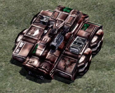
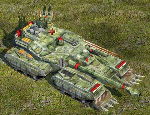
This one was to see what ive learnt so far!Resultion: 10000x5200 pixels
Program: Photoshop cs5
Time: 7hours
Tablet: Wacom Intous 3 A4
the details on the picture:
Related content


Comments: 35

Wow the colours on this really pop due to the darkness. Great work.
👍: 0 ⏩: 1


This is epic! wonderful job on the details! i love the glowing red lines in the big mechs and the background especially.
👍: 0 ⏩: 1


Sieges are always interesting to work on, especially those involving giant machinery. I'm not entirely qualified to critique machinery and mechanical design, but there are some problems that relate to general principles of art that need addressing.
The intention of focusing and displaying the elaborate machinery and impressive nature of the attacking machines has failed, to say the least. The main problem is that the machine, the one in the foreground, the location where artists use to elaborate on machines, does not stand out from the background. It is red and middling to dark shades of brown-black, just like the space behind it. The viewer's eyes are naturally drawn to the point of highest contrast, which is where the sun peaks and shines through the ruined city. Either the mechanical attacker needs to be silhouetted against some lighter values, or it needs to catch planes of light.
With pieces that focus heavily on mechanical and rigid structures it is best to ditch using the soft brush altogether. Just, no. Even rounded smooth machinery will still have a rigid quality with planes.
Here's an example of a depiction of a machine: [link]
The work is very similar to yours, in terms of theme and color schemes, but pay close attention to Radojavor's execution. The subject is silhouetted and is solidly blocked in, contributing to a great and easy read of the structure.
An example of simple buildings: [link]
The tower is slightly silhouetted, with enough contrast to distinguish it. Notice how rough the rubble is.
That all being said, this piece has a lot of potential. Keep up the good work!
👍: 0 ⏩: 1

thank you for the critique and sorry for the slow answer! i willl study these images! and once again thank you!
👍: 0 ⏩: 0

Awesome man!
Also, ure saying that there will be a movie of this picture or something like that. Like in theaters maybe though, if that's what ure sayin.
👍: 0 ⏩: 1
thank you!
something along those lines you could say
👍: 0 ⏩: 1
I c, well I hope they or whoever is making it...I hope its gonna be awesome and great though. XD
👍: 0 ⏩: 0

Indeed this is one of your bests. The lighting is what I like the most because you used shades of dark pink rather than just red and has a lot of grey shading also.
Those burning buildings are a plus, it shows that you don't need to be an architect to draw a powerful structure.
I would give a 10/10 because of the landscape and the mecha desing, I can tell there's some sort of blood that keeps them alive.
👍: 0 ⏩: 1
Thank you for the feedback! ^^
👍: 0 ⏩: 0


Wow another beautiful piece by you. I would critique you, but I can't now I'm too tired so I will keep to just a comment. Maybe later though
👍: 0 ⏩: 1
thank you! np critique if you feel like it
👍: 0 ⏩: 0

To coin a phrase - they are F***ed!
Good learning - you have the potential of going far - don't stop!
👍: 0 ⏩: 1
Pleasure!
This is so ominous - the glare, the pose, the mood.
Like I said - they are F***Ed!
👍: 0 ⏩: 0


I can't write a formal critique because dA doesn't love me, but here's what I think anyway.
Overall this piece is very well done technically. The sense of scale and depth is excellent, and I absolutely love the hazy light in the background. The only thing that needs work is the perspective on the giant mech, whose farther away legs looking bigger than its nearer ones. To a lesser extent, this is also the case with the one in the middle.
I love the design of the characters in this scene. The big scary robots look, bizarre, otherwordly and apocalyptic. The humans (love the armor) look small and weak, but determined to fight. One thing I think would benefit this picture is some action: gunfire, explosions, destruction, that sort of thing. As it stands now, it seems like the humans, particularly in the foreground, aren't trying to fight back. Then again, the eerie sense of calm before the humans strike gives an interesting tension to this piece. I also think a little more detail in the rubble would be a nice touch. Not so much that it distracts from the characters, but just enough to give a sense of what sort of civilization is being destroyed.
This scene is absolutely gorgeous and an instant favorite. I can't wait to see more!
👍: 0 ⏩: 1
thanks alot for the Feedback ")
again thank you for the feedback and there will be more like this soon, recently started working as a concept artist for a newly started indie developer!
👍: 0 ⏩: 1
Hey, congrats on landing a job! Can't wait to see more!
👍: 0 ⏩: 0

Riktigt grymt, coolt att se din utveckling!  (Smile)")
👍: 0 ⏩: 1
tackar! om du menar dom små så tittar två av dom på roboten och en tittar på en av dom som tittar ...men en av dom lite större tittar lite snett, det förstör lite! det kommer jag göra!
👍: 0 ⏩: 1