HOME | DD
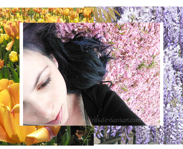
 Idrils — I dreamt of a Valley, V 1.2

Published: 2006-05-07 15:31:20 +0000 UTC; Views: 198; Favourites: 2; Downloads: 20
Redirect to original
Description
And this disposition was suggested by =JenniferStarlingwhat do you think ?
"Original" version : [link]
Related content
Comments: 10

i like it its very pretty colors and interesting composition
👍: 0 ⏩: 1

your wecome hun 
👍: 0 ⏩: 0

I like the flower border, but personally I'd prefer one single photo in the background. Maybe not all the exact same flowers, maybe a photo of a flowerbed with different kinds of plants mixed in it, but the two photos seemed disjointed to me.
👍: 0 ⏩: 1

heeeeey i'm not going to make anothe rpicture for the background ! for the contest i have to put only pictures i took this specific day , this specific time !
👍: 0 ⏩: 0

I do prefer this version but I'm biased of course.
👍: 0 ⏩: 1

hehe ^^ but it means i got what you said right
👍: 0 ⏩: 0

When i first saw this i thought Hallmark colors.. the composition is a-symetrical, which is good. There is a good harmony of colors.
Im just a little unsure about the layering because the portrait of the woman is cuttoff and somewhat floading in the middle.
The vertical lines next to her face emphasises the fact that we cannot see the other eye. Plus it emphasises the difference between the pictures.
What you could do is create paths in photoshop to cut out the woman and flowers properly to intertwine the images together to create a balanced montage rather than using the regular rectangle framing. I think this way it could look much much better. If you dont want to do that just remove the white vertical and horizontal lines it might look a little better.
(just some suggestions)
👍: 0 ⏩: 1

well in this version [link] , there are not the vertical borders (in this version i put them on a suggestion by someone). And what do you mean by paths ? Which which shapes if not rectangular ?
👍: 0 ⏩: 0


