HOME | DD
 Ielemientje — Dead!

Published: 2012-08-24 18:36:24 +0000 UTC; Views: 469; Favourites: 9; Downloads: 11
Redirect to original
Description
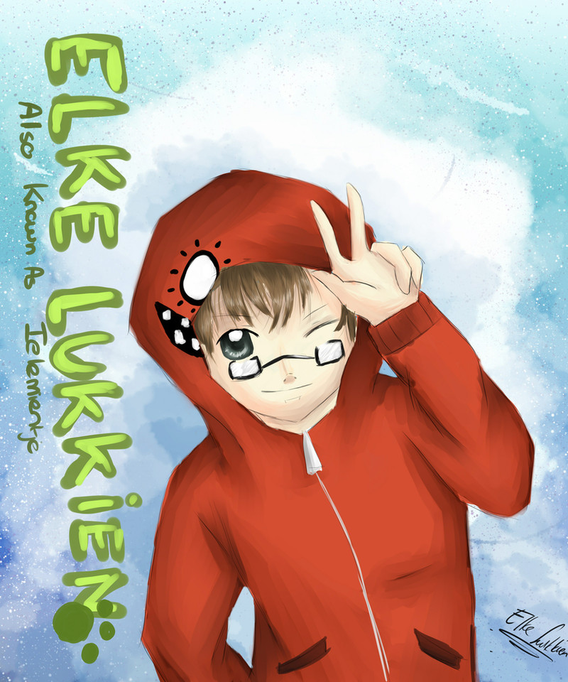
This is the first finisher of my first assignment at the Art Academy!We went to an excursion to MOTI, Museum of the Image, in Breda, the Netherlands. There was a certain exposition there, and we had to pick 5 images we saw there and make a new image based or inspired from it.
I made this.
You see, I thought there was a lot of violence they showed there. Dead people and violence. It was ...confronting. Kindof. So I decided to make something that gives others the same feeling as the images there gave me. The person kills themselves because of the violence. They can't take it anymore. The colours are because..I think we're not serious about death and people being murdered/killing themselves anymore. We make it seem 'normal'..almost colorful to our lives.
I hope this works as confronting. The letters say DEAD.
Just like this person is/will be.
I hope you like this
 I'm not too happy about how this came out, anatomy sucks :V But the painting was funny to do;D
AND MY ART COLLEGE IS SO MUCH FUN HNG
Thanks to Mike from my class for helping me with this idea!
Art (c) me~
Commissions /Art Trades are on hold. I am sorry. I will be busy for a while. You can still commission me. It'll be late though.
Hope you like~<3
Related content


Comments: 22

Now that is one colorful death. It bothers me that it was a suicide, but otherwise, I really like it.
 (Smile)")
👍: 0 ⏩: 1

Ah, im sorry that it kind of bothers you ;n; It was for a school project ~
It's colourful because i think we're too easy and colourful about death nowadays, especially about suicide..at least from what i hear on the news ..
Thank you<3 Also for the favourite!:3
👍: 0 ⏩: 1
Honestly, I think that's why it bothers me though. People take suicide too lightly & people jump to it too quickly to escape their problems instead of finding another way. Your art was supposed to show people that right? So u did a good job.
👍: 0 ⏩: 1
Yes! I think that ! Haha, thank you (: My teacher liked it too, but he told me I need to get more used to my art style by drawing common objects in it...so it really is my style only
But he liked the drawing and the idea (:
👍: 0 ⏩: 0

whoei, er is weer Tonnie-art mensennnnnnn ~ >U<
daaaaaaaaaaaaaaaaaaaaaaaaamnn Tonnie, ziet er echt heel gaaf uit ~ ouo
het idee vind ik echt heel goed, en de tekening zelf ook ;u;
de kleurtjes zijn echt heel awesome, en de anatomie is best goed vind ik c:
en ik ben blij voor je dat je college leuk is haha x'D
👍: 0 ⏩: 1
Waaahh dankjewelll1!~<3 Hahahaa, ikben blij dat je 'm cool vindt ! OvO hoop dat de leraren dat ook vinden..xD
Dankjewelll<3 Ik vind de anatomie echt puurkut, de hand is echt een fail maarja~
Dat moet dan maar x]]]
Ja mna 't is super leuk ;w; IK MAAK AL VRIENDEN
👍: 0 ⏩: 1
alsjeblieftttt ~
ik denk wel dat de leraren het ook wel leuk vindennn
anatomie is over het algemeen kut TuT'
ooohh awesome, you go girlll ~ : D
👍: 0 ⏩: 0

heel mooi gepaint en een great deep idee o3o i love it seriously!
👍: 0 ⏩: 1
Dankjewelll =w=b Hopen dat de leraarmensjes het ook mooi vinden xd
👍: 0 ⏩: 1
dat zit wel goed denk ik ;3
👍: 0 ⏩: 0

shading is awesome and I love how the blood splatter turned out, it's an interesting visual effect that I've never seen done like this before.
👍: 0 ⏩: 1
Thanks!!!<3 But it's not that original..im glad you think that way though<3 Haha<3
👍: 0 ⏩: 1
yeah, I admit I haven't seen a whole lot of art.
honestly, the only thing that isn't great is the arm holding a gun. but a diamond with a chip in it is a diamond all the same, and if your work was flawless you wouldn't be at art college getting the diamond recut.
okay, I've taken that metaphor far enough.
so... yeah. the decision to not show the person's face is an interesting one... I like the idea that it could be anyone holding that gun.
👍: 0 ⏩: 1
Haha, thanks , really ;w; Haha, you're so sweettttttt
LOL OH YOU
I wanted that..on purpose. Eyes could of made it more personal maybe..them piercing at you. But this..is different. Society. Imade the persoon look "unisex" if you get me. I wanted it to look like "society"...anyone. ;D I hope that turned out well..
👍: 0 ⏩: 1
yeah, it worked out great! I mean, I spotted it and I'm not exactly known for being perceptive
")
👍: 0 ⏩: 1
Hahahaha, thank you!!!<333 so much hnggg
I hope i can be more proud/confident in this work as it'll get checked and such.
👍: 0 ⏩: 1
yeah, you have every right to be proud about this
")
👍: 0 ⏩: 1

Amazing graphics and detail. The color makes it seem more exciting and creative. Great work!
👍: 0 ⏩: 1
Wow, thank you so much!>w< That makes me so happy to hear<3 I'm really nervous about the way I'll get rated for it..D:
👍: 0 ⏩: 1
Waahh, thank you so much!;w; <3 It's seriously not THAT good...anatomy is terrible D:
👍: 0 ⏩: 0